White Balance Question
Dec 1, 2023 13:01:31 #

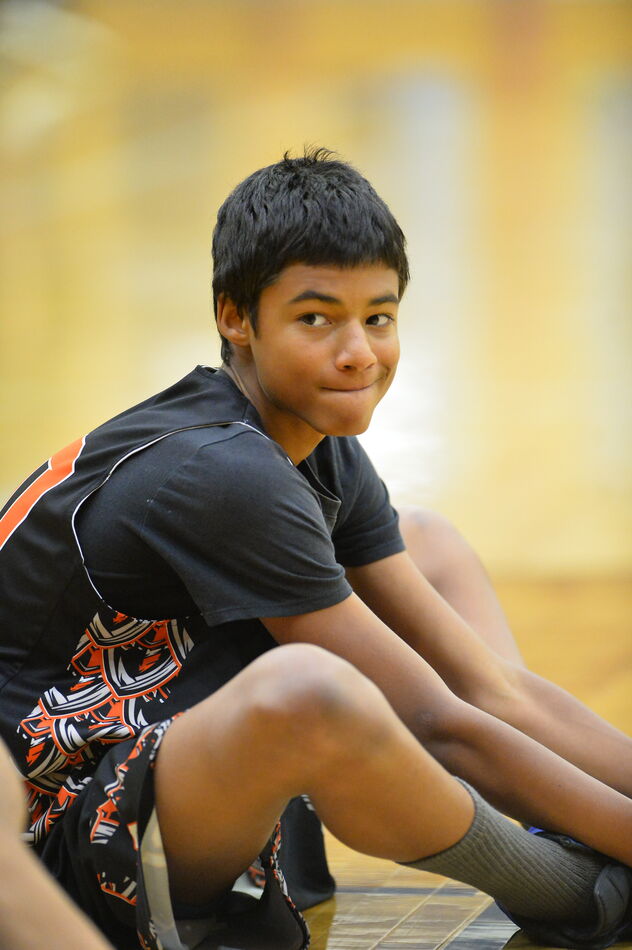
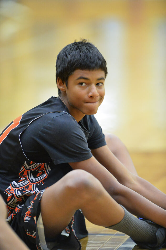
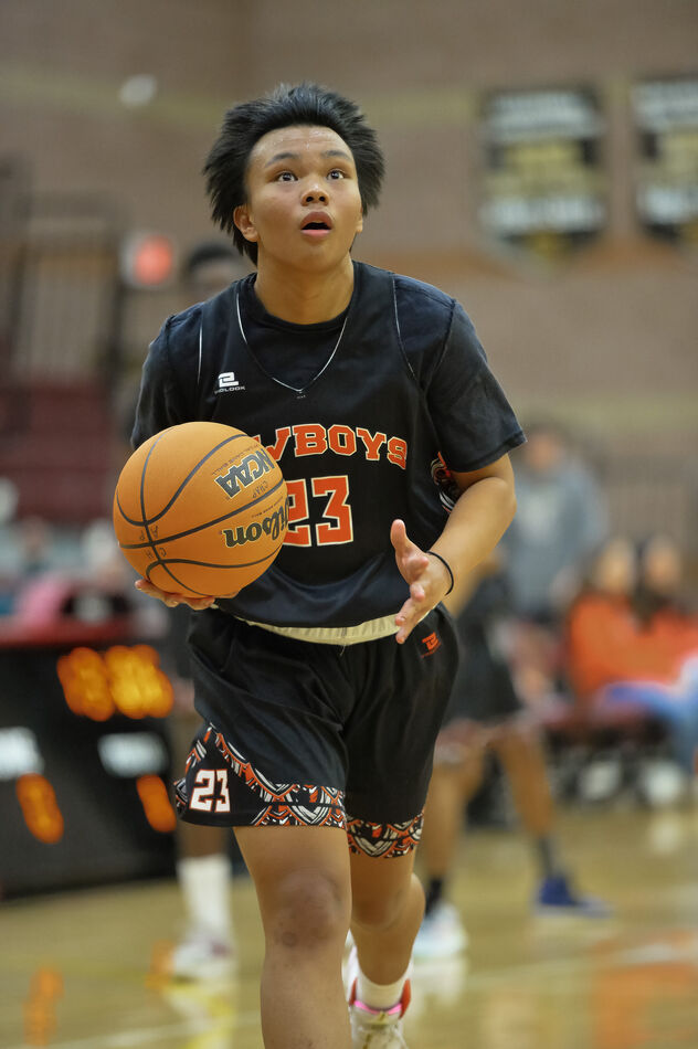
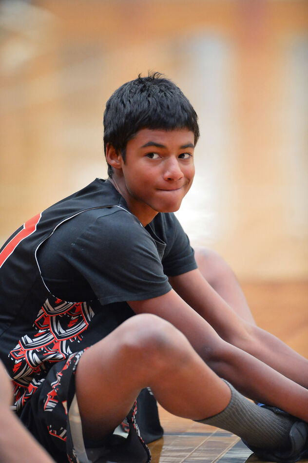
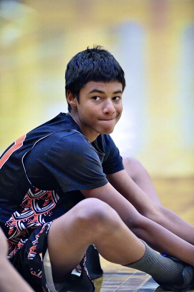
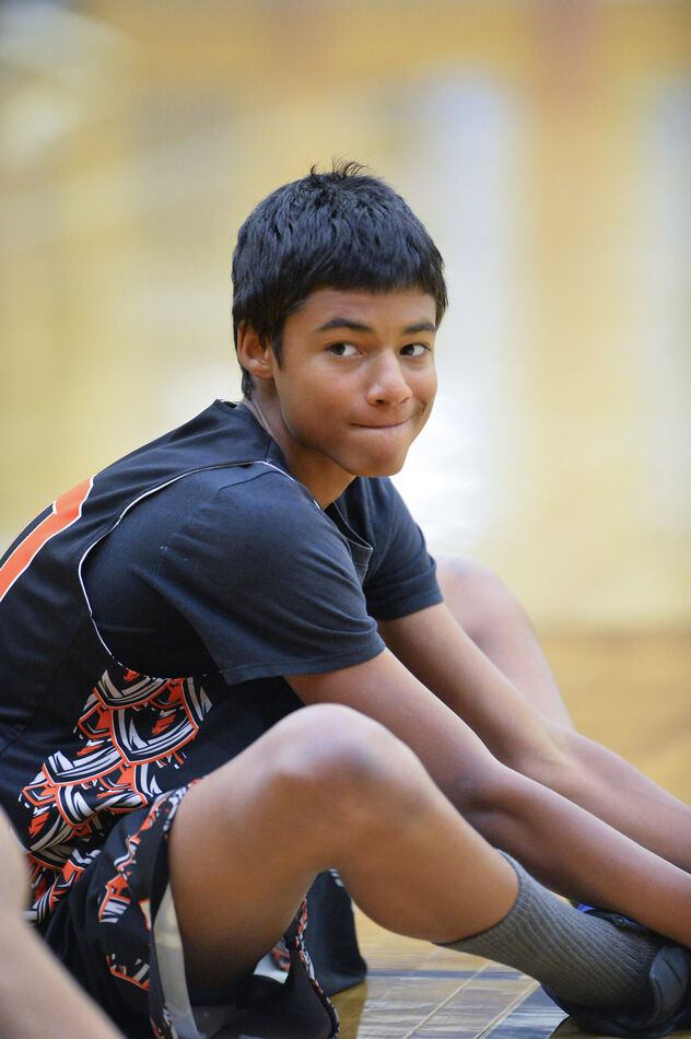
I am having trouble with the white balance on Photoshop. Lots of yellow. Trying with the blue balance, etc. taking out the yellow. Still not right. Any suggestions will be appreciated.
Jules
Jules

Dec 1, 2023 13:24:18 #
Ysarex
Loc: St. Louis
Jules Karney wrote:
I am having trouble with the white balance on Photoshop. Lots of yellow. Trying with the blue balance, etc. taking out the yellow. Still not right. Any suggestions will be appreciated.
Jules
Jules
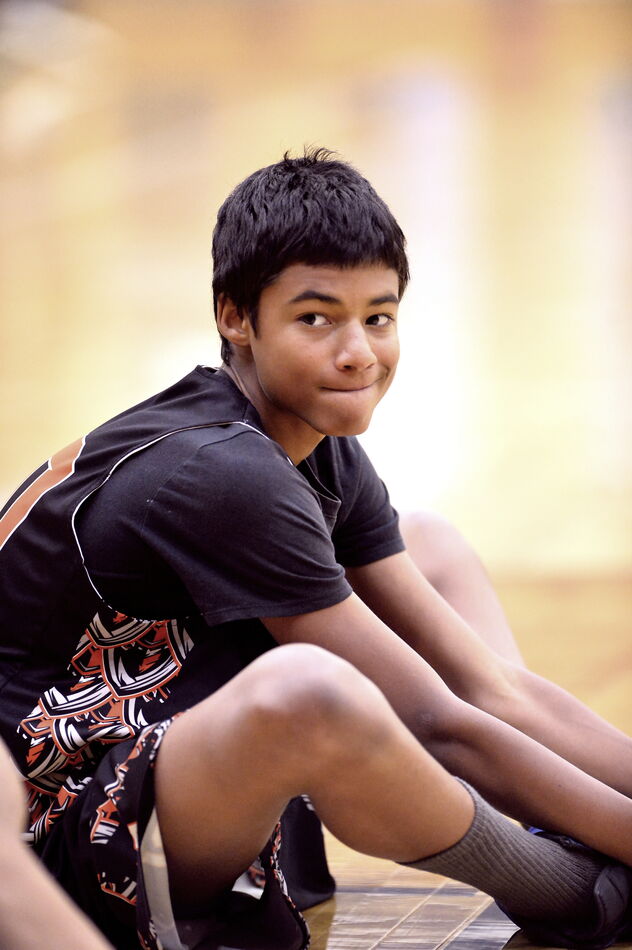
The first two photos you posted are identical -- the same photo twice.
In any case the color is fine. It appears believably accurate. Skin color looks and measures correct.
Dec 1, 2023 13:33:36 #
larryepage
Loc: North Texas area
Jules Karney wrote:
I am having trouble with the white balance on Photoshop. Lots of yellow. Trying with the blue balance, etc. taking out the yellow. Still not right. Any suggestions will be appreciated.
Jules
Jules
I agree that the overall images seem to have a yellowish bias. But if you look carefully at the things that are supposed to be white, like the socks, the white in the trunks, the whites of the player's eyes, the catchlights in his eyes, they are all white, not yellow. So I question whether there is really any further white balance adjustment needed or appropriate.
I sympathize with your question, but this situation exemplifies why I prefer to get white balance as close as possible at the time of capture. Our brains will work with our eyes to make a scene which is really "off" appear "right" to us. Unfortunately, those two organs have a multi-channel adjustment system available to them that is not available to our processing software.
I have on numerous occasions photographed artwork resulting in an image that looked quite different from my mental recollection. When I was able to follow-up with further investigation, it turned out that the photograph was correct. My brain and eyes concocted an "adjusted perceived image" that quite different from reality. (Part of the fun of photography for me has become exposing visual reality.)
Dec 1, 2023 13:54:14 #

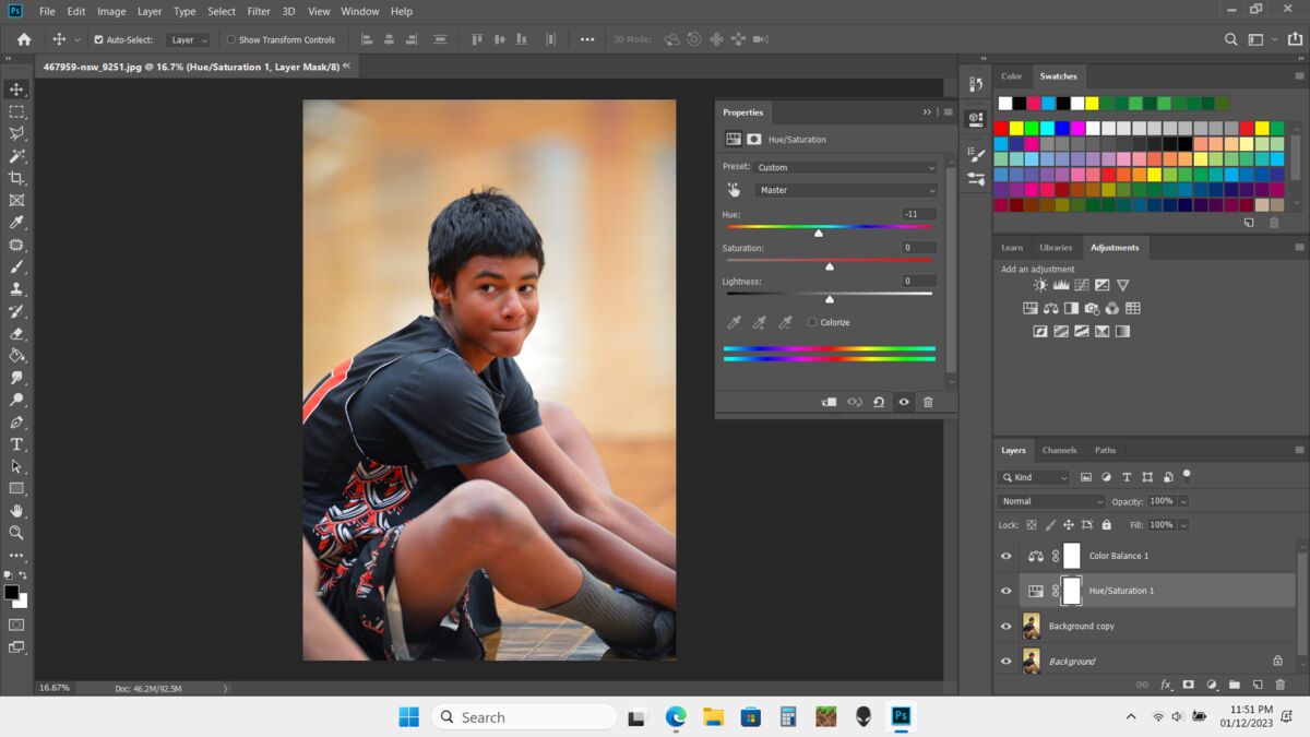
The problem is more than just a WB question. Yellow and orange are not only too strong, they're too bright as well (note how bright the basketball looks). The cause of the colour imbalance is probably the artificial lighting. Trying to weaken yellow and orange using WB adjustments alone won't be enough.
For demonstration purposes the only adjustments I made to #2 were to darken and desaturate yellow and orange. #1 didn't appear to have any WB adjustments as posted so I added a Temp shift from yellow to blue in addition to the yellow and orange adjustments.
The face in #2 appears blotchy. That is probably because the posted image was a jpg. If you have the raw files you should be able to get smoother adjustments. There are probably other adjustments that you could add for better results. I'm just making a point with these examples.
.
Dec 1, 2023 15:01:36 #
Jules Karney wrote:
I am having trouble with the white balance on Photoshop. Lots of yellow. Trying with the blue balance, etc. taking out the yellow. Still not right. Any suggestions will be appreciated.
Jules
Jules
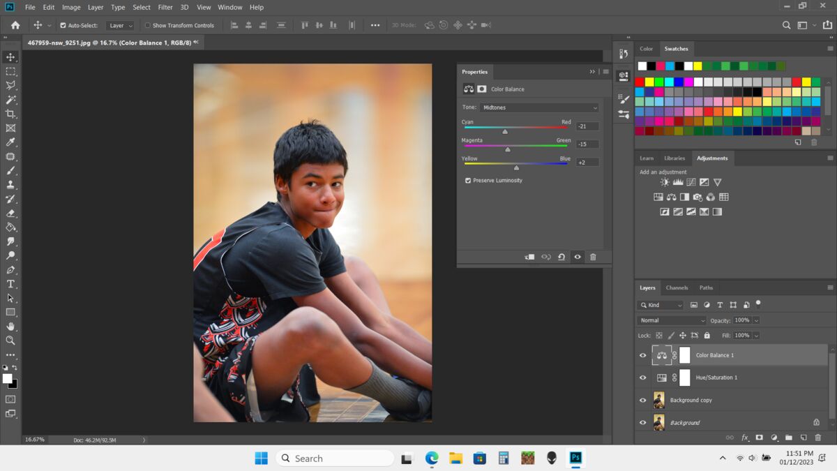
I also lessen the saturation a tiny bit.
Settings and output below:
Dec 1, 2023 15:13:26 #
Jules Karney wrote:
I am having trouble with the white balance on Photoshop. Lots of yellow. Trying with the blue balance, etc. taking out the yellow. Still not right. Any suggestions will be appreciated.
Jules
Jules
Below examples are your thumbnails adjusted for K-temp and green-magenta using only the adjustments in my phone (iphone 11).
Acoarst Ive got no clue how you recall these scenes looking to your eye at the time, so Im only just guessing.
Dec 1, 2023 15:28:11 #
Dec 1, 2023 15:47:45 #
larryepage
Loc: North Texas area
Preface and disclaimer--none of what follows is intended to be taken personally by anyone. This challenge is the result of shooting in a very difficult situation with very limited options.
Gymnasium lighting has for a long time typically been done with mercury vapor lighting. I am guessing that is the case here. It is very efficient and can quite easily achieve quite high brightness levels. The problem is that if you look at the light on a spectrograph, it's all made up of six very narrow lines of light...two each of orange, green, and violet. (Sort of like red, blue, and green, but not really.) The problem is that while the light looks sort of white (subjectively, at least), it's really not. The CRI of mercury vapor lamps ranges from about 17 (clear lamps) to somewhere around 49 (coated lamps, similar to fluorescent tubes). This limits the ability to do color correction, because much of the color that you might want to increase is simply not present. (By the way, low pressure sodium lamps have a CRI of around -44 (yes, that's negative 44), and high pressure sodium...the ones that make you think they're white...are around 24. They are essentially almost monochromatic yellow light sources.) Some gyms today are equipped with LED or other new-fangled lighting, but this is far from universal. It's expensive, and despite marketing claims, maintenance and replacement frequency is about the same as for the more traditional options.
I have found through experience that just about the best way to handle sodium lighting is to shoot in monochrome. Mercury vapor can usually be best handled by exposing for fluorescent and then leaving everything alone. What you would like to achieve is simply not there to be recovered. With apologies to each of those who have tried, I do not believe that the corrections offered provide improvement over the originals. They all seem (to me at least) to have something of a blue haze that I don't care for. Additionally, the skin tones do not seem natural (or healthy) and the colors in the clothing are less believable.
Of great importance here is for me to acknowledge that I was not present at the game. Like everyone else, I have no frame of reference of what might be correct. But to me, the original remains most pleasing and most believable.
Dec 1, 2023 16:11:43 #
R.G. wrote:
The problem is more than just a WB question...
However, to get an impression about what corrections are needed you can use the WB dropper and see what WB corrections are suggested. I did that with both images a few times and (depending on what I used as the white reference) I usually got a significant Tint shift towards magenta (between 10 and 18 in Lr). I also got a Temp shift towards yellow (between 5 and 10) but each time it looked better if I backed off and left it more neutral.
The fact that a WB shift towards yellow was suggested indicates that it's less of a WB problem and more of a yellow and orange problem.
A combination of HSL and WB adjustments will get you as close as is possible given the unnatural lighting.
.
Dec 1, 2023 16:32:08 #

Here's my take on the situation.
Attached is my eyeball correction- it may differ for your gaol in that our monitors and not calibrated with each other.
I draw my color-correctio experience from years of analog color printing- conventional "C" prints, however most (COLOR) theory is the same. First the problem.
In great acts shots that you have here, they can be mixed with lighting- even out of doors. Light comes from the open shade, sky, direct sun, or even stadium lights and reflects off surroundings as well and all o at the same time. This can cause a crossover where you correct for one color such as a skin tone and get inaccuracy in other elements such as clothing or the background. This can be somewhat corrected in post-processing by selective "dodging". This can be used to correct shifts in clothing but is nearly impossible to do with variations within a skin tone. A compromise has to be reached and perhaps a reduction in saturation.
The other issue is multiple corrections. A correction may be needed for one color, in the cases yearly. But it could be yellow/green or yellow/red. A cyan case can be cyan/green cyan/blue, etc. So you need to work with multiple corrections.
Density (brightness/darkness has to be established before the final color correction is determined. Contrast counts too.
So, back in the old days, we were stuck with one kind of printing paper for contrast and saturation. The process had to be uniform. In Digital we can control all the colors AND vary brightness,saturation, and contrast.
Skintone: It can be difficult to determine an accurate skin if you do not know the subject. None of us are
white, pink, black, brown, yellow, or red! There are millions of variations and mixtures.
At the end of the day, there are all kinds of color control systems, calibration methods, white balance targets, and gray scales and cards. These controls are all helpful but your best tools are your eyeballs in learning to detect nuances in colors and the effect of mixed light and surroundings on your subject. .
Dec 1, 2023 16:42:25 #

Jules Karney wrote:
I am having trouble with the white balance on Photoshop. Lots of yellow. Trying with the blue balance, etc. taking out the yellow. Still not right. Any suggestions will be appreciated.
Jules
Jules
Were the walls and floor of the facility a shade of yellow?
When was your monitor last calibrated and custom-profiled? If you're using any Mac notebook/laptop computer, have you turned off Automatically Adjust Brightness, True Tone, and Night Shift? These will screw up color!
What white balance setting did you use at the camera?
Did you record raw files, or camera-processed JPEGs?
If you saved JPEGs at the camera, did you use Custom/Pre-set/Manual white balance in reference to a suitable white balance target?
What was the light source? It's in a gym, which could have been lit with sodium vapor lamps. They have a very discontinuous spectral response, with gaping holes where colors should be. (The only continuous sources are daylight and incandescent, each of which has varying proportions of RGB in it.)
My recommendation for indoor sports arenas is to talk to the maintenance manager of the facility and find out what type and brand of lighting is in use.
> HMI is pretty good... It's used for arenas and stadiums where TV broadcasts will be done.
> Incandescent is rare in 2023. It's too expensive and too dim, and too hard to change the lamps.
> Mercury vapor is rare in 2023 also. It's the worst. It's almost all cyan and very discontinuous.
> Sodium vapor is common. There are two types, one of which is almost all yellow. The other has lots of holes in the spectrum, but does have some other colors in it.
> Fluorescent is still found in some school gyms. It is usually fairly correctable with a custom white balance.
When I work in an environment with controlled, consistent lighting, whether I'm saving JPEGs or raw files, or both, I will set a custom/pre-set/manual white balance in reference to a One Shot Digital Calibration Target, or a Delta-1 Gray Card, or an ExpoDisc. I will keep an exposure of the white balanced target for post-processing reference.
If the lighting is very consistent across a room or gym, I'll use the same exposure and set manual ISO, manual shutter speed, and manual aperture. If it varies, I'll let my ISO float, while setting the aperture for the depth of field I need and the shutter for the action stopping ability I need.
If I have it with me, I'll photograph my ColorChecker Chart along with the white balance target. This will reveal which colors are flat-out MISSING from the light source (such colors will appear much darker than normal on the image of the chart.)
Unfortunately, you cannot create or put back colors that were not properly recorded due to the use of a poor light source.
Fortunately, there are always monochrome conversions!
Dec 1, 2023 17:16:45 #

E.L.. Shapiro wrote:
Here's my take on the situation. br br Attached ... (show quote)
Awesome shot 🔥🔥🔥🔥🔥
Dec 1, 2023 17:23:06 #
Jules Karney wrote:
I am having trouble with the white balance on Photoshop. Lots of yellow. Trying with the blue balance, etc. taking out the yellow. Still not right. Any suggestions will be appreciated.
Jules
Jules
To all the club members who have chimed in on this subject. A big thank you. I appreciate all the time you have spent. This is the only gym I have this problem with.
Jules
Dec 1, 2023 20:48:00 #
Orphoto
Loc: Oregon
another avenue is to go into the HSL panel of lightroom or ACR and selectively pull back the saturation of the yellow tones.
Dec 1, 2023 21:58:32 #
Orphoto wrote:
another avenue is to go into the HSL panel of lightroom or ACR and selectively pull back the saturation of the yellow tones.
Show result ?
If you want to reply, then register here. Registration is free and your account is created instantly, so you can post right away.