Check out Astronomical Photography Forum section of our forum.
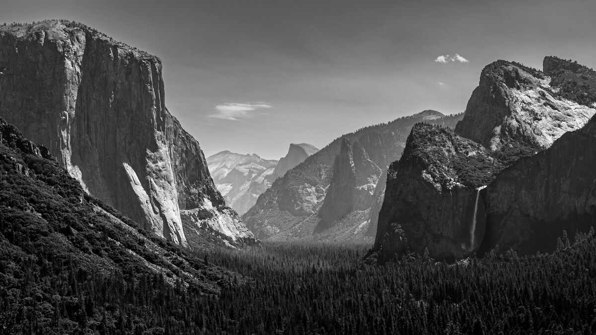
Yosemite Tunnel View
Nov 28, 2023 21:58:13 #
Chance Logan
Loc: New England
Several years ago we found a last minute trip to Yosemite due to a cancellation. All images were in color, but the big disappointment was the ones taken at this location. None were keepers for anything more than a memory of being there. This image is a prayer that I could make something that would allow me to change that feeling. Shows better with the download. Comments welcome.
Nov 28, 2023 22:43:16 #
Nov 28, 2023 23:53:22 #
Nov 29, 2023 01:23:05 #

It makes a good B&W, but have you tried the HSL tool? It's designed to get colours to where they should have been or could have been if they're not to your liking.
Nov 29, 2023 05:32:29 #
Chance Logan wrote:
Several years ago we found a last minute trip to Yosemite due to a cancellation. All images were in color, but the big disappointment was the ones taken at this location. None were keepers for anything more than a memory of being there. This image is a prayer that I could make something that would allow me to change that feeling. Shows better with the download. Comments welcome.
All I can say is WOW!!. Love it. Post more when you can. Thanks BE SAFE!!
Tom
Nov 29, 2023 08:28:17 #

You shot the iconic view known 'round the world  Your b&w version is lovely and delicate, letting the scene be the star, not the pp. It's especially nice for the feeling of depth with the lighter, hazier distance.
Your b&w version is lovely and delicate, letting the scene be the star, not the pp. It's especially nice for the feeling of depth with the lighter, hazier distance.Nov 29, 2023 08:32:55 #
Chance Logan
Loc: New England
NMGal wrote:
Really nice.
Thanks so much. Good to here you liked it, Barbara.
Check out Video for DSLR and Point and Shoot Cameras section of our forum.
Nov 29, 2023 08:36:09 #
Chance Logan
Loc: New England
Curmudgeon wrote:
Beautiful
Appreciate hearing that. Jack. Door #1 has the original color that was begging to be 86ed.
Nov 29, 2023 08:45:45 #
Chance Logan
Loc: New England
R.G. wrote:
It makes a good B&W, but have you tried the HSL tool? It's designed to get colours to where they should have been or could have been if they're not to your liking.
Thanks for stopping by, R.G. Appreciate the kind words. Tried a number of times to use sliders and masks that just wouldn't get me a result I could accept. Either I'm too critical or my skills ran short, but it was uncomfortable to have had the experience of Yosemite and know 'that' was the shot I missed. But... it's a good reason to go back.
Nov 29, 2023 08:49:42 #
Chance Logan
Loc: New England
tshift wrote:
All I can say is WOW!!. Love it. Post more when you can. Thanks BE SAFE!!
Tom
Tom
Thanks very much, Tom. When I was there, it was the goal to come away with an image that would get that type of a response, but B&W was not the path of thought at that time.
Nov 29, 2023 09:01:23 #
Chance Logan
Loc: New England
Linda From Maine wrote:
You shot the iconic view known 'round the world Your b&w version is lovely and delicate, letting the scene be the star, not the pp. It's especially nice for the feeling of depth with the lighter, hazier distance.
Your b&w version is lovely and delicate, letting the scene be the star, not the pp. It's especially nice for the feeling of depth with the lighter, hazier distance.So glad for your perspective, Linda. Oddly, the biggest concern was that I wasn't doing enough with the B&W. I knew it was better than the original, but kept asking myself, what else should I do? My skin is thick enough to take it, so I thought it best to post for constructive criticism. Sometimes you need to have another set of eyes help you see you through it. Thank you.
Check out Video for DSLR and Point and Shoot Cameras section of our forum.
Nov 29, 2023 09:18:52 #

Nov 29, 2023 09:28:31 #
Nov 29, 2023 10:27:08 #

Chance Logan wrote:
Several years ago we found a last minute trip to Yosemite due to a cancellation. All images were in color, but the big disappointment was the ones taken at this location. None were keepers for anything more than a memory of being there. This image is a prayer that I could make something that would allow me to change that feeling. Shows better with the download. Comments welcome.
Very nice.
Nov 29, 2023 10:47:12 #
I think if Adams were alive today and you shared this image with him he would have patted you on the back and say “nice shot”. If you had asked him how it could be improved, I wonder what he might have suggested?
I think it is a matter of personal preference and I agree with Linda the softness of the light and feeling of distance created by the haze is appealing. Perhaps a good term might be “warm”. But when I first looked at the image, it seemed a bit “soft”, both in clarity and light. I’m wondering whether increasing the sharpness and applying a bit of “dehaze”, and perhaps adjusting the contrast might make the image pop a bit more. Not a bunch, but very slight adjustments. I think the image justifies playing with it a bit more and see what YOU like before you print it, put it in a nice frame, and hang it on your wall.
I think it is a matter of personal preference and I agree with Linda the softness of the light and feeling of distance created by the haze is appealing. Perhaps a good term might be “warm”. But when I first looked at the image, it seemed a bit “soft”, both in clarity and light. I’m wondering whether increasing the sharpness and applying a bit of “dehaze”, and perhaps adjusting the contrast might make the image pop a bit more. Not a bunch, but very slight adjustments. I think the image justifies playing with it a bit more and see what YOU like before you print it, put it in a nice frame, and hang it on your wall.
If you want to reply, then register here. Registration is free and your account is created instantly, so you can post right away.
Check out Film Photography section of our forum.