Putting a Bird on a Bush - Minimalist Composite #2
Nov 20, 2023 15:35:11 #

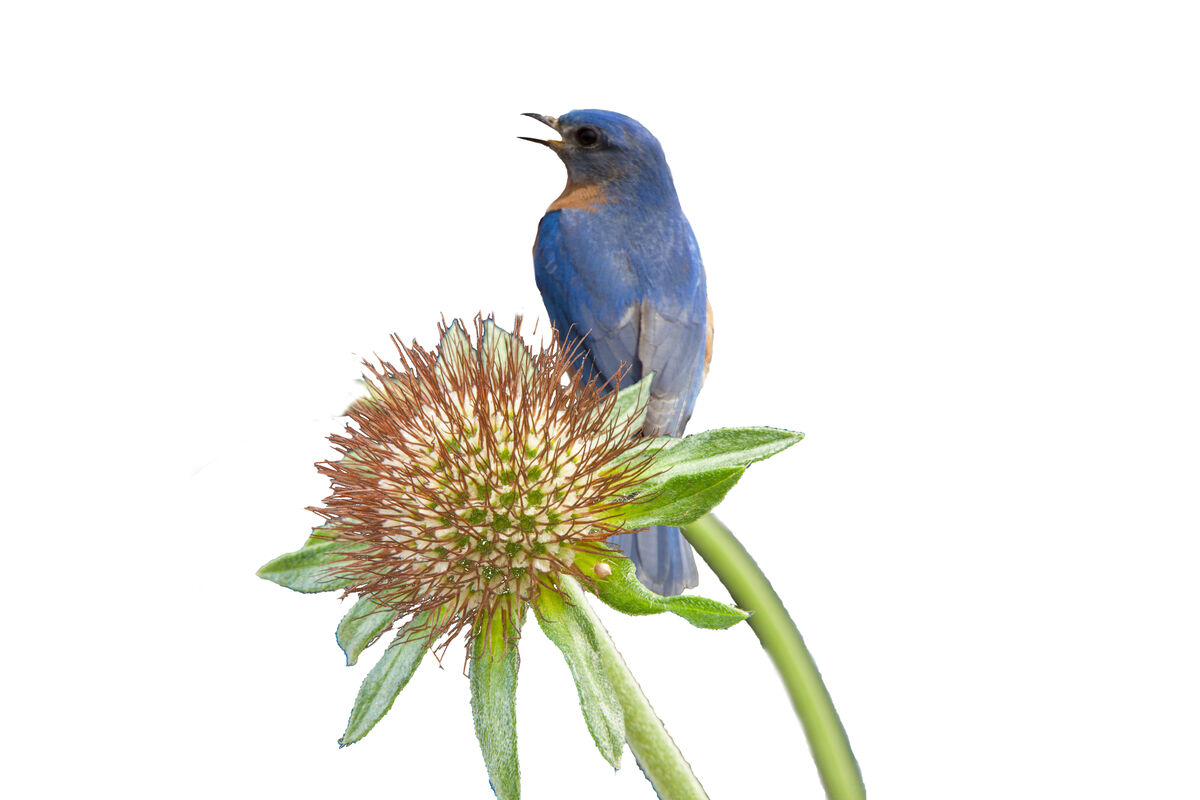
I posted a composite on the 17th, and, at Linda's suggestion, here's another. Pretty much the same approach as in the 11/17 post, but I didn't need to duplicate the flower layer this time.
(manager's note: Click here for Dan's first topic and the instructions on how he achieved)
(manager's note: Click here for Dan's first topic and the instructions on how he achieved)
Nov 20, 2023 15:39:44 #

Nov 20, 2023 16:06:42 #

Nov 20, 2023 16:52:26 #

I think much of the success of both comes from your choice of super-interesting flowers and beautiful birds. I love this one as much as the other, except...it feels that there's too much white space. I did a little crop from the right side in my mind and really like it because of the way the flower curves.
Many thanks for posting!
Many thanks for posting!
Nov 20, 2023 16:55:24 #
Linda From Maine wrote:
I think much of the success of both comes from the choice of super-interesting flowers and beautiful birds. I love this one as much as the other, except...it feels that there's too much white space. I did a crop from the right side in my mind and really like it because of the way the flower curves.
Many thanks for posting!
Many thanks for posting!
I think you're right. I left it like it is because I wanted to retain the original 3 x 2 form factor, but less space would probably be better.
Nov 20, 2023 17:00:38 #
DWU2 wrote:
I meant to ask if you had a special purpose in that, such as creating a photo book, or planning a cohesive series or grouping such as a triptych.I think you're right. I left it like it is because I wanted to retain the original 3 x 2 form factor, but less space would probably be better.
Nov 20, 2023 18:58:18 #
Nov 21, 2023 06:14:55 #

Nov 21, 2023 07:13:55 #

Visual dissonance grabs us. We know that the bird should be big and the flower small ... the image goes against our logic and that is what makes it a stand out photo.
Extend the canvas and patch in the clipped in bottom leaf to make perfection.
I agree with Linda's cropping suggestion but one step beyond. I would do a horizontal flip so that the photo arc and subject reads from left to right. With that flip the bird will be looking the positive future vs a grim past... the left with fearful memories of Elmer Fudd and his gun.** The solid on the left vs the void white on the right... a yin-yang balance.
**For the illiterate who have not read the true American visual literature ..comics.
https://www.pinterest.com/morrishollis/elmer-fudd-with-gun/
Nov 21, 2023 10:41:00 #

I really like this image. I do agree with Linda that cropping a bit from the right would be good. But I went a bit further and also cropped from the left. I feel like this is a vertical image concealed in a landscape format. What I came up with isn't a true vertical, but neither is it a square. And it put both the flower and the bird's head in the junction of the thirds lines - or close to them. As to the size of the flower in comparison with the bird, that doesn't bother me, and I likely wouldn't have thought about it were it not for the post above. I find the image pleasing, so I'm choosing to ignore that issue.
You've done a wonderful job in selecting the subjects from their original background.
You've done a wonderful job in selecting the subjects from their original background.
Nov 21, 2023 11:06:49 #
Nov 21, 2023 11:31:54 #
Linda From Maine wrote:
I meant to ask if you had a special purpose in that, such as creating a photo book, or planning a cohesive series or grouping such as a triptych.
Right now, I'm just experimenting, but eventually, I may make a triptych.
Nov 21, 2023 11:39:18 #
Fstop12 wrote:
I like the end result. How are you going about cutting out the image?
I cut it out some time ago for a different project, so I don't exactly recall, but here's what I typically do:
- Find a bird relatively "in the clear" without branches or leaves in front of it.
- In PS Select Subject.
- Modify selection by decreasing it by a couple of pixels.
- Invert selection
- With layer unlocked, delete background.
- Occasionally need to polish it a little with eraser tool, set soft.
Also:
- If there is a little branch or leaf on the bird, I often can remove in PS with one of several tools, including new AI Generative Fill.
- Sometimes feet don't select, or select incompletely. If that's to hard to fix, I try to position the bird within the new foliage so feet don't show.
Nov 21, 2023 12:27:40 #
DWU2 wrote:
Great solution! ...
- Sometimes feet don't select, or select incompletely. If that's to hard to fix, I try to position the bird within the new foliage so feet don't show.
- Sometimes feet don't select, or select incompletely. If that's to hard to fix, I try to position the bird within the new foliage so feet don't show.

Nov 23, 2023 05:05:15 #

It’s all been said but I’d like to comment anyway. It’s stunning, would make an excellent book illustration, would be nicer if the foliage wasn’t ‘clipped’ and, for me, should be in portrait format. All that said, it’s still stunning.
If you want to reply, then register here. Registration is free and your account is created instantly, so you can post right away.