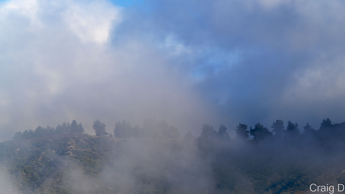
Misty San Gabriels - 3 versions
Nov 18, 2023 17:04:08 #

I'm trying out some options and would like your opinion on which is better, either for show, sales, or personal preference. This is after watching Serge Ramelli's video using LRC linear and radial gradations for inspiration.
Just your quick initial impression would be enough - Thanks for your feedback.
(BTW, I like the vibrant colors version the most if I were printing on metal or for sharing some drama, and the first least vibrant version as a realistic screen wallpaper.)
Just your quick initial impression would be enough - Thanks for your feedback.
(BTW, I like the vibrant colors version the most if I were printing on metal or for sharing some drama, and the first least vibrant version as a realistic screen wallpaper.)
Misty San Gabriels - Photoshop only
(Download)
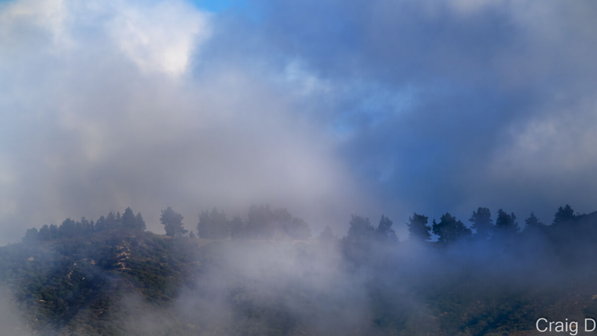
Misty San Gabriels 2 - Photoshop only
(Download)
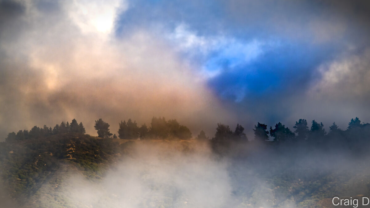
Misty San Gabriels (vibrant colors) - Lightroom Classic and Photoshop
(Download)
Nov 18, 2023 18:36:02 #

Nov 18, 2023 18:37:12 #

If these were mine, I would go with number two. It shows a bit more of the trees. In the first one the background is a tad obscure. The last one I don’t know why but I am not feeling the colors. I have a feeling if you only displayed the last in this thread I probably would not feel the same way as I do. And the coloring would be ok. If that makes any sense.
Nov 18, 2023 21:56:15 #

Craigdca wrote:
I like #2 for what Frank said. Maybe consider just a tiny bit more saturation to give just a hint of color in the clouds? I'm trying out some options and would like your opinion on which is better, either for show, sales, or personal preference. This is after watching Serge Ramelli's video using LRC linear and radial gradations for inspiration.
Just your quick initial impression would be enough - Thanks for your feedback.
(BTW, I like the vibrant colors version the most if I were printing on metal or for sharing some drama, and the first least vibrant version as a realistic screen wallpaper.)
Just your quick initial impression would be enough - Thanks for your feedback.
(BTW, I like the vibrant colors version the most if I were printing on metal or for sharing some drama, and the first least vibrant version as a realistic screen wallpaper.)
#3 looks over-cooked to my eyes and it seems like the processing has increased the noise level. But that’s just me. Everyone has different tastes and likes and it’s your art, so you should definitely choose the one you like. “Don’t pay me no nevermind” so to say. ;)
FYI- I find sometimes when trying to pick from multiple frames that leaving and coming back a few days or a week later, helps me decide.
Nov 18, 2023 22:05:28 #
JD750 wrote:
I like #2 for what Frank said. Maybe consider just... (show quote)
Thanks for the practical feedback. #3 definitely got a little noisy, although maybe somewhat artistically. I like your idea for #2 to bring it closer to its potential. I’ve heard about letting it simmer a few days but haven’t been mature enough to try this wise practice. It’s time to start 😎👍
Nov 18, 2023 22:06:56 #

Nov 18, 2023 22:10:22 #
NJFrank wrote:
If these were mine, I would go with number two. It shows a bit more of the trees. In the first one the background is a tad obscure. The last one I don’t know why but I am not feeling the colors. I have a feeling if you only displayed the last in this thread I probably would not feel the same way as I do. And the coloring would be ok. If that makes any sense.
I did make an effort to improve the tree line as you noticed. The colors in #3 are from an attempt at cinematic color grading and probably works only if that’s what’s needed. But next to realistic coloring, I see what you mean!
Nov 19, 2023 07:51:14 #

Please forgive me for being the bad guy but I don't like any of them. My main reason is the subject matter, the mountains in the background are not worthy of being the initial subject matter and the mist does not help in the slightest. All it does is to cloud, no pun intended, what there is of the mountains. The colors do not help either. Ask yourself, if it was a bright sunny day and no mist would the photo be any better? There are no majestic snow covered peaks, no rocky crags, no mountain sheep or goats to give interest to the mountains. Perhaps choose a small portion of the mountains such as the left side and focus, no pun intended there either, on that smaller area.
Dennis
Dennis
Nov 19, 2023 08:45:11 #

I'd go for #2. It look more real to me. Of course, I didn't actually see the scene, so I actually don't know.
Nov 19, 2023 12:16:24 #
dennis2146 wrote:
For me it speaks of a quiet cool misty morning in the mountains. And that has its own subtle allure.Please forgive me for being the bad guy but I don'... (show quote)
You don’t get that and that’s ok, everyone has different tastes and likes and dislikes.
Nov 19, 2023 12:19:00 #
JD750 wrote:
For me it speaks of a quiet cool misty morning in the mountains. And that has its own subtle allure.
You don’t get that and that’s ok, everyone has different tastes and likes and dislikes.
You don’t get that and that’s ok, everyone has different tastes and likes and dislikes.
I love your second sentence and I could not have said it better. Apparently I am missing something and that is perfectly OK. It is your photograph and if you like it that is all that counts. Be well my friend and have a great photographic journey.
Dennis
Nov 19, 2023 12:38:18 #
dennis2146 wrote:
Thank you, Dennis. It’s not my photo. Your comments, were of course valid and would also work to tell a different story. I’m just saying photographs can have different moods and appeal to different people in different ways. That’s all.I love your second sentence and I could not have said it better. Apparently I am missing something and that is perfectly OK. It is your photograph and if you like it that is all that counts. Be well my friend and have a great photographic journey.Dennis
Nov 19, 2023 12:44:34 #
dennis2146 wrote:
Please forgive me for being the bad guy but I don'... (show quote)
Thanks for the excellent comments. Even if I disagreed, this is the type of honest critique I was asking for. Actually, I agree that these mountains above my house are dull, boring and ugly. I shoot them a lot from my backyard to practice for real mountains like this of Convict Lake. This practice series was just to learn how to process mist like this and to hear qualified feedback from my UHH pals.
So far the second image is the best of the bunch, and some tips to improve it a little more.
Nov 19, 2023 12:50:14 #
AzPicLady wrote:
I'd go for #2. It look more real to me. Of course, I didn't actually see the scene, so I actually don't know.
Thanks for writing in. It was very misty so the first is more realistic, but the richer look of the second is a cleaner version of reality.
Nov 19, 2023 12:54:48 #
JD750 wrote:
For me it speaks of a quiet cool misty morning in the mountains. And that has its own subtle allure.
You don’t get that and that’s ok, everyone has different tastes and likes and dislikes.
You don’t get that and that’s ok, everyone has different tastes and likes and dislikes.
Thanks for your comments which I hadn’t even thought of. So instead of cleaning it up as I was trying, are you suggesting that I embrace the mist and work with it? Maybe try black and white?
If you want to reply, then register here. Registration is free and your account is created instantly, so you can post right away.