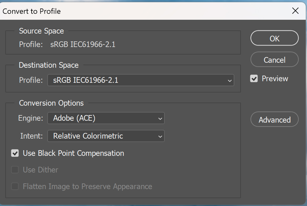
Screen shot of Photoshop Edit/Convert to sRGB
Nov 6, 2023 20:02:40 #
Nov 6, 2023 20:39:10 #

Nov 7, 2023 09:41:06 #

Markag wrote:
Are these the preferred settings?
For general use, where the source is a file in the sRGB color space, and the destination is a file in the sRGB color space, yes. That will work. You may want to use Perceptual instead of Relative color conversion if you are doing portrait work. But that is a matter of experience and taste.
My workflow is based around Lightroom Classic (LrC) being the "hub." Photoshop and all other graphic applications are "spokes." Everything starts from the hub, goes out to a spoke, and comes back to the hub before it goes anywhere else. My preferred workflow is raw capture for most subjects, but I'm known to use JPEGs in distinct, controlled lighting situations where they have a speed or cost advantage.
Generally, I set up Photoshop to receive files from Lightroom Classic as 16-bit TIFF in ProPhoto RGB, and to return the file to Lightroom Classic in the exact same format. (16-Bits handles a wide dynamic range. ProPhoto RGB handles all the colors humans can see, and many we cannot see.) Since all my exporting, web posting, printing, etc. is done from LrC, I use the deepest bit depth and widest possible color space for all color and brightness adjustments. The output color space (from LrC to the outside world) is either a printer profile for directly connected printers, or sRGB for the Internet and conventional photo labs, or Adobe RGB if a lab or service bureau suggests or requires that. The output file type is usually a JPEG in sRGB, but high end service bureaus often want a TIFF in ProPhoto RGB.
When you capture JPEGs at the camera, the Color Space or ICC Profile setting matters:
> Adobe RGB CAN be helpful, IF you control the entire post photography workflow, but dangerous if you are not in control of that (since not everyone is set up to handle Adobe RGB properly).
> If you will be handing files to someone else, unless they ASK for Adobe RGB as the color space, use sRGB! It is all too easy for an unsuspecting noob to reproduce your color incorrectly if the file is in Adobe RGB and their use case calls for sRGB.
When you capture raw data at the camera, the Color Space or ICC Profile setting only matters for the JPEG PREVIEW image stuffed into the raw data file, and the EXIF table stuffed inside that JPEG. Raw data is raw data, meaning it is not in an ICC color space. It is in the color space of the camera itself. But if the camera menu was set to Adobe RGB, the JPEG PREVIEW of the raw file is in Adobe RGB, so it may not reflect accurate color in all situations where a file preview is displayed on your monitor.
This is one reason I use Adobe Lightroom Classic as the hub of my workflow. It will take JPEGs, TIFFs, raw files, etc. and correctly read the metadata tags and/or use any embedded profile, OR the correct camera profile for raw files. I don't have to tell it what the input profile is.
Photoshop has to be set up... I always tell it to warn me of profile mismatches (It displays a warning similar to, "This file's color space is different from Photoshop's WORKING color space. What do you want to do?" and then presents several choices.)
Nov 7, 2023 09:54:04 #

What happens when you set your camera to Adobe RGB?
To the OP -- Markag -- what is the question here?
Are you shooting in RAW? Edit in ProPhotoRGB.
Are you shooting in JPEG? Edit in sRGB?
Are you asking when to convert to sRGB in your workflow? Convert when creating the output JPEG for digital sharing.
Are you asking the best workflow? See Bill's response above, specifically -> start & end your workflow in Adobe Lightroom Classic.
Nov 7, 2023 10:20:02 #

burkphoto wrote:
My workflow is based around Lightroom Classic (LrC) being the "hub." Photoshop and all other graphic applications are "spokes." Everything starts from the hub, goes out to a spoke, and comes back to the hub before it goes anywhere else.
My workflow is based around Lightroom Classic (LrC) being the "hub." Photoshop and all other graphic applications are "spokes." Everything starts from the hub, goes out to a spoke, and comes back to the hub before it goes anywhere else.
That is about the best description of the proper use of LR I have seen. If people can internalize this concept they'd be way ahead of the game.
Nov 7, 2023 10:35:19 #
Hip Coyote wrote:
That is about the best description of the proper use of LR I have seen. If people can internalize this concept they'd be way ahead of the game.
Thanks! It's Adobe's suggested way to work. Especially for raw workflow, the key is to keep everything in the deepest bit depth and widest color space available, UNTIL you output a specific file for a specific purpose. It yields the most accurate color available, especially if you use Soft Proofing (which is essentially putting an output profile OR a printer profile in the path ahead of your custom monitor profile, so you can see what the output device will do with your color).
Nov 7, 2023 10:43:24 #
burkphoto wrote:
Thanks! It's Adobe's suggested way to work. Especially for raw workflow, the key is to keep everything in the deepest bit depth and widest color space available, UNTIL you output a specific file for a specific purpose. It yields the most accurate color available, especially if you use Soft Proofing (which is essentially putting an output profile OR a printer profile in the path ahead of your custom monitor profile, so you can see what the output device will do with your color).
Exactly..
Nov 7, 2023 11:07:58 #
CHG_CANON wrote:
b color=blue url=https://www.uglyhedgehog.com/t... (show quote)
When shooting just one or two photos as in the recent Raining in Oregon shots, I just open them in Photoshop as 16 bit pro photo. They need to be in sRGB for UHH so I use Photoshop/Edit/Convert to sRGB. In that conversion window a pull down includes what's shown in the screen shot plus, under "intent" besides Relative Colorimetric there's "Absolute Colorimetric," "Perceptual," and "Saturation." My question is which one is best? Or which one is used when the photos are exported from Lightroom as sRGB would be a better question? I'd keep them the same!
Nov 7, 2023 11:22:13 #
Markag wrote:
When shooting just one or two photos as in the rec... (show quote)
Rendering intent is whatever looks best for the scene. Absolute is generally good for things such as product photos, where a brand's logo color needs to be a certain hue. Absolute works best in WIDE GAMUT color spaces (at least Adobe RGB). Relative shrinks the color gamut so the out-of-gamut hues are in the same relative direction they were in the original file. Perceptual attempts to shift out of gamut colors in a way that keeps them looking natural (not the same as relative!). I find it best for skin tones. Saturation tries to maintain saturation of in-gamut hues, while limiting out-of-gamut hues to the most saturated in-gamut values. I often like it for landscapes.
Relative is a good default.
These things don't matter that much if you used JPEG processing in the camera. They can matter a lot if you are printing on wide-gamut inkjet printers (8 or more inks), directly from Lightroom Classic, and converting "on the fly" from raw files, directly to the printer/paper/ink profile in use.
Finally, I'll add that ALL color management is referenced to a custom-calibrated and custom-profiled monitor. Without that, you're "judging weather with a wet finger in the wind." Also, color may be a matter of personal taste and interpretation. You don't always NEED a perfect reproduction of reality. But it's a nice aim point from which to start...
Nov 7, 2023 11:59:47 #
burkphoto wrote:
Rendering intent is whatever looks best for the sc... (show quote)
You seem the most knowledgeable and your explanations are fully appreciated. Thank You.
But when I export from LR Classic the same sRGB options are NOT available. How do I make them consistent with Photoshop?
Nov 7, 2023 12:22:36 #
Markag wrote:
You seem the most knowledgeable and your explanations are fully appreciated. Thank You.
But when I export from LR Classic the same sRGB options are NOT available. How do I make them consistent with Photoshop?
But when I export from LR Classic the same sRGB options are NOT available. How do I make them consistent with Photoshop?
The LR Export colorspace dropdown includes sRGB, use that. Better yet, create a User Export Preset in LR that includes sRGB so you don't have to remember this setting beyond just using the export preset.
Nov 7, 2023 12:36:54 #
Markag wrote:
You seem the most knowledgeable and your explanations are fully appreciated. Thank You.
But when I export from LR Classic the same sRGB options are NOT available. How do I make them consistent with Photoshop?
But when I export from LR Classic the same sRGB options are NOT available. How do I make them consistent with Photoshop?
Don't worry about them... If you are setting them in Photoshop, files transferred to Lightroom should reflect those settings.
Nov 7, 2023 13:53:05 #
CHG_CANON wrote:
The LR Export colorspace dropdown includes sRGB, use that. Better yet, create a User Export Preset in LR that includes sRGB so you don't have to remember this setting beyond just using the export preset.
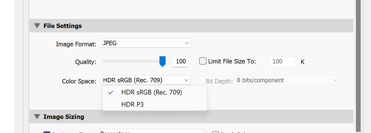
A screen shot of my LR Classic Export. Create a "User Export" link?
Nov 7, 2023 13:57:00 #
Markag wrote:
A screen shot of my LR Classic Export. Create a "User Export" link?
Consult your LR training / documentation on how to create and name your own LR Export User Preset. The goal is to set defaults for a few decisions so they're a 1-click action in the future:
1, file renaming
2, image format, JPEG
3, pixel resolution, at least one for 2048px on the long-side
4, 100% JPEG quality
5, sRGB colorspace
6, target output folder
7, including (or excluding) metadata
8, whether to open a OS explorer window at the end of the export processing
Nov 7, 2023 14:08:11 #
CHG_CANON wrote:
Consult your LR training / documentation on how to create and name your own LR Export User Preset. The goal is to set defaults for a few decisions so they're a 1-click action in the future:
1, file renaming
2, image format, JPEG
3, pixel resolution, at least one for 2048px on the long-side
4, 100% JPEG quality
5, sRGB colorspace
6, target output folder
7, including (or excluding) metadata
8, whether to open a OS explorer window at the end of the export processing
1, file renaming
2, image format, JPEG
3, pixel resolution, at least one for 2048px on the long-side
4, 100% JPEG quality
5, sRGB colorspace
6, target output folder
7, including (or excluding) metadata
8, whether to open a OS explorer window at the end of the export processing
Never seen any LR Training/Documentation.
my goal here was to use a LR export "preset" that matches Photoshop exactly or as close as possible.
If you want to reply, then register here. Registration is free and your account is created instantly, so you can post right away.