New to RAW...Pt. 2
Sep 4, 2023 18:50:20 #

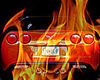
OK! THANK you to EVERYBODY for the help in getting started in RAW Process....
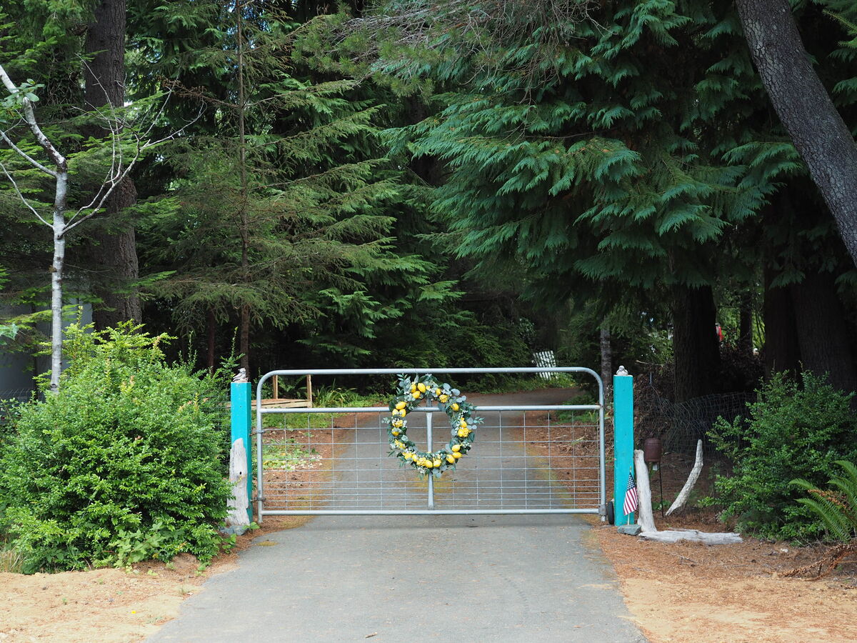
~ These images are a comparison of my first REAL attempt after several starts and stops since my first post on this forum.....
Critiques invited, please!!
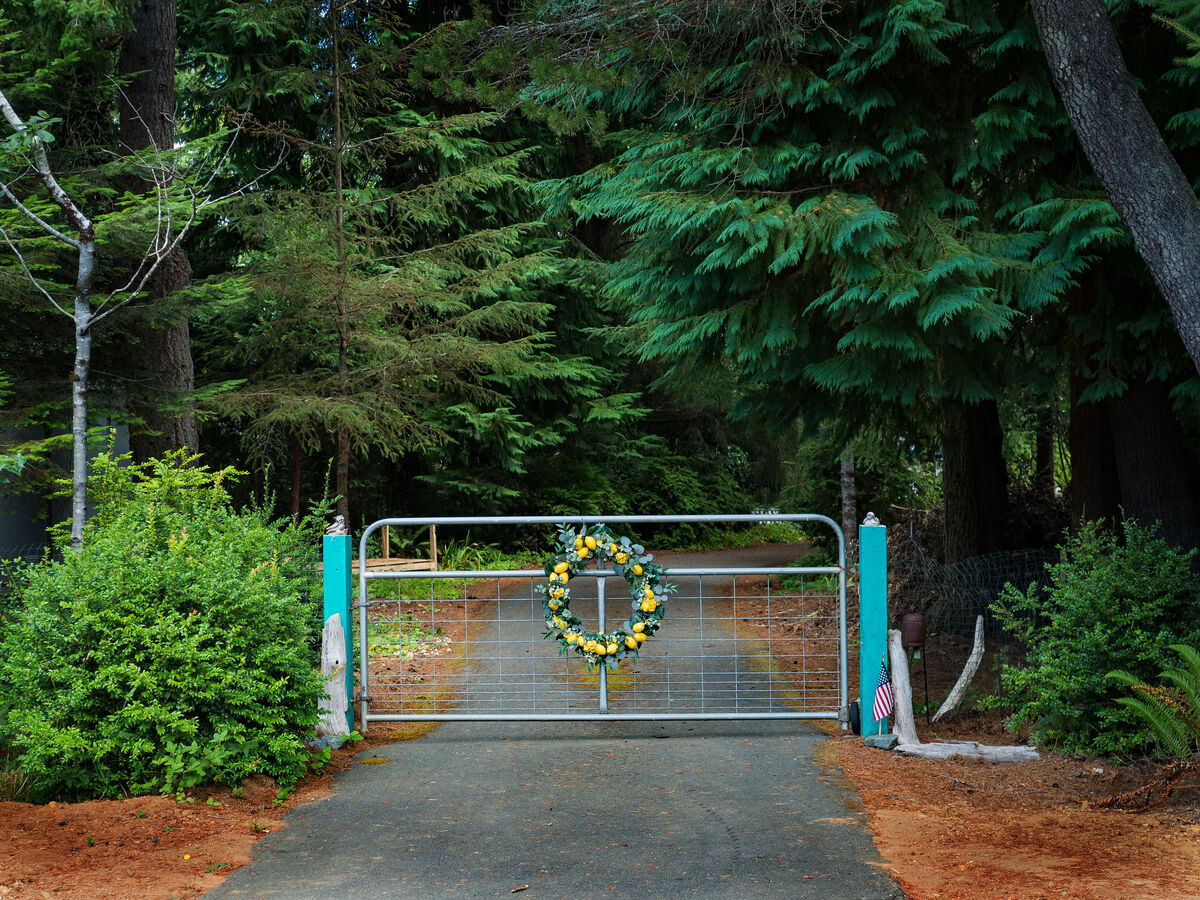
~ These images are a comparison of my first REAL attempt after several starts and stops since my first post on this forum.....
Critiques invited, please!!
Sep 4, 2023 19:14:21 #

Since you have raw you could have opened the dark/shadow BUT, as is, it works.
Since you tried to remove some objects (red in the tree) and white fence, you must learn to use replace. Also, you forget a blue tube on the right.
Since you tried to remove some objects (red in the tree) and white fence, you must learn to use replace. Also, you forget a blue tube on the right.
Sep 4, 2023 22:09:18 #

Sep 4, 2023 23:32:12 #
Sep 5, 2023 05:02:42 #

When you edit raw files you're taking their flatness and creating something better out of it. That flatness has more than one side to it, and if you get the chance to find out how jpeg files are made you'd see that contrast, saturation and sharpness are the main adjustments that tackle flatness, while denoise may be applied as standard (for obvious reasons).
The main thing you have to tackle is the lack of contrast. Jpegs are given a contrast adjustment but they're only given a standard amount that's applied to all files. Doing your own editing allows you to apply contrast as required, and all images are not the same when it comes to how much contrast is optimum. For example if you want to enhance softness you may want to apply very little contrast or possibly none.
One of the things that contrast does is it counters flatness by enhancing a photo's 3D look. Typically, adding contrast works wonders in some parts of the image but has adverse effects on other parts. You'll see the adverse effects more clearly if you deliberately push the Contrast adjustment. Generally speaking the adverse effects will be that the darks become too dark and solid while the brights become too harsh, and the brightest parts may become blown. One of the things you can do that a camera won't do (to create a jpeg) is to adjust the Highlights, Shadows, Whites and Blacks individually. In addition to that, you are also able to control the overall brightness. If you use those sliders to counteract the unwanted effects of pushing the contrast, you get to keep the wanted effects of the increased contrast.
You'll find that there's a point beyond which you can't reverse the unwanted effects of pushing the Contrast adjustment. That point needs to be found by trial and error, but it's not difficult to get the hang of it. The advantage is that you end up with fully optimised contrast and brightness levels. Typically the optimum level of brightness for the shadows is that the details in them are visible - but not necessarily vivid. Sometimes you want eye-catching details, sometimes you don't, but in either case it's usually (but not always) better than having large areas of impenetrable darkness.
The optimum level of brightness for the highlights is whatever looks best. It's possible that you may want a harsh look, but more typically harshness is something that you'll want to minimise. Lowering the highlights too far can result in a loss of contrast and a re-emergence of the flat look that you're trying to avoid. The same applies to lifting the shadows too high.
Lifting the shadows and lowering the highlights is the essence of HDR processing, but on their own those adjustments cause a loss of contrast that needs to be countered. There is always an optimum balance that you can find (usually quite quickly) by trial and error.
-
Saturation is another aspect of the flatness that raw files come with. Saturation adjustments can be applied globally, but if you have an HSL tool or something similar, I suggest that you learn to use it so that you can optimise the colours individually. Red, orange, yellow and yellow-green are considered to be the "warm" colours but they are the first to look too garish when you turn up the saturation too high. Vegetation is typically more yellow-green than green and it is something you have to keep an eye on when you boost saturation. Neon-bright grass is not a good look.
It's up to you to decide if you want to stick to a natural look or if you like the look of an image that's had its contrast and saturation boosted beyond what you would consider to be natural. My personal opinion is that your posted edit is slightly overcooked, mainly because of the saturation levels, and as others have noted, the shadows are a bit on the dark side. Having said that, it's a very respectable first attempt.
-
If you have the means I suggest that you keep sharpening to the main edges. Not only is that where it's needed, it also keeps the sharpening away from the smooth areas where any noise is going to be most noticeable. Sharpening applied to noise makes it a lot more noticeable. If there's texture or fine detail that you want to enhance, I suggest that you do it via some kind of selection - for example by using an adjustments brush.
If noise is a problem it will typically be only certain areas where it's a problem (unless it's severe). Usually it's smooth areas where it shows up most. There may be noise in areas where there is a lot of small detail or texture, but typically it won't be noticeable in those areas unless it's extreme. Brightening dark areas can also aggravate noise. If noise is a problem only in specific areas I would apply only small amounts of denoise globally and I would then concentrate on adding extra denoise locally to the problem areas via a brush or some other means of selection.
Contrast can aggravate noise, so reducing contrast locally in problem areas can help with noise, but on its own it has only a sight effect, so it needs to be done along with other adjustments. Having said that, turning contrast up high can make it very difficult to deal effectively with noise, so if your starting point is a noisy image, there will have to be some sort of compromise (and/or lots of brushwork).
Sep 5, 2023 10:41:58 #
Rongnongno wrote:
Since you have raw you could have opened the dark/shadow BUT as is, it works.
Since you tried to remove some objects (red in the tree) and white fence, you must learn to use replace. Also, you forget a blue tube on the right.
Since you tried to remove some objects (red in the tree) and white fence, you must learn to use replace. Also, you forget a blue tube on the right.
Awesome advice!! Thank you, Rongnongno!

Sep 5, 2023 10:42:53 #
kpmac wrote:
Shadows are maybe a little deep but not by much. Nice job.
Thank you, kpmac!

Sep 5, 2023 10:59:01 #
Rongnongno wrote:
What software are you using?
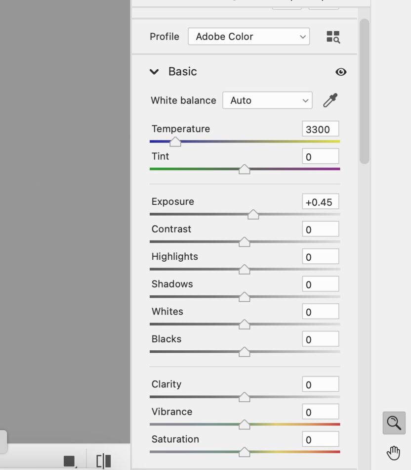
Thank you,Rongnongno. At this point, I am using PS Elements 14 (example - this image). I also have OM Workspace ver. 2.2 which is much more comprehensive and will take a while to even be a little proficient at!!
If I find, in the future, that I like the idea of processing images in RAW (so far - so good), I will go ahead and purchase something at the advice of this forum and possibly others.
The camera bodies I'm using are in my "Signature" (if that helps!).
Sep 5, 2023 11:13:01 #
yorkiebyte wrote:
Thank you,Rongnongno. At this point, I am using b... (show quote)
Does PSE 14 include ACR? (Adobe Camera Raw)?
Sep 5, 2023 11:24:06 #
R.G. wrote:
When you edit raw files you're taking their flatne... (show quote)
Wow! THAT is some Awesome schooling, R.G.!!
~ I'm gonna have to print your note (on real paper, no less!) here and keep it on my desk..... A lot of what you are talking about may not be in my PS-E 14 RAW program. However, in the OM Workspace ver. 2.2, there is a whole new arena of things that are possible, I've noticed. Fine-tuning, especially individual color and contrast, as you have pointed out looks to be accomplished there, as opposed to the simpler program of PS-E 14.
Thank you very much, R.G.!!
Sep 5, 2023 11:30:22 #
Rongnongno wrote:
Does PSE 14 include ACR? (Adobe Camera Raw)?
It does - albeit I think it may be a stunted version (still feeling it out!).
~ The OM Workspace ver. 2.2 that I have is a whole 'nuther ball game. It is a much higher learning curve than the PS-E RAW version - way more tools than I see in the PS-E also.

Sep 5, 2023 12:02:46 #

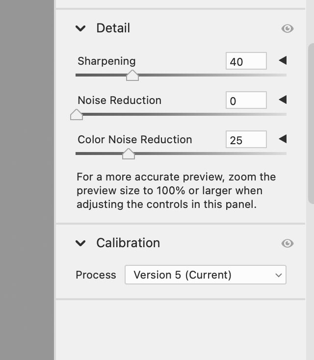
Rongnongno wrote:
These are PSE 2022's sliders in ACR. Version 14 has fairly similar, if I recall correctly. Does PSE 14 include ACR? (Adobe Camera Raw)?
Yorkie, I prefer "less complex" to "stunted"

Sep 6, 2023 10:17:32 #
R.G. wrote:
When you edit raw files you're taking their flatne... (show quote)
Thanks for these Wonderful Experienced Based Insights!
JimmyT Sends
Bravo Zulu
Sep 6, 2023 12:32:05 #
Just for fun I would try using the eyedropper tool in the white balance, if available. It would seem the that the RAW edit is leaning a bit toward the cooler side, blue. Just find the whitest spot, zoom the flag, in the pic and see if it make a difference. If not then ctrl Z to undo. I don't use PS elements, I use DxO PL but ctrl Z or Edit undo should be there.
Keep at it.
Keep at it.
Sep 6, 2023 16:58:13 #
Linda From Maine wrote:
These are PSE 2022's sliders in ACR. Version 14 has fairly similar, if I recall correctly.
Yorkie, I prefer "less complex" to "stunted"
Yorkie, I prefer "less complex" to "stunted"
Yes! Very similar, indeed in 14.
If you want to reply, then register here. Registration is free and your account is created instantly, so you can post right away.