Portrait of A Pre-Raphaelite Lady
Jul 1, 2023 07:07:04 #

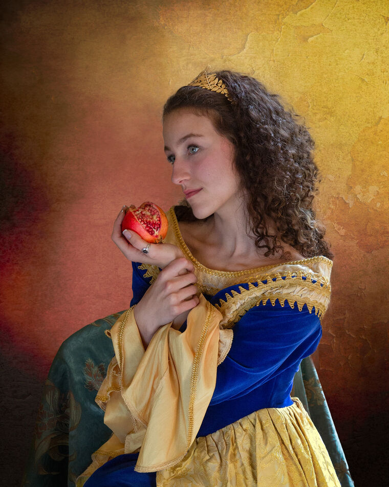
It breaks one or two portrait rules perhaps, but I am not too bothered about that. It is a multi composite, first to separate the subject from the background and then to create a new background. The subject has then been modified with both composite portions and adjustment layers. Your critique will be appreciated if you have the time.
Jul 1, 2023 10:06:50 #

Jul 1, 2023 10:19:28 #
Jul 1, 2023 12:52:46 #
The colors in the background compliment the very saturated and bold colors of the drapery. That works for me. I like the hint of pink in the checks; but the facial colors are spot on and not exaggerated. I'm just learning compositing; so my insights are probably not worth much. I think this is really good.
Erich
Erich
Jul 1, 2023 14:25:08 #
ebrunner wrote:
The colors in the background compliment the very saturated and bold colors of the drapery. That works for me. I like the hint of pink in the checks; but the facial colors are spot on and not exaggerated. I'm just learning compositing; so my insights are probably not worth much. I think this is really good.
Erich
Erich
Thanks Erich. The facial colours are pretty much as taken, I haven’t added anything. The background colours are picked within the original image. Glad you like it.
Jul 1, 2023 14:43:16 #

A gentle mood, with engaging details, particularly the opened fruit in her hand (pomegranate?), but also the hair band.
Jul 1, 2023 15:02:46 #
Linda From Maine wrote:
A gentle mood, with engaging details, particularly the opened fruit in her hand (pomegranate?), but also the hair band.
Yes, the pomegranate is most famously used by Rossetti in his painting of Prosperine. She holds it in a similar fashion. It’s the ‘forbidden fruit’ of the underworld. I think the lady that set-up this pose had the painting in mind. She certainly puts some effort into organising the shoots. The hair band is not in Rossetti’s painting but is a favourite of hers too.
The model is staggeringly alike to one of the pre-Raphaelite models whom I’m unable to name (unfortunately - must do more homework!). The only problem with her is a lack of height, so when used full length she requires a lot of ‘stretching’.
Glad you found the image interesting Linda, thanks for commenting.
Jul 1, 2023 16:24:17 #

A stupendous shot - and a gorgeous model all decked out in finery - in lovely light 👑👑👑👑👑
Jul 1, 2023 16:43:41 #
joecichjr wrote:
A stupendous shot - and a gorgeous model all decked out in finery - in lovely light 👑👑👑👑👑
Thanks Joe - I’ve done a few of these Pre-Raphaelite themed shoots, this lady is my joint favourite.
Jul 2, 2023 00:00:36 #
I really, really, love your colors and general composition. Now for the critique part. The subjects right hand is too strong and steals attention. Dim it or some such. Background in upper right is too strong/sharp. Let it fade away (my opinion anyway). Soften her left eye some - though I love the wildness you have captured here.
She has a magic - this is wonderful to me.
She has a magic - this is wonderful to me.
Jul 2, 2023 04:06:35 #
pfrancke wrote:
I really, really, love your colors and general composition. Now for the critique part. The subjects right hand is too strong and steals attention. Dim it or some such. Background in upper right is too strong/sharp. Let it fade away (my opinion anyway). Soften her left eye some - though I love the wildness you have captured here.
She has a magic - this is wonderful to me.
She has a magic - this is wonderful to me.
That’s a good critique Piet, I don’t disagree with any of it and will try those things. The background should include some trailing ivy to be a little more like Rossetti’s Prosperine, but I’m undecided on whether to add it. Probably try it and see what I think.
I also agree that our model is a cut above most we get - if only she was a bit taller…..!
Jul 2, 2023 06:09:01 #

I was going to suggest flipping the background. But the more I looked at it the less I liked that idea. The way you have it now her hair stands out from the background. It appears there is some side lighting, so the lighter color works for me. My original thought of flipping the background would have (in my mind) messed things up.
Jul 2, 2023 08:16:29 #

magnetoman wrote:
It breaks one or two portrait rules perhaps, but I am not too bothered about that. It is a multi composite, first to separate the subject from the background and then to create a new background. The subject has then been modified with both composite portions and adjustment layers. Your critique will be appreciated if you have the time.
Very nicely done, I do like the trailing ivy idea but wonder how you'll incorporate it. Having said that the work is excellent as it stands and is really how you choose to interpret it.
Jul 2, 2023 12:44:37 #
NJFrank wrote:
I was going to suggest flipping the background. But the more I looked at it the less I liked that idea. The way you have it now her hair stands out from the background. It appears there is some side lighting, so the lighter color works for me. My original thought of flipping the background would have (in my mind) messed things up.
Hi Frank. The background colours were generated from the original image of the model and I tried to keep the lighting in line with that too. So I agree, a background flip wouldn’t really work. I think the flaky texture on the right could be reduced to some benefit, as Piet suggests. I’m still wondering whether to add the trailing ivy - probably a ‘suck it and see’ thing.
Thanks for your thoughts on it.
Jul 2, 2023 12:46:36 #
UncleBuck wrote:
Very nicely done, I do like the trailing ivy idea but wonder how you'll incorporate it. Having said that the work is excellent as it stands and is really how you choose to interpret it.
Thanks Dave. I’ll try the ivy, it’s easily disposed of if necessary, as you know.
If you want to reply, then register here. Registration is free and your account is created instantly, so you can post right away.