The Corsair.
Jun 28, 2023 18:05:18 #

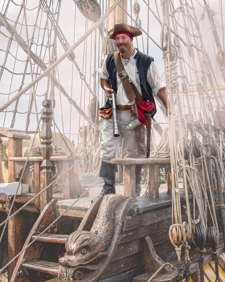
This guy was actually one of the volunteers collecting for local charities at the recent pirate parade. I posted the image to the Pirates of Poole FB page and commented on how hard he'd been working with his collection bucket. I was then told they had advised him that very evening he was the top collector on the day. I hope he finds the image some reward for his efforts.
The boat was taken back in 2016 when it visited our local pier - a great photo-op! Rigging is proving a popular background with pirates, the requests continue!
The boat was taken back in 2016 when it visited our local pier - a great photo-op! Rigging is proving a popular background with pirates, the requests continue!
Jun 28, 2023 18:45:28 #
Technically the composition is everything we have come to expect from you. With that blunderbuss I can see why he was the top collector. The brightness and the fog both bother me. There is fog both behind and in front of him but for him there is no fog above his knees. He seems too bright for his surroundings and seems to stand out rather then blend into his surroundings
Jun 28, 2023 21:16:19 #

Jun 29, 2023 03:06:26 #
Curmudgeon wrote:
Technically the composition is everything we have come to expect from you. With that blunderbuss I can see why he was the top collector. The brightness and the fog both bother me. There is fog both behind and in front of him but for him there is no fog above his knees. He seems too bright for his surroundings and seems to stand out rather then blend into his surroundings
That’s a pretty accurate description Jack, and it’s all intentional. It’s designed to keep a reenactor happy! If I was going to print it for myself I would change those things but it’s a form of illustration and they like it. You might see something done like this for a book illustration. An excellent critique though.
Jun 29, 2023 03:08:28 #
UTMike wrote:
You have the pirate theme mastered, Dave!
Starting to feel a bit repetitious Mike but still one or two more to do! Thanks for your comment.
Jun 29, 2023 05:44:05 #
Curmudgeon wrote:
Technically the composition is everything we have come to expect from you. With that blunderbuss I can see why he was the top collector. The brightness and the fog both bother me. There is fog both behind and in front of him but for him there is no fog above his knees. He seems too bright for his surroundings and seems to stand out rather then blend into his surroundings
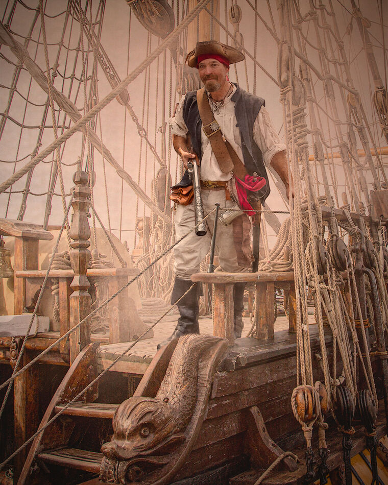
Jack, I saved an alternative version with the type of detail you mention - and it also corrected the ropes I seemed to lose in the lighter version. This would make a better print I think. Any thoughts?
Jun 29, 2023 06:42:55 #

I think this version is so much better that the first. Was it me in the picture, the second one would be the one I would like to have printed for me...
Jun 29, 2023 07:25:12 #

magnetoman wrote:
This guy was actually one of the volunteers collec... (show quote)
Nicely done Dave, I'm sure he's pleased with either version

Jun 29, 2023 08:00:37 #
nanaval wrote:
I think this version is so much better that the first. Was it me in the picture, the second one would be the one I would like to have printed for me...
Yes, think you’re right Val. Thanks for commenting - it all helps sway the issue!
Jun 29, 2023 08:01:19 #
UncleBuck wrote:
Nicely done Dave, I'm sure he's pleased with either version
Many thanks Dave, I’ll send him the alternative.
Jun 29, 2023 08:37:24 #

Between the two versions, I like the first best. The second looks like all the same toning - on my screen (or through my eyes) it's a light pinkish orange.
The very different results are perfect for an informative discussion of printing vs. viewing online and creator's intent. Thanks much!
The very different results are perfect for an informative discussion of printing vs. viewing online and creator's intent. Thanks much!
Jun 29, 2023 09:28:50 #
Linda From Maine wrote:
Between the two versions, I like the first best. The second looks like all the same toning - on my screen (or through my eyes) it's a light pinkish orange.
The very different results are perfect for an informative discussion of printing vs. viewing online and creator's intent. Thanks much!
The very different results are perfect for an informative discussion of printing vs. viewing online and creator's intent. Thanks much!
Definitely two different intentions Linda. The orange/pink overlay is a texture image x2. It’s a favourite of mine called Blind Orange - because it’s a shot of a window blind - leave you to guess what colour it is. It also adds a bit of vignette. Perhaps I need to put it away somewhere where I’ll forget about it!
Jun 29, 2023 11:20:09 #

Dave and members forgive me but the second composite has too much of a Muddy appearance and lacks too much definition. There needs to be a happy median in my Opinion.
Jun 29, 2023 11:59:18 #
magnetoman wrote:
Jack, I saved an alternative version with the type of detail you mention - and it also corrected the ropes I seemed to lose in the lighter version. This would make a better print I think. Any thoughts?
Except for the fog I have the same issue with the subject. Now that I understand the parameters you were working under Dave I like the first one better.
Jun 29, 2023 13:08:10 #
Curmudgeon wrote:
Except for the fog I have the same issue with the subject. Now that I understand the parameter's you were working under Dave I like the first one better.
OK Jack. I’ll wait to hear what the guy thinks and adjust if he feels he’s too prominent. Thanks for your critique with this one,
If you want to reply, then register here. Registration is free and your account is created instantly, so you can post right away.