Another IR
May 17, 2023 20:28:55 #

May 17, 2023 20:57:34 #

May 17, 2023 21:23:58 #
topcat wrote:
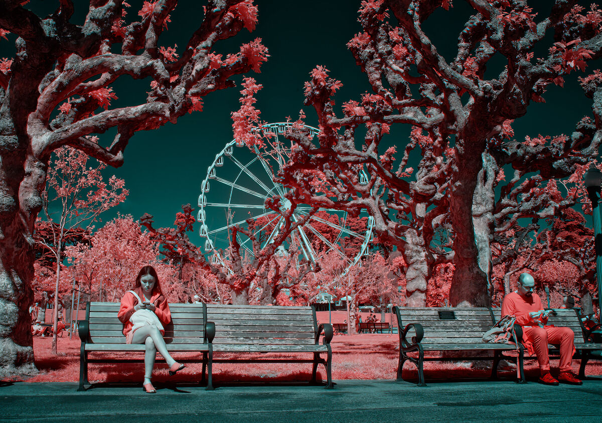
Sunday in the park.
Golden Gate Park in SF
Golden Gate Park in SF
Intriguing. I do not like the picture, but some of the things I dislike the most are the most interesting.
Excellent technique. Boris
May 17, 2023 21:54:55 #

May 17, 2023 21:57:46 #
May 17, 2023 21:58:21 #
Boris77 wrote:
Intriguing. I do not like the picture, but some of the things I dislike the most are the most interesting.
Excellent technique. Boris
Excellent technique. Boris
Thank you, Boris. What is it that you don't like?
May 17, 2023 21:58:34 #
May 17, 2023 22:07:42 #
May 17, 2023 22:32:22 #
Cany143
Loc: SE Utah
For me, it often comes down to 'balance'. The person on the right attempts to provide a 'sort of' thematic balance, but as an element, he lacks the placement and/or the visual weight (i.e., doesn't have sufficient 'brightness') to draw a viewer's attention equally, the result being something that neither overcomes nor does it 'balance' what the visual center of the image actually is --in terms of both (overall relative) 'brightness' and 'what is central'-- the ferris wheel that first draws visual attention. Sightline perspective is likewise skewed left to right (the foreground left [the bench] being more or less straight on while the foreground right [again, the bench] being angled such that the (minimal) 'leading lines' that result lead off into what I'd call an unintended direction, away from the 'center' and away from anything that might be visually useful.
Reality (the 'scene' and the ways it can be viewed and be made to fit within the frame) rarely conforms to what might be 'ideal', and I recognize the possibility that had you moved several steps to the right (so as to 'balance' [or equalize] the angular perspective issue mentioned above) would certainly have altered the ferris wheel's placement greatly, and as a primary element (which again I'd base on form, relative brightness, and centrality [which would consequently have been repositioned into an asymmetrical position, and which might not have been a particularly bad visual decision]) it might've taken less precedence than it presently does, and placed greater emphasis on the two seated people.
Reality (the 'scene' and the ways it can be viewed and be made to fit within the frame) rarely conforms to what might be 'ideal', and I recognize the possibility that had you moved several steps to the right (so as to 'balance' [or equalize] the angular perspective issue mentioned above) would certainly have altered the ferris wheel's placement greatly, and as a primary element (which again I'd base on form, relative brightness, and centrality [which would consequently have been repositioned into an asymmetrical position, and which might not have been a particularly bad visual decision]) it might've taken less precedence than it presently does, and placed greater emphasis on the two seated people.
May 17, 2023 22:49:41 #
topcat wrote:
Thank you, Boris. What is it that you don't like?
First impressions: White Ferris Wheel almost in the center, Man almost pushed off the page, unbalanced feel to picture built from balancing elements, and Red - my non-favorite color.
Boris
May 17, 2023 22:52:44 #
Cany143 wrote:
For me, it often comes down to 'balance'. The per... (show quote)
Cany, this is not my post but I am interested in your comments. You seem to have given a lot of thought to the post. Could you summarize your response in maybe 3 or 4 sentences
May 17, 2023 22:56:24 #
Cany143
Loc: SE Utah
Curmudgeon wrote:
Cany, this is not my post but I am interested in your comments. You seem to have given a lot of thought to the post. Could you summarize your response in maybe 3 or 4 sentences
Summarize? Sure. And into a single sentence: The image is imbalanced.
May 17, 2023 22:57:24 #
Cany143 wrote:
Summarize? Sure. And into a single sentence: The image is imbalanced.
Thank you
May 17, 2023 23:22:17 #
I agree. I don't like the guy on the end, but he was there and I didn't think that I could crop him out.
Maybe I should have.
Maybe I should have.
May 18, 2023 00:17:11 #
Cany143
Loc: SE Utah
topcat wrote:
I agree. I don't like the guy on the end, but he was there and I didn't think that I could crop him out.
Maybe I should have.
Maybe I should have.
The guy on the end is not the problem, per se. His placement (and the angle that's formed by the bench he sits on) is --if anything-- 'the problem'. While cropping him out in post and after-the-fact might in one way or another make for 'better' image, doing so would unfortunately remove (what could've been had, had you stepped a few steps off to your right) the kind of balance that could otherwise have formed a thematic balance between the woman, the man, the wheel, and even the trees, though in an asymmetric sort of way.
In effect, I see SO many possibilities in your image. If only they'd been actualized....
If you want to reply, then register here. Registration is free and your account is created instantly, so you can post right away.