Breaking the Rules:- A Deliberate Imbalance.
May 10, 2023 11:28:58 #

Generally speaking, the "rules" in photography are easy to define and the situations where they would typically be applied are also similarly easy to specify. What's not so easy to specify is the sort of situation where you may want to ignore the rules or maybe even do the exact opposite of what the rules would dictate.
I'm starting this thread as a way to introduce the subject of the title as a discussion topic where hopefully we will see examples of when that rule was deliberately broken, ideally accompanied by a brief description of what the shooter hoped to achieve by breaking that rule.
In this thread the rule under the spotlight is that balance is a desirable ingredient to have as a composition element, which raises the question "When would you want to break this rule and for what purpose?" In other words when would you want to use a deliberate imbalance as a composition technique?
Please feel free to post any examples of your use of a deliberate imbalance and ideally include a brief description of what your intention was.
Balance is a desirable composition feature because balance = harmonious = restful. However, harmonious and restful aren't the only possibilities. We could also add that positive space isn't the only possibility and negative space can be used to good effect. It's very often the case that compositions which use negative space have a significant imbalance.
I could go on trying to list possibilities but hopefully that's the sort of thing that will come out as the thread progresses.
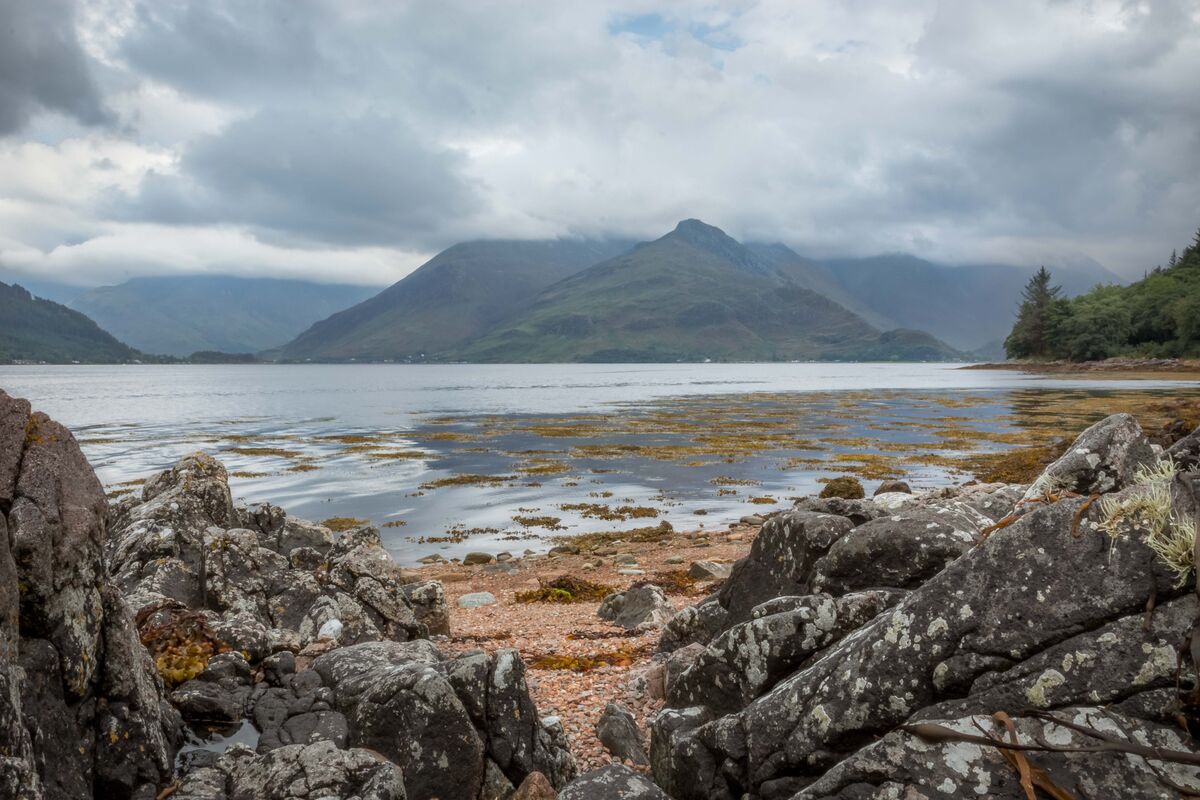
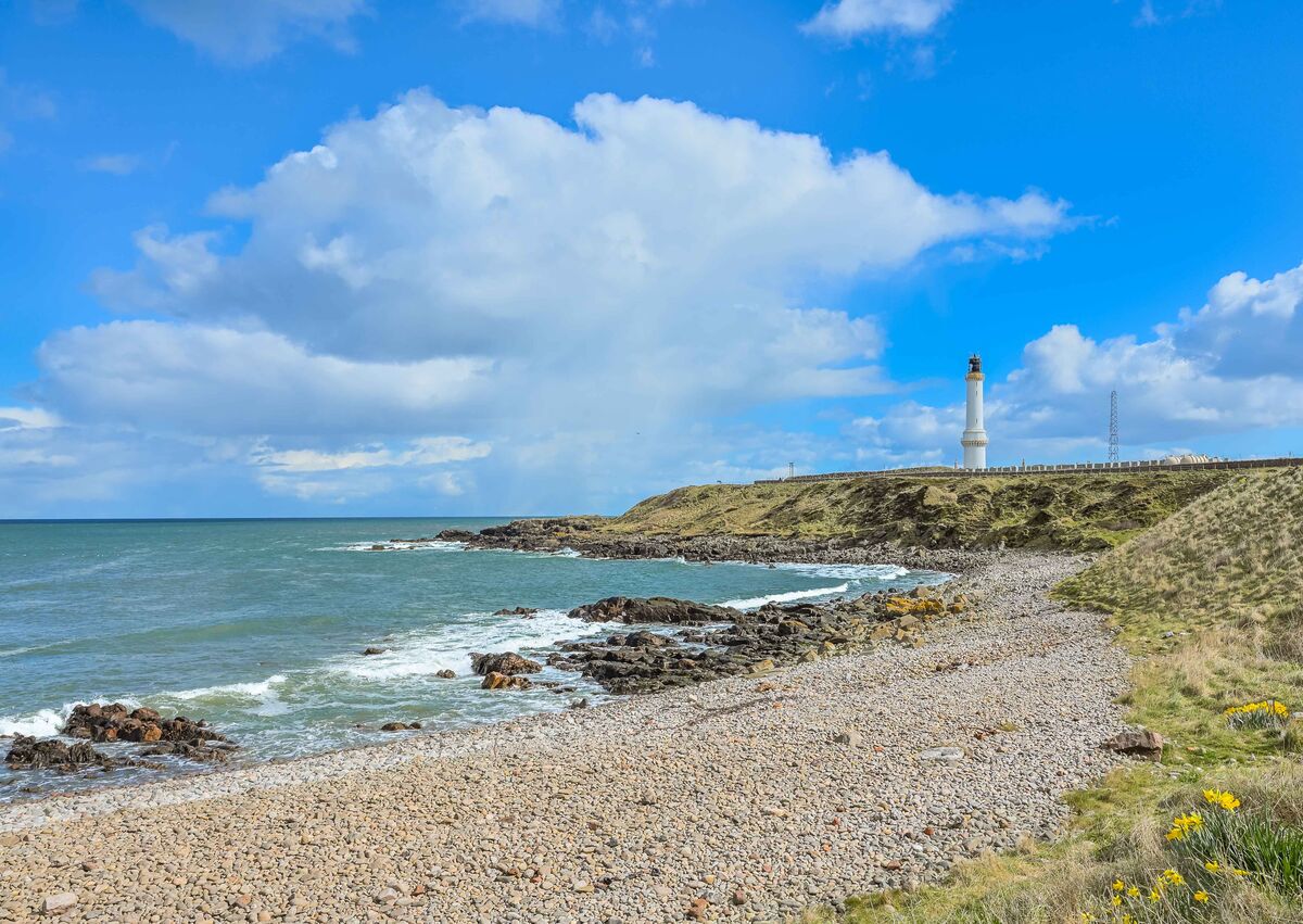
I'll post one example of balance in a composition and one of deliberate imbalance. In the lighthouse shot the side opposite the lighthouse has a fair amount of negative space and that is a common feature of lighthouse shots. One reason for that is that the emptiness represents the vastness of the sea that the lighthouse looks out onto. You could think of the negative space as being a small representative of the larger emptiness of the open sea.
.
I'm starting this thread as a way to introduce the subject of the title as a discussion topic where hopefully we will see examples of when that rule was deliberately broken, ideally accompanied by a brief description of what the shooter hoped to achieve by breaking that rule.
In this thread the rule under the spotlight is that balance is a desirable ingredient to have as a composition element, which raises the question "When would you want to break this rule and for what purpose?" In other words when would you want to use a deliberate imbalance as a composition technique?
Please feel free to post any examples of your use of a deliberate imbalance and ideally include a brief description of what your intention was.
Balance is a desirable composition feature because balance = harmonious = restful. However, harmonious and restful aren't the only possibilities. We could also add that positive space isn't the only possibility and negative space can be used to good effect. It's very often the case that compositions which use negative space have a significant imbalance.
I could go on trying to list possibilities but hopefully that's the sort of thing that will come out as the thread progresses.
I'll post one example of balance in a composition and one of deliberate imbalance. In the lighthouse shot the side opposite the lighthouse has a fair amount of negative space and that is a common feature of lighthouse shots. One reason for that is that the emptiness represents the vastness of the sea that the lighthouse looks out onto. You could think of the negative space as being a small representative of the larger emptiness of the open sea.
.
Balance.
A deliberate imbalance.
May 10, 2023 12:38:52 #

Thanks for starting the discussion, R.G.!
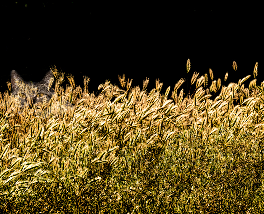
In this fanciful composite, I placed Stella off to the side in the hopes that it would take longer to discover her hiding place, and that once found, the surprise would be enjoyable
In this fanciful composite, I placed Stella off to the side in the hopes that it would take longer to discover her hiding place, and that once found, the surprise would be enjoyable
May 10, 2023 12:49:18 #
Linda From Maine wrote:
Thanks for starting the discussion, R.G.!
In this fanciful composite, I placed Stella off to the side in the hopes that it would take longer to discover her hiding place, and that once found, the surprise would be enjoyable
In this fanciful composite, I placed Stella off to the side in the hopes that it would take longer to discover her hiding place, and that once found, the surprise would be enjoyable
I can think of quite a few rules that you broke composing this one, Linda
 . And it works. Perhaps the rules are a way to use our natural tendencies when viewing photos. Our attention has a natural tendency to follow certain paths and to gravitate towards certain areas of an image, and Stella has been placed well away from those areas. Thanks for posting a thought-provoking example.
May 10, 2023 13:17:25 #
Thanks R.G.!
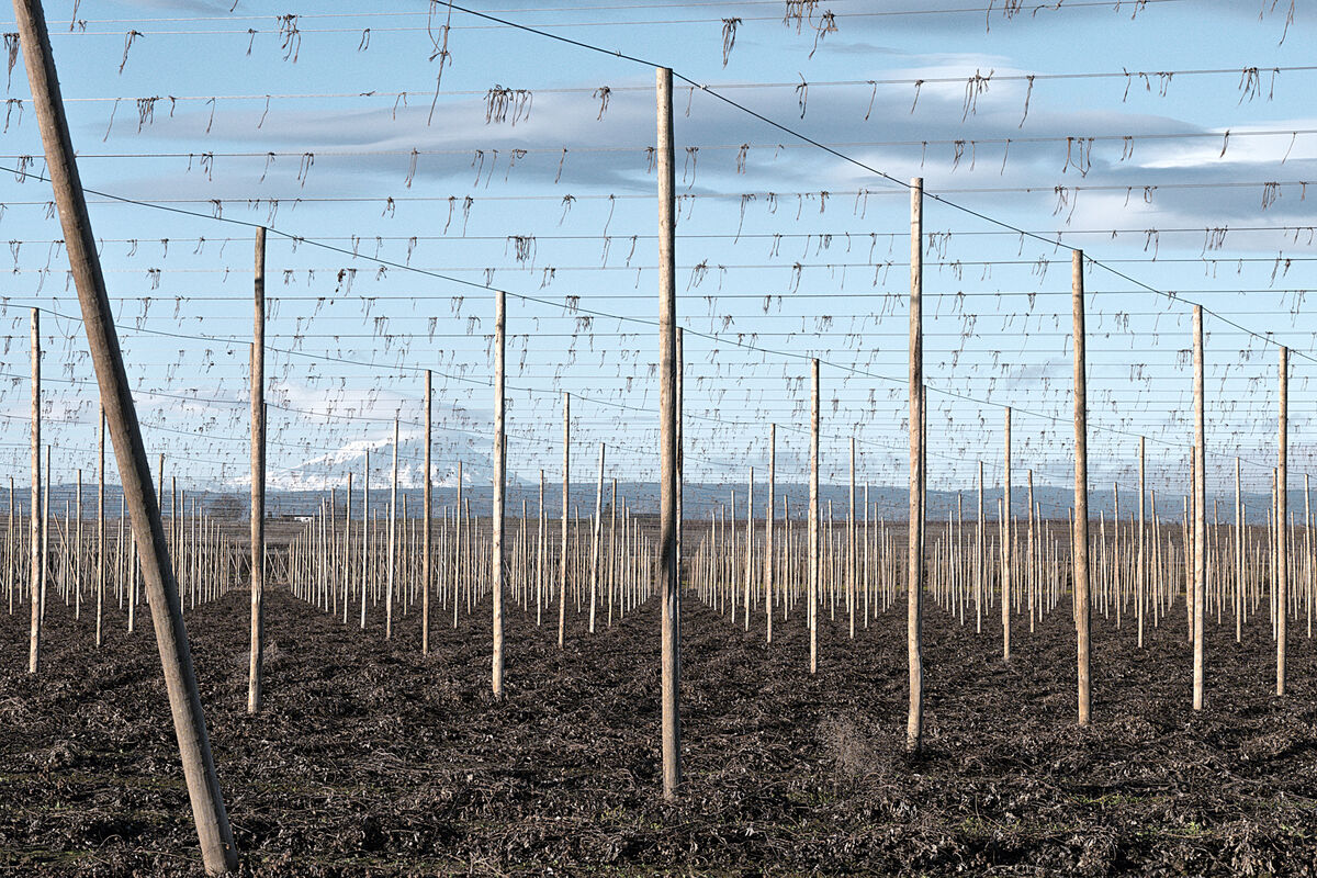
Here's one that is very different from the whimsical Stella. I purposely composed to include the diagonal pole as a way to break the symmetry and to jar the eye a little. In previous postings, there are about equal thumbs-up and thumbs-down for the composition.
Here's one that is very different from the whimsical Stella. I purposely composed to include the diagonal pole as a way to break the symmetry and to jar the eye a little. In previous postings, there are about equal thumbs-up and thumbs-down for the composition.
May 10, 2023 13:27:45 #
Linda From Maine wrote:
....In previous postings, there are about equal thumbs-up and thumbs-down for the composition.
.... and no doubt several recommendations to clone out the offending pole
. If jarring was your intention you can probably assume that you succeeded. Jarring because we look for and like symmetry. Also jarring = attention-grabbing. Thanks for another revealing post. I knew that trying to list the possibilities was not the best approach. Hopefully the thread will progress in this vein.
May 11, 2023 09:40:36 #
I love this topic, and the discussion that comes with it! Thanks for starting this, RG!
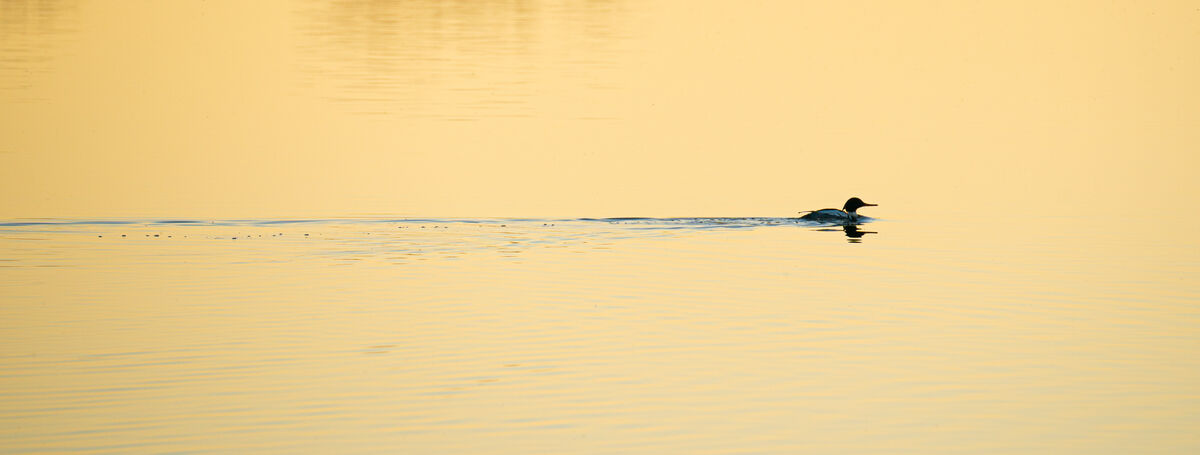
Here are two I took recently that showcase both balance and imbalance. In the first, there is almost perfect vertical balance, with equal space above and below the trail of the merganser. There is more visual weight to the bird itself, but it is counter-balanced by the length of the narrow trail leading to it. Despite the greater weight of the bird, to me the image feels balanced and serene. (Incidental to imbalance, the image also breaks the rule of thirds in both directions.)
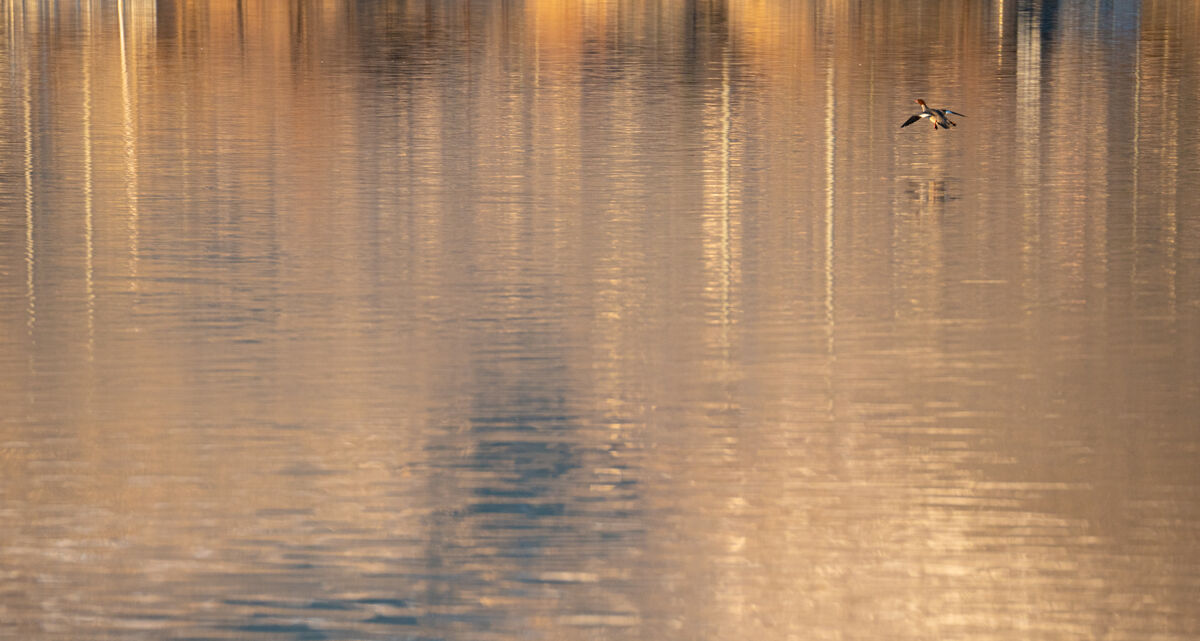
In the second, the whole image looks balanced except for the bird in the upper right. In part, this image is strangely weighted because I had my camera pointed somewhere else when the bird flew in. :-) But I kept the image because it speaks to me of the last second panic and tiny adjustments a bird makes just before landing, where it so frequently looks like they're about to smack headlong into their landing pad.
Here are two I took recently that showcase both balance and imbalance. In the first, there is almost perfect vertical balance, with equal space above and below the trail of the merganser. There is more visual weight to the bird itself, but it is counter-balanced by the length of the narrow trail leading to it. Despite the greater weight of the bird, to me the image feels balanced and serene. (Incidental to imbalance, the image also breaks the rule of thirds in both directions.)
In the second, the whole image looks balanced except for the bird in the upper right. In part, this image is strangely weighted because I had my camera pointed somewhere else when the bird flew in. :-) But I kept the image because it speaks to me of the last second panic and tiny adjustments a bird makes just before landing, where it so frequently looks like they're about to smack headlong into their landing pad.
May 11, 2023 09:41:05 #

Linda From Maine wrote:
Thanks for starting the discussion, R.G.!
In this fanciful composite, I placed Stella off to the side in the hopes that it would take longer to discover her hiding place, and that once found, the surprise would be enjoyable
In this fanciful composite, I placed Stella off to the side in the hopes that it would take longer to discover her hiding place, and that once found, the surprise would be enjoyable
Love this picture!

May 11, 2023 09:46:58 #
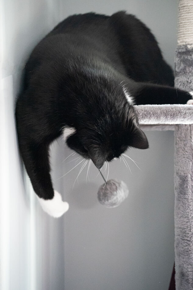
In this one, the whole point of the photo is imbalance. Well, okay, and a cute cat. All the visual weight is at the top. The empty space at the bottom emphasizes the precarious position Nightshade is in as he plays with the toy.
May 11, 2023 10:04:44 #
Reflecting on this further as I skim through my photos, I'm finding it a bit tricky to identify imbalance. Apparently, I have a strong predilection for balance in my images, but in some cases the balance is subtle.
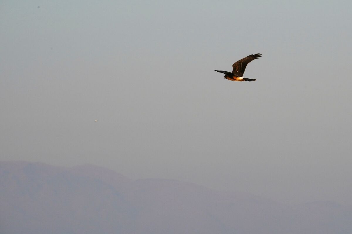
For example, in this image the bird is toward the upper right corner, intending to show the intense focus of a raptor on the prowl. As the bird is the highest contrast, sharpest part of the picture, my eye is immediately drawn there.
But the bird is looking toward the bottom left, so my eye then follows the direction of the bird's gaze and then notices the much subtler mountains. To me, this harmonizes the picture and makes it feel balanced, even though it objectively isn't.
I think the same thing about the "imbalanced" photo that R.G. posted. The lighthouse "looks" out toward the seascape to the left, creating a visual path the gives weight to the much less dense part of the picture.
May 11, 2023 10:17:40 #
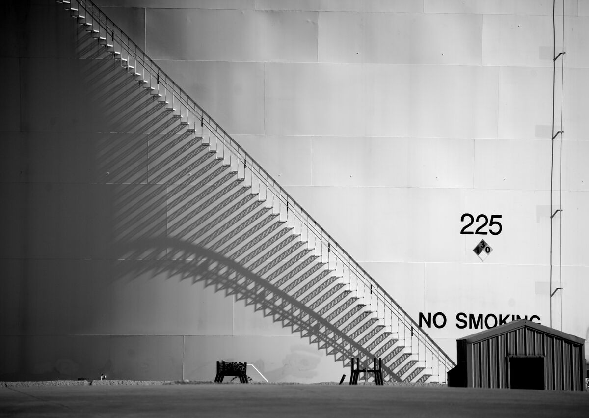
One last example and then I'll stop hogging the thread. In general, I don't think I deliberately focus on balance when creating an image. I think I might have at one point in my photographic journey, but I think it's gone almost entirely subliminal and intuitive. Nowadays I'm much more focused on how my eye travels around the frame to make sure attention focuses where I want it.
I've posted this before, but I think it's a good illustration of this. The strongest lines in this photo lead the eye immediately to the shed in the lower right. Is the photo balanced? I don't know. It just feels right to me.
I've posted this before, but I think it's a good illustration of this. The strongest lines in this photo lead the eye immediately to the shed in the lower right. Is the photo balanced? I don't know. It just feels right to me.
May 11, 2023 11:06:35 #
jaredjacobson wrote:
....to me the image feels balanced and serene......
Thanks for joining in, JJ. I'm not surprised to see the words "balanced" and "serene" being used together.
jaredjacobson wrote:
....I kept the image because it speaks to me of the last second panic and tiny adjustments a bird makes just before landing.....
If I'm reading you right you like the imbalance because of the dynamic that it brings to the composition. The first composition is restful while the other creates a sense of restlessness.
One of the basic polarities in composition is the difference between restfulness and tension. Tension imparts a dynamism that restful compositions can never have. That polarity gives rise to other polarities like harmonious/disharmonious, comfortable/uncomfortable, congruent/incongruent, the expected/the unexpected.... the list goes on.
Hopefully we'll see examples of the various possibilities being posted. I don't have many myself because balance is one of the things I try to base my landscape compositions on.
May 11, 2023 11:16:01 #
jaredjacobson wrote:
In this one, the whole point of the photo is imbalance. Well, okay, and a cute cat. All the visual weight is at the top. The empty space at the bottom emphasizes the precarious position Nightshade is in as he plays with the toy.
Thanks for another excellent example, JJ. Again, imbalance has the effect of getting us out of our visual comfort zone.
I found that trying to understand the concept of visual weight helped me to deepen my understanding of composition in general. Negative space can have a form of visual weight, which explains why some hugely unbalanced compositions can still feel just right. Such compositions need to be assessed subjectively, and we all have our own evaluation of what's right, but personal assessments are usually enough to get us into the ballpark when compiling our own compositions.
May 11, 2023 11:24:01 #
jaredjacobson wrote:
...in some cases the balance is subtle.....
Many aspects of the visual arts are subtle - but don't let that put you off
. Part of the elusiveness is down to the fact that visual weight can have many forms. Even empty space can take on new meaning if the image's storytelling suggests there is meaning in that space. For example the hovering bird is looking intently and there must be a reason for that, so we direct our gaze towards the same direction as the bird's gaze in order to discover that reason.May 11, 2023 11:37:45 #
jaredjacobson wrote:
.....Nowadays I'm much more focused on how my eye travels around the frame to make sure attention focuses where I want it....
....Is the photo balanced? I don't know. It just feels right to me.
....Is the photo balanced? I don't know. It just feels right to me.
Visual weight is about so much more than just placement. Even when we're using deliberate imbalance we have to be able to discern when enough is enough. Often that point is revealed when other more subtle factors get to the point where they're becoming unbalanced. For example negative and positive space can have visual weight that has nothing to do with the size of the areas that they occupy. Situations like that can't be assessed intellectually and intuition is our only recourse.
May 11, 2023 13:32:26 #

Love this Linda!!! Most would have put the kitty in the middle but yours really adds to the fun factor.
Interesting thread. Will check for more when I get home this afternoon.😁
Interesting thread. Will check for more when I get home this afternoon.😁
If you want to reply, then register here. Registration is free and your account is created instantly, so you can post right away.