Check out Black and White Photography section of our forum.
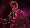
Angler's Cool Digi-Art
Apr 24, 2023 19:09:39 #
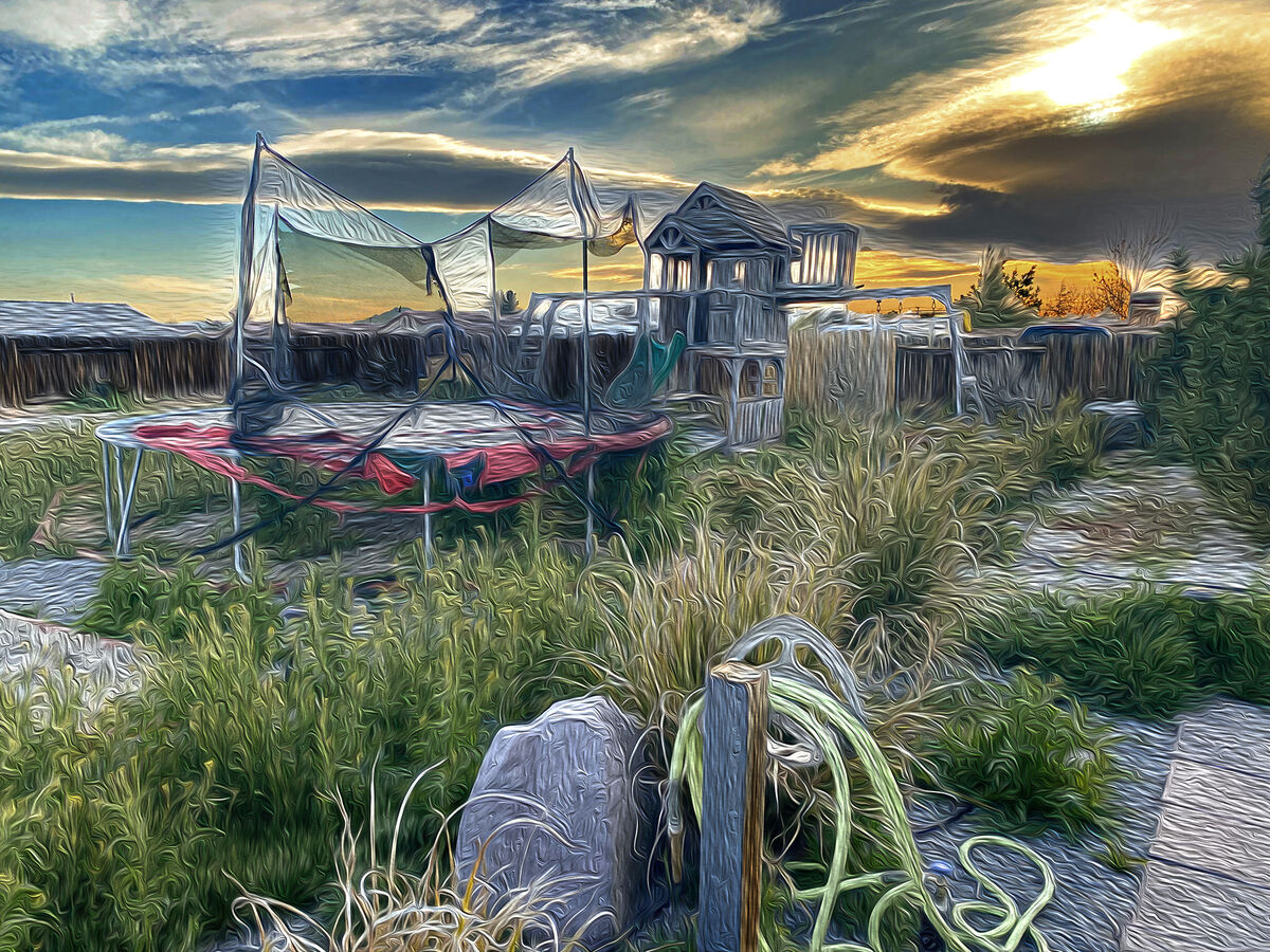
I thought I'd post my son's backyard in an attempt to copy Angler's digital art style. I did this entirely in PS. Original was taken by my son on an iPhone. Sadly - I flattened the file except for a final curves touch-up. I really like Angler's and I'm inspired to try this again on the right photo - thinking decaying barn or house.
Apr 25, 2023 02:26:15 #

Apr 25, 2023 07:25:45 #

Leaving the sky realistic accents the vibration surreal image of the yard. The real sky was a good decision waltnetto.
Check out Software and Computer Support for Photographers section of our forum.
Apr 25, 2023 07:49:33 #

Have you been warned that playful pp is addictive? 
The effect works really well on several of the elements here, I think, the grasses and fort/playhouse in particular. Enjoy your journey and be sure to come back to share new results!
The effect works really well on several of the elements here, I think, the grasses and fort/playhouse in particular. Enjoy your journey and be sure to come back to share new results!
Apr 25, 2023 08:18:35 #

Apr 25, 2023 11:40:44 #

Apr 25, 2023 12:57:38 #
dpullum wrote:
Leaving the sky realistic accents the vibration surreal image of the yard. The real sky was a good decision waltnetto.
Tried it including the sky Dpullum - Didn't like it at all. Thanks for your sharing your thoughts
Apr 25, 2023 12:58:22 #
angler wrote:
Excellent Waltnetto.
Thanks Angler - you were the inspiration to try it.
Apr 25, 2023 13:00:37 #
Linda From Maine wrote:
Have you been warned that playful pp is addictive?
The effect works really well on several of the elements here, I think, the grasses and fort/playhouse in particular. Enjoy your journey and be sure to come back to share new results!
The effect works really well on several of the elements here, I think, the grasses and fort/playhouse in particular. Enjoy your journey and be sure to come back to share new results!
Now I know where the shaking comes from when I am separated from working with PS! There is no cure...
Thank you for the comments!
Apr 25, 2023 13:01:50 #
jaymatt wrote:
Not a fan of that technique at all, sorry.
No apology necessary. I'm not a fan of many, many aspects of life (and PS).
Apr 25, 2023 13:02:36 #
Check out Underwater Photography Forum section of our forum.
Apr 27, 2023 13:14:42 #
At first I didn't like and I went away. I came back for another look and started to like it. Went away again. Came back once more and decided I think I could see this framed and up on the wall. I don't think I've had that feeling not liking and then thinking its good enough for a wall hanging before.
Good Job. WOW I surprised myself.
Thanks for sharing.
Jim
Good Job. WOW I surprised myself.
Thanks for sharing.
Jim
Apr 27, 2023 15:18:30 #
Jim-Pops wrote:
At first I didn't like and I went away. I came back for another look and started to like it. Went away again. Came back once more and decided I think I could see this framed and up on the wall. I don't think I've had that feeling not liking and then thinking its good enough for a wall hanging before.
Good Job. WOW I surprised myself.
Thanks for sharing.
Jim
Good Job. WOW I surprised myself.
Thanks for sharing.
Jim
Well thank you Jim-Pops. Isn't life interesting in so many ways!
Additional info - I said the PP was all done in PS but I couldn't remember and I had flattened the file. That didn't sit well with me so I spent some time trying to recreate the effects. Turns out the effect was done with the PS sliders in Oil Paint. (of course I did a curves levels adjustment to warm the tones up and a "select sky" to eliminate the effects from the sky).
Further experimentation (and this may come as no surprise to many UHHers) the level of the effect has a hidden control... DPI. I lowered the original dpi from 300 to 72 and the results were astounding (not better). I then tried other DPI settings and each large change made the image look quite different. (I never changed the sliders inside Oil Paint). I really enjoyed the exercise. So my original post is on the first page here. This one is the 72DPI version so you can see what I'm babbling about. (oh- I didn't exclude the sky on this one)
Thanks for looking.

Apr 27, 2023 17:16:50 #
waltnetto wrote:
Googling the PS Oil Paint filter, I found a list of the effects that you can control with sliders. I've attached a screen print below. You mentioned "level of effect." That's usually an opacity slider....Further experimentation (and this may come as no surprise to many UHHers) the level of the effect has a hidden control: DPI...
I'm nearly 100% positive that the change you documented isn't related to DPI. But I haven't been wrong yet today, so I'm due
Let me know what you discover, if you get a chance.

Apr 27, 2023 18:57:04 #
I really like the first one better. This new one is too abstract for me, can't find anything to relate to.
If you want to reply, then register here. Registration is free and your account is created instantly, so you can post right away.
Check out Black and White Photography section of our forum.