The Archer - with optional tree
Apr 7, 2023 09:55:01 #

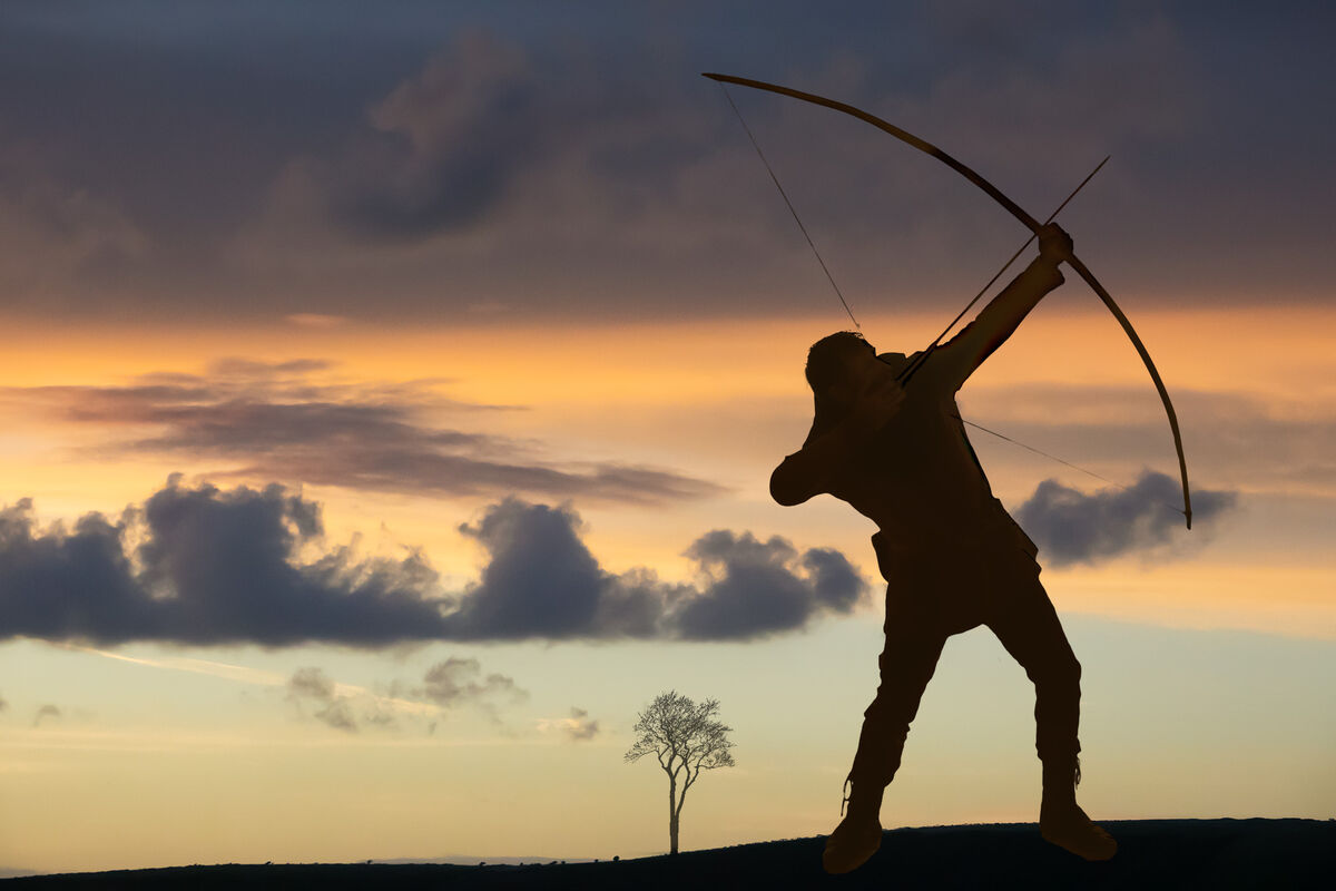
A simple composite of three images - do you have any thoughts upon the inclusion of the tree? If you have the time I'd appreciate your critique.
Apr 7, 2023 10:02:38 #

The right half looks a bit busy compared to the left half, making the overall image a bit unbalanced. I would try either cropping some of the left hand side or moving the tree away from the archer a bit (maybe a bit of both). I'm not sure how I feel about the archer shooting out of the frame. I'd need to see both options before I decided if it was OK. But in any case the archer is striking a strong pose.
Apr 7, 2023 10:52:45 #

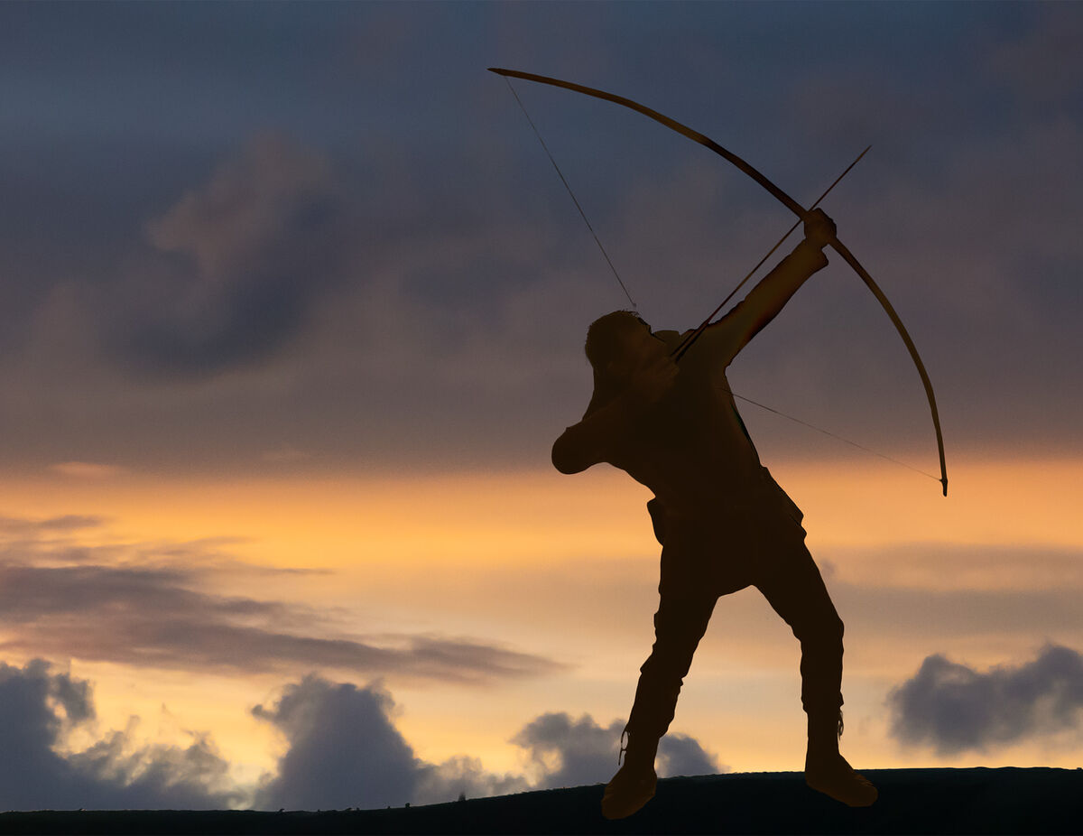
I have a problem with the difference in the color tones of the skies not blending.
Cropping out everything below the dark clouds seems to be a better fit for me.
Cropping out everything below the dark clouds seems to be a better fit for me.
Apr 7, 2023 11:05:02 #

Apr 7, 2023 11:59:55 #
R.G. wrote:
The right half looks a bit busy compared to the left half, making the overall image a bit unbalanced. I would try either cropping some of the left hand side or moving the tree away from the archer a bit (maybe a bit of both). I'm not sure how I feel about the archer shooting out of the frame. I'd need to see both options before I decided if it was OK. But in any case the archer is striking a strong pose.
I did intend for it to be ‘unbalanced’ RG. In a way I think the tree is just a bit too much, I just couldn’t resist it due to mimic of the archer’s bow, but that’s probably irrevelant. Moving it aside doesn’t look good (I had it there initially). My wife said I should dump it from the outset and she’s usually right when it comes to composition. I’ll give the left hand crop a try. Thanks for a thoughtful critique, it’s helpful.
The archer had no option but to shoot out of frame in the original pose, which probably influenced me a bit.
Apr 7, 2023 12:13:26 #
SoHillGuy wrote:
I have a problem with the difference in the color tones of the skies not blending.
Cropping out everything below the dark clouds seems to be a better fit for me.
Cropping out everything below the dark clouds seems to be a better fit for me.
The sky (and foreground) is as taken SHG but a quick fiddle produces this option. I've removed the tree too as I feel it's better gone. What are your thoughts on it now please?
Apr 7, 2023 12:18:40 #
kpmac wrote:
The tree is fine. Too much negative space on the left, though.
Looks like we sort of half agree kp, but you may not like the modified sky - or possibly the crop? The tree had to go, I found it became a distraction. Thanks for your critique, I do appreciate it.
Apr 7, 2023 12:33:59 #
magnetoman wrote:
A simple composite of three images - do you have any thoughts upon the inclusion of the tree? If you have the time I'd appreciate your critique.
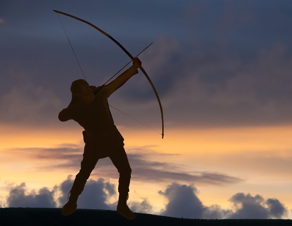
Or perhaps just be conventional:
Apr 7, 2023 12:52:08 #
magnetoman wrote:
Or perhaps just be conventional:
***
Best I have seen so Far.
Apr 7, 2023 13:38:24 #

What a great thread for discussion of diverse opinions.
I adore the first entry! The imbalance is eye-catching, provides tension and emphasizes the dynamic pose. Sky colors are very appealing. The tree is unexpected and adds visual interest. Home run, touchdown, score!!
#2 is OK; I'd probably be happy if I'd never seen the first Moving the clouds down to the horizon line is nice.
#3 has the figure too large in the frame and I feel that the placement is too common or "safe" - that it's trying to be an illustration of sinply how to hold the bow.
I adore the first entry! The imbalance is eye-catching, provides tension and emphasizes the dynamic pose. Sky colors are very appealing. The tree is unexpected and adds visual interest. Home run, touchdown, score!!
#2 is OK; I'd probably be happy if I'd never seen the first
Moving the clouds down to the horizon line is nice. #3 has the figure too large in the frame and I feel that the placement is too common or "safe" - that it's trying to be an illustration of sinply how to hold the bow.
Apr 7, 2023 13:47:36 #
SoHillGuy wrote:
***
Best I have seen so Far.
Best I have seen so Far.
Nowt wrong with conventional then SHG!
Apr 7, 2023 13:51:21 #
Linda From Maine wrote:
What a great thread for discussion of diverse opin... (show quote)
Thanks for this Linda - I’m undecided between 1 and 3 but agree our man could be a tad smaller in 3.
Apr 7, 2023 14:04:50 #
magnetoman wrote:
A simple composite of three images - do you have any thoughts upon the inclusion of the tree? If you have the time I'd appreciate your critique.
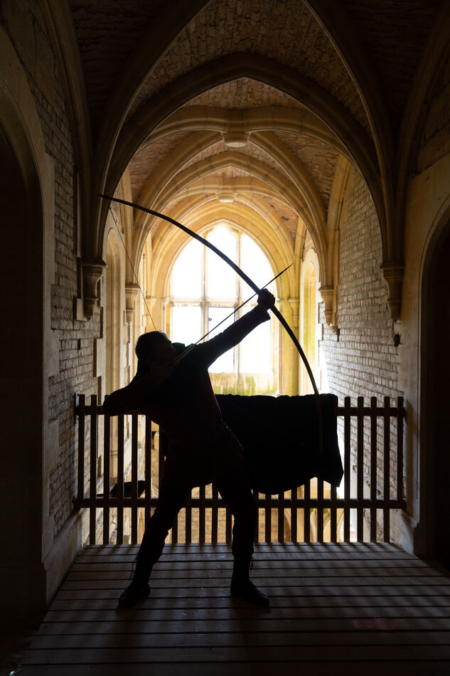
And where it started - rather confined and somewhat meaningless in setting. The archer insisted on the cloth covering part of the balcony fencing because of a small sign on the fence, which would have been easier to deal with in terms of extraction. Never mind, there was non point in upsetting the chap, he was an excellent model.
Apr 7, 2023 14:05:51 #
#3 has the restful composition but the overall effect is still dynamic. Conclusion - the pose is sufficiently dynamic and the image doesn't need the tension provided by the deliberate imbalance.
But it's still a matter of intention. Maybe you want dynamism and tension. My personal preference for balance takes over and I end up preferring #3. But I think it's a good thing that we're exposed to deliberate imbalance now and then.
So when does deliberate imbalance work and when is it too much? That would be as good subject for another thread.
Apr 7, 2023 16:04:59 #
R.G. wrote:
#3 has the restful composition but the overall eff... (show quote)
I have a feeling personal taste will make that a rather indecisive result RG?
If you want to reply, then register here. Registration is free and your account is created instantly, so you can post right away.