Seascape Antarctica
Mar 22, 2023 16:46:19 #
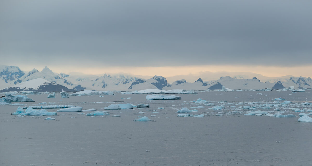
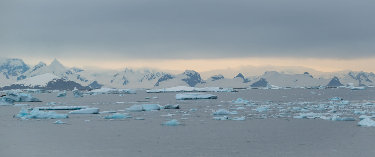
Thoughts, comments and criticism welcome.
(specifically wondering whether I should use the top or bottom one -- but other comments are welcome too).
(specifically wondering whether I should use the top or bottom one -- but other comments are welcome too).
Mar 22, 2023 17:32:23 #

Mar 22, 2023 17:40:38 #

Love the limited color palette. I'd choose #1 for even more feeling of that awesome expansive cold space.
Mar 23, 2023 10:05:24 #

Try cropping so that the horizon is about a third from the top and then again with it about a third from the bottom. Either has a big effect on how you react to this scene.
Mar 23, 2023 17:33:46 #
KenProspero wrote:
Thoughts, comments and criticism welcome.
(specifically wondering whether I should use the top or bottom one -- but other comments are welcome too).
(specifically wondering whether I should use the top or bottom one -- but other comments are welcome too).
Hi Ken,
If you're asking about the two images that I would prefer, I would pick the second. The first includes too much dead space in the sky and foreground water that doesn't really add to the feeling of expanse in the image, which is what I'm assuming is your intent.
My critique of both images is the lack of detail. The image has a slight blur. With all the details being small, the blur makes it look flat with a significant amount of the highlights and shadows clipped. While a blue color cast will convey a cold feeling, there is just a little too much for my preference.
I'm assuming the your objective is to convey the feeling of expanse. However, when I look at this image, I'm immediately drawn to the turquoise icebergs. For me, they are the real subject of this image, with the background mountains giving context to the environment. To make the icebergs more prominent, I would crop the image to something more manageable for the eye to focus on. My preference was the left 1/3 of the image, while also removing some of the background sky and foreground water. I would reduce the strong blue color cast while retaining the beautiful turquoise colors in the icebergs. I don't know how much detail is in the original file, but there is still some that can be extracted from your posted image. I would bring out those details in the icebergs and also more detail in the snow covering the background mountains to reduce the clipped feeling. After that some minor dodging and burning would help add depth to the image. This approach still illustrates the ruggedness of the area, but those beautiful icebergs in the foreground stand out much more than before.
With permission, I'll post an example that I described above.
I understand that your objective may be different, I'm just providing another view based on what I see in this image. Obviously, your mileage may vary.
Mike
Mar 23, 2023 18:39:27 #
KenProspero wrote:
Thoughts, comments and criticism welcome.
(specifically wondering whether I should use the top or bottom one -- but other comments are welcome too).
(specifically wondering whether I should use the top or bottom one -- but other comments are welcome too).
I prefer the 2nd picture BUT I do wonder why there is no detail in the ice/glaciers on the mountains?? Were they foggy at the time?
bwa
Mar 24, 2023 14:29:08 #
SalvageDiver wrote:
Hi Ken, br br If you're asking about the two imag... (show quote)
Thank you for your thoughtful comments, I'd love to see any idea that you have.
Mar 25, 2023 20:42:22 #
KenProspero wrote:
Thank you for your thoughtful comments, I'd love to see any idea that you have.
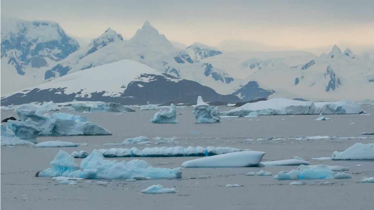
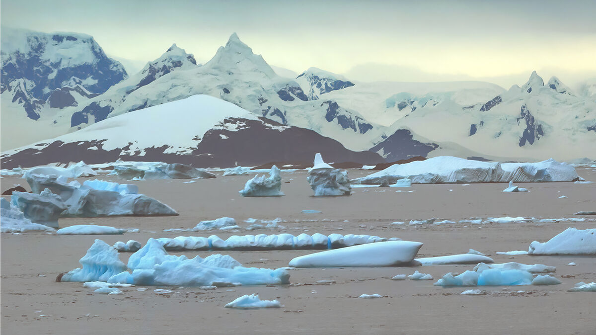
Here is what I was thinking. The edit is not refined, but just to show what I saw in the image.
Cropped from the original
Recovering detail in the snow and preserving the turquoise color of the icebergs
Mar 25, 2023 23:22:52 #
Mar 26, 2023 11:42:04 #

If you want to reply, then register here. Registration is free and your account is created instantly, so you can post right away.