The Seer
Feb 8, 2023 15:20:05 #

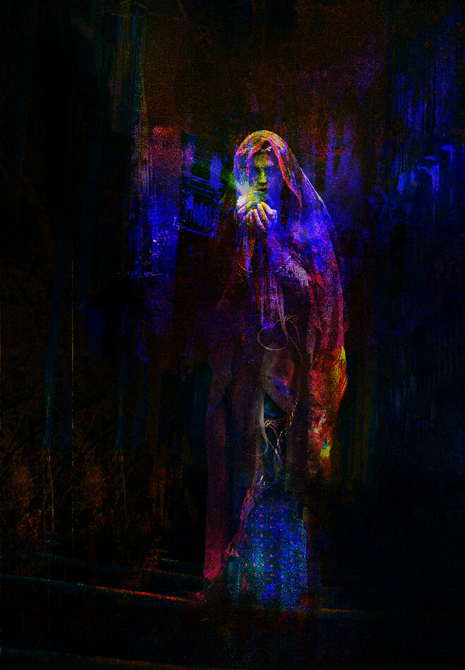
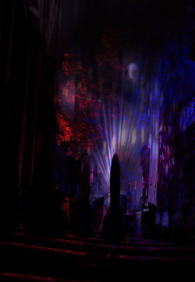
This composite is a difficult one to explain. It's made from several images some of which are only used for their colour - in much the same way one might use a texture layer, relying entirely upon the blend mode used to provide effect. I didn't find it easy! Please feel free to critique.
Feb 8, 2023 15:25:36 #

Intriguing--the work has a dark, macabre aura about it that appeals to me. I don’t generally care for these kinds of concoctions, but this one draws me in--I like it! Congratulations on your work here.
Feb 8, 2023 16:09:12 #
jaymatt wrote:
Intriguing--the work has a dark, macabre aura about it that appeals to me. I don’t generally care for these kinds of concoctions, but this one draws me in--I like it! Congratulations on your work here.
That’s good to hear John, I know you’re not usually a composite man! Many thanks for giving your thoughts on it.
Feb 8, 2023 17:55:03 #

Feb 8, 2023 18:45:05 #
Feb 9, 2023 00:23:55 #
Feb 9, 2023 00:33:31 #
Curmudgeon wrote:
Beautiful work. It looks vaguely like a Psychedelic Luke Skywalker
More Emperor Palpatine than Luke I think Curmudgeon?
Feb 9, 2023 07:20:57 #

Certainly not your usual composite. Your use of color work makes it work. At least for me it does.
Feb 9, 2023 07:46:24 #

It's compelling! Holds my attention for both the result and the technique. Would you provide an example of a couple of layers used for "just" color via the blend mode? I believe I stumbled onto something like that (with one or two layers) once upon a time. Is there a name for the technique?
Feb 9, 2023 07:56:06 #
NJFrank wrote:
Certainly not your usual composite. Your use of color work makes it work. At least for me it does.
Perhaps I’ll veer off in this direction for a while Frank - then, on the other hand…
Thanks for commenting.
Feb 9, 2023 08:02:29 #

Magnetoman, Wow, this photo has just gotta be printed in glow in the dark inks and bathed in UV light.
About such posters: "One of the most ubiquitous items of the 1960s and 1970s, the black light poster represented some of the most imaginative, colorful, and "out there" creativity of the period;"
Temu.com sells them
About such posters: "One of the most ubiquitous items of the 1960s and 1970s, the black light poster represented some of the most imaginative, colorful, and "out there" creativity of the period;"
Temu.com sells them
Feb 9, 2023 08:03:19 #
Linda From Maine wrote:
It's compelling! Holds my attention for both the result and the technique. Would you provide an example of a couple of layers used for "just" color via the blend mode? I believe I stumbled onto something like that (with one or two layers) once upon a time. Is there a name for the technique?
Certainly Linda, but not until the update I’ve started on my computer gets around to finishing! I think the technical term for the technique is ‘messing around’! It’s the same as a texture layer really and, like them, you’re not quite sure where it will take you or whether it will work. Pretty sure I used one of those layers twice, with the second rotated to spread whichever colour I was after. I’ll be back later with an example. Thanks for your interest in it.
Feb 9, 2023 11:20:00 #

The lighting and colour has produced an excellent ethereal effect. I'm left wondering if the grainy look could be improved on with a bit of denoise or negative Clarity.
Feb 9, 2023 14:26:51 #
Linda From Maine wrote:
It's compelling! Holds my attention for both the result and the technique. Would you provide an example of a couple of layers used for "just" color via the blend mode? I believe I stumbled onto something like that (with one or two layers) once upon a time. Is there a name for the technique?
OK, here goes!
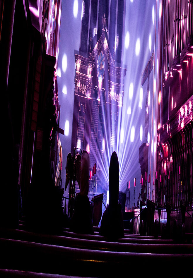
The first image (an illuminated church interior that has been stretched) started as the background (later an under-layer was added in order to mask part of background!).
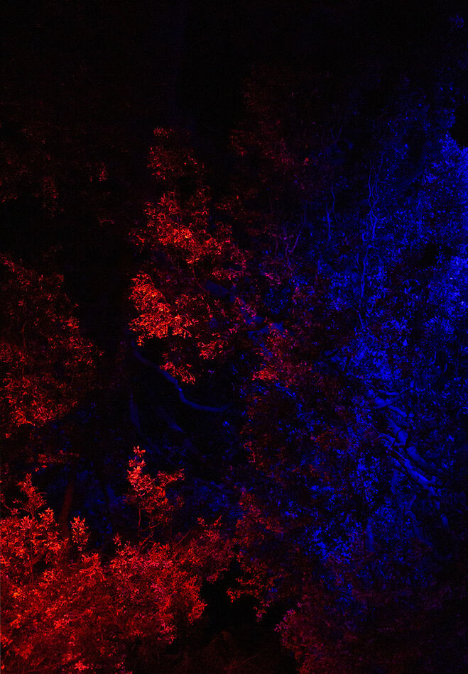
The second (Red/Blue) image layer was added (a photo from an illuminated garden) and placed above layer 1 and the blend mode changed to Darken. This has the effect of picking-up the highlights from the background layer and colouring them. Particularly obvious are the backs of the pews in the church, the tops of which are the red edges of the 'steps' in the final image. Darker areas of the background are either less, or not, affected according to their saturation.
Where areas of layer two later affect other added layers they were simply masked out on the Red/Blue layer.
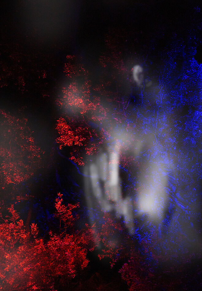
I also show part of the subject layer. She was actually sitting on the ground so is a composite in order to make her stand up. Her shawl was short so much of that is composite too. I controlled the colour of the shawl by adding selected parts of the Red/Blue layer as additional layers. This applied to other areas too, according to which colour I wanted, red or blue.
There were of course a lot more layers to create the finished image, around sixty in total.
Feb 9, 2023 14:45:10 #
lnl
Loc: SWFL
I can’t imagine your creative mind! Thanks for the explanation for Linda. I’m far from understanding it all but it gives me something to grow into…probably a hundred years from now!
If you want to reply, then register here. Registration is free and your account is created instantly, so you can post right away.