Monochromes
Nov 7, 2022 10:27:32 #
photophile wrote:
Thanks Dennis, I like your first image the most.
Thanks Karin.
Dennis
Nov 7, 2022 10:27:44 #

junglejim1949 wrote:
Nice set Karin. #1 & #2 are my favorites. Good eye 👁
Thanks junglejim!
Nov 7, 2022 10:30:39 #
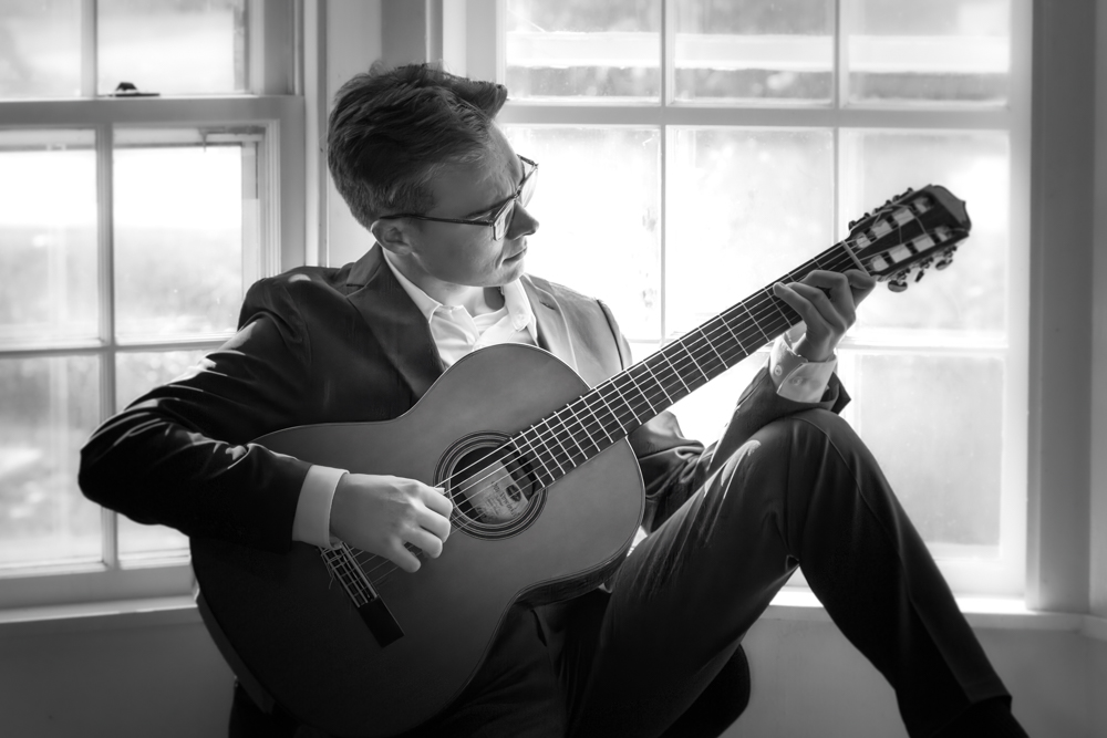
Thanks for hosting, Karin.... a senior portrait I took a couple weeks ago. I may have posted it before, but I just learned it was chosen as Photo of the Week on another forum.
Nov 7, 2022 10:31:46 #
PAToGraphy wrote:
Thanks for hosting, Karin.... a senior portrait I took a couple weeks ago. I may have posted it before, but I just learned it was chosen as Photo of the Week on another forum.
Congrats Pat, well done image!
Nov 7, 2022 10:59:43 #
PAToGraphy wrote:
Thanks for hosting, Karin.... a senior portrait I took a couple weeks ago. I may have posted it before, but I just learned it was chosen as Photo of the Week on another forum.
I can easily see how it could be chosen as Photo of the Week. It is an outstanding portrait. Well done.
Dennis
Nov 7, 2022 11:10:56 #
Here are a few from Edinburgh.
Hands at the Camera Obscura
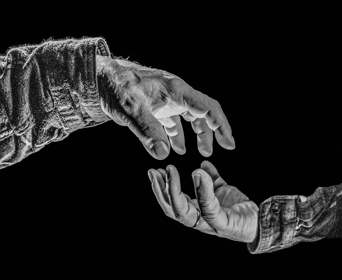
(Download)
David Hume with St. Giles cathedral in the background
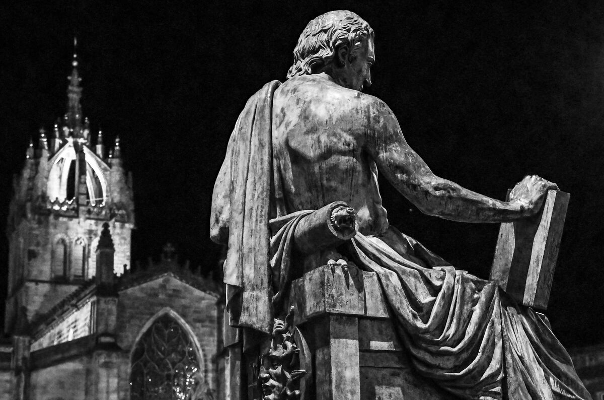
(Download)
The Grassmarket at night
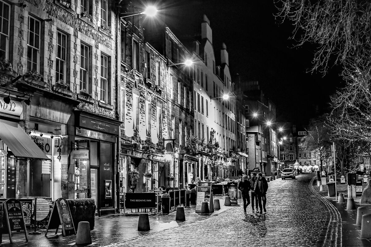
(Download)
Nov 7, 2022 11:23:22 #
PAToGraphy wrote:
Thanks for hosting, Karin.... a senior portrait I took a couple weeks ago. I may have posted it before, but I just learned it was chosen as Photo of the Week on another forum.
pg. 2
This is a wonderful portrait - I love the way you used the backlighting from the windows but still had proper lighting on the subject. Did you use all natural light or some supplemental?
Nov 7, 2022 12:04:39 #
judy juul
Loc: Cheshire, Ct.
cmc4214 wrote:
I, too like converting to B&W, but haven't done any for quite a while, so thanks for this challenge
I quickly did these tonight so I could join in. Thanks again for hosting
I quickly did these tonight so I could join in. Thanks again for hosting
These are really great, cm!
Nov 7, 2022 12:13:07 #
judy juul
Loc: Cheshire, Ct.
PAToGraphy wrote:
Thanks for hosting, Karin.... a senior portrait I took a couple weeks ago. I may have posted it before, but I just learned it was chosen as Photo of the Week on another forum.
Nice Pat!
Nov 7, 2022 12:32:57 #
judy juul
Loc: Cheshire, Ct.
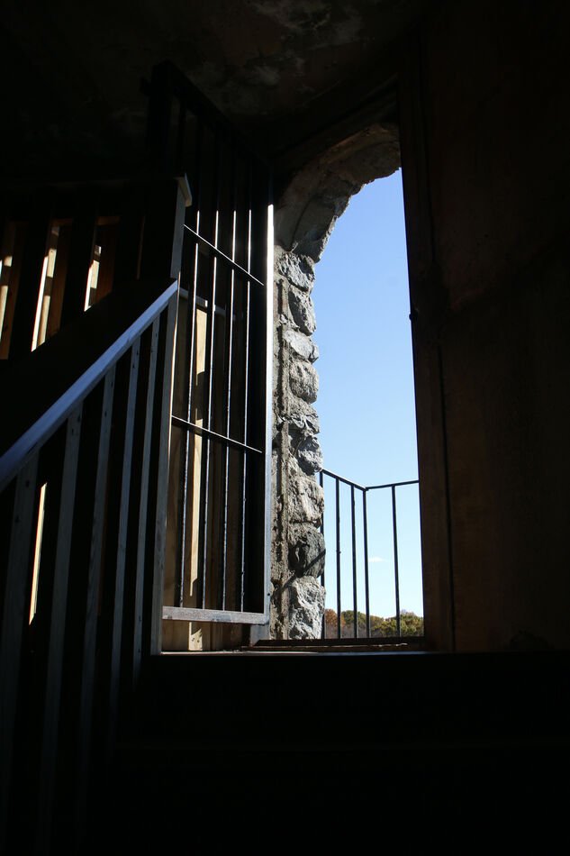
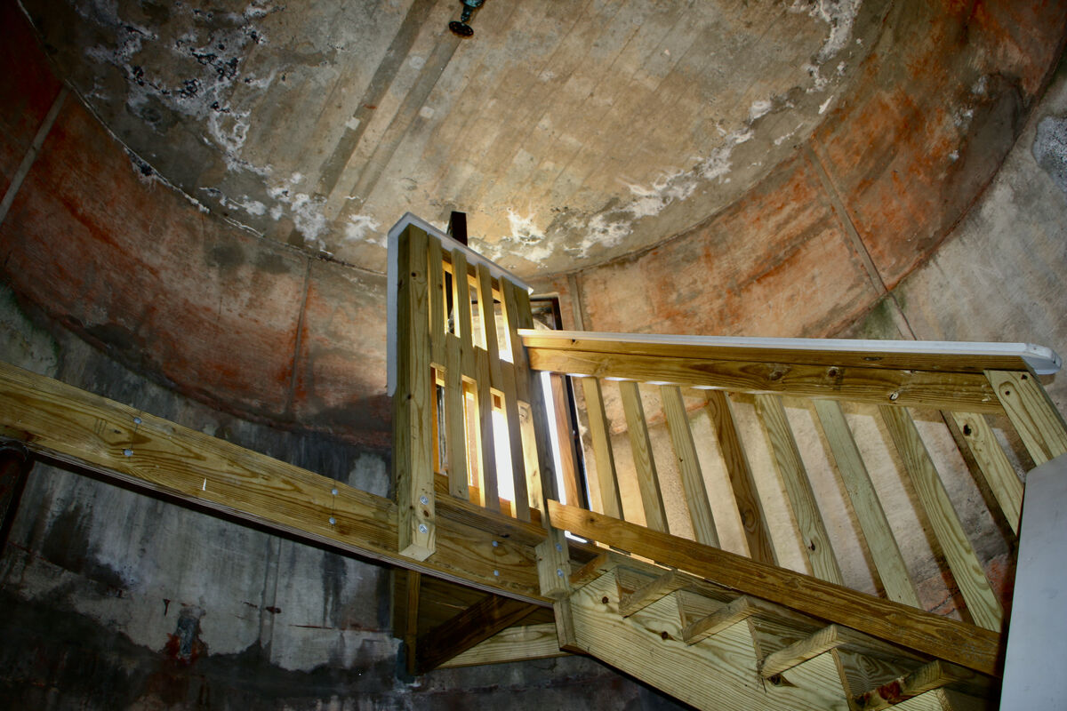
Thought I'd do a before and after...showing the change from color y B/w....
All these were taken inside a 1942 water tower...
What do you think-re which one of both do you like more???
All these were taken inside a 1942 water tower...
What do you think-re which one of both do you like more???


Nov 7, 2022 12:42:53 #
cmc4214 wrote:
I, too like converting to B&W, but haven't done any for quite a while, so thanks for this challenge
I quickly did these tonight so I could join in. Thanks again for hosting
I quickly did these tonight so I could join in. Thanks again for hosting
pg. 1
"Who ya lookin' at?!?" sez the deer in the last photo!

Nov 7, 2022 12:45:06 #
fredtoo wrote:
The first two shots are not particularly enhanced ... (show quote)
pg. 1
Sure hope you had a very long lens for that lion portrait - he sure looks cranky!! And I agree - much more dramatic in B/W!
Nov 7, 2022 12:48:53 #

Nov 7, 2022 13:19:08 #
Nov 7, 2022 13:21:59 #
cmc4214
Loc: S.W. Pennsylvania
photophile wrote:
More images:
Really like the way the clouds "pop" in #6,7&8
If you want to reply, then register here. Registration is free and your account is created instantly, so you can post right away.