Shooting B&W with digital camera
Aug 25, 2022 09:54:51 #
gvarner
Loc: Central Oregon Coast
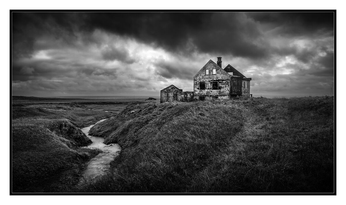
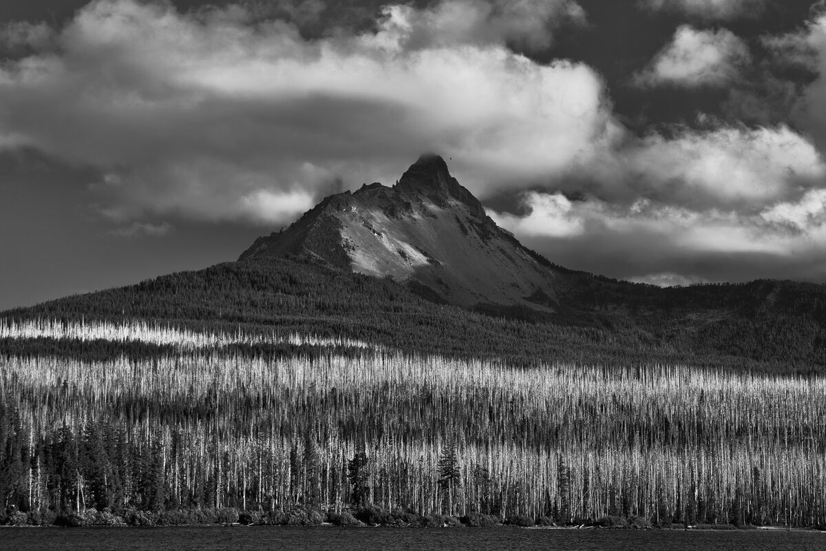
I think the advise here is good, shooting in RAW and then PP to B&W. And I also think that the subject matter, the light, and the composition are major components. Yes, shoot in color but not all color photos make good B&W's. I see a lot of examples of low contrast color photos here that are converted to B&W and it doesn’t work for me.
Aug 25, 2022 10:42:10 #

I enjoy black and white photography immensely. 20+ years ago, I purchased the first camera that could capture RAW images. Being familiar with jpg images from previous cameras, I initially shot jpg. Shortly after purchasing a "real" digital camera, I learned about RAW. I plunged into learning as much about RAW as I could. A few years after that I learned about and started using some advanced techniques. I also found that converting to black and white was not simply a desaturation process.
JPG capture is similar to a Polaroid photo. There are limited things one can do in processing. Some years ago, I developed a method that allows me to apply The Zone System to my digital exposures. That allowed me to capture photo such as:
https://www.uglyhedgehog.com/t-737107-1.html
https://www.uglyhedgehog.com/t-720029-1.html
So, there's a bit of work producing a black and white photograph from a polychromatic digital camera.
--Bob
dkeysser wrote:
Guys, I have a Sony A7c and want to shoot great B&W (like the old film camera days). I usually shoot in JPEG (X-fine version), and I usually shoot in normal color mode, and then decide to convert to B&W in PhotoShop Elements. I have also tried the B&W setting in Creative Style. In most cases, the results look muddy and boring, not like I got in the old days shooting a Leica and Tri-X. Any suggestions on how to proceed? Thanks in advance.
Aug 25, 2022 11:00:42 #
osoblancophoto
Loc: Venice FL
I use NIK and love it. I do basics in Lightroom first, then to NIK to choose a profile and then back to Lightroom for enhancements, dodging and burning, etc.
Aug 25, 2022 11:18:32 #

osoblancophoto wrote:
I use NIK and love it. I do basics in Lightroom first, then to NIK to choose a profile and then back to Lightroom for enhancements, dodging and burning, etc.
A first-rate, phenomenally beautiful composition 🖤🖤🖤🖤🖤
Aug 25, 2022 11:35:53 #
I have a Sony a7ii converted to B&W and love it since I can't afford the Leica Monochrome. With it I shoot using filters just like I use to do with film. But there are times when I don't have the converted camera with me. I then shoot in color and convert in PP. I usually convert using Noir filter in Apple Photos. Fujifilm cameras have emulated B&W film modes in their cameras. They are quite good. I was not real happy with color to B&W PP conversions so I opted for the Sony a7ii conversion. It is the most like shooting film I have found so far.
original color
converted in Apple Photos ,Noir
Sony a7ii converted to B&W with red filter
Aug 25, 2022 11:43:37 #
brooklyn-camera I wrote:
Converted from color to BW..... I think that some photos just look better in BW. This was shot at a night game and the lighting really sucked in the end zones.
I love them both, but I agree with your assessment. The B&W has an impact in the poor light that the color shot doesn't 🖤🤍🤍🤍🖤
Aug 25, 2022 11:55:06 #
Aug 25, 2022 11:59:40 #

Aug 25, 2022 12:02:45 #
xt2
Loc: British Columbia, Canada
dkeysser wrote:
Guys, I have a Sony A7c and want to shoot great B&W (like the old film camera days). I usually shoot in JPEG (X-fine version), and I usually shoot in normal color mode, and then decide to convert to B&W in PhotoShop Elements. I have also tried the B&W setting in Creative Style. In most cases, the results look muddy and boring, not like I got in the old days shooting a Leica and Tri-X. Any suggestions on how to proceed? Thanks in advance.
I manage to avoid a lot of post work by shooting with one of the Fuji B&W options built into the hardware. Cheers!
Aug 25, 2022 13:36:24 #
spaceytracey
Loc: East Glacier Park, MT
robertjerl wrote:
Using the camera in RAW and then converting gives ... (show quote)
Outstanding! I'm a dark & gloomy girl so I prefer the 1st one. I LOVE Silver EFEX & have often used it to convert color images. Lots of sliders to play with.
Aug 25, 2022 13:48:58 #
DWU2 wrote:
Shoot raw mode in color, then convert to B&W in post. You'll have a much greater chance of bagging a great B&W photo.
That is what I do and suggest too.
Aug 25, 2022 13:53:02 #
dkeysser wrote:
Guys, I have a Sony A7c and want to shoot great B&W (like the old film camera days). I usually shoot in JPEG (X-fine version), and I usually shoot in normal color mode, and then decide to convert to B&W in PhotoShop Elements. I have also tried the B&W setting in Creative Style. In most cases, the results look muddy and boring, not like I got in the old days shooting a Leica and Tri-X. Any suggestions on how to proceed? Thanks in advance.
I shoot RAW. If I want B&W I convert manually with Ps. I did a lot of B&W with 35mm Plus-X even 4x5" large format Tri-x.
Aug 25, 2022 14:01:03 #
amfoto1
Loc: San Jose, Calif. USA
dkeysser wrote:
Guys, I have a Sony A7c and want to shoot great B&W (like the old film camera days). I usually shoot in JPEG (X-fine version), and I usually shoot in normal color mode, and then decide to convert to B&W in PhotoShop Elements. I have also tried the B&W setting in Creative Style. In most cases, the results look muddy and boring, not like I got in the old days shooting a Leica and Tri-X. Any suggestions on how to proceed? Thanks in advance.
I never shoot B&W "in camera". I always convert in post-processing. That gives me much more control over the end results. But I also always shoot RAW and work from that, because the RAW file has much more latitude for adjustment than JPEGs.
It is almost always necessary to do some contrast, curves and levels adjustment during B&W conversion. These are easily applied in post-processing. I use Photoshop instead of Elements, but am sure you have option to make these adjustments too, as needed.
There also are "filters" that can be applied in post-processing, much like we used actual filters to enhance our black and white film images. With actual filters to darken any color we needed to apply a filter the color directly opposite it on the color wheel. For example, a deep red filter will make deep green foliage turn very dark. Now in Photoshop I can lighten or darken each color directly during the B&W conversion, there's no need to consult a color wheel.
Pay a lot of attention to the histogram of the image. It needs to be "expanded" to both edges and possibly enhanced by some brightening of the in the mid-tones.
For the following image I actually tweaked the B&W conversion differently for the background than for the subjects in the foreground. I used a red filter on the background, but not on the subjects. I toned down the mid-tones in the background, while lightening them in the subjects. All this was to better separate the subjects from the background (more difficult in monochrome than in a color image).

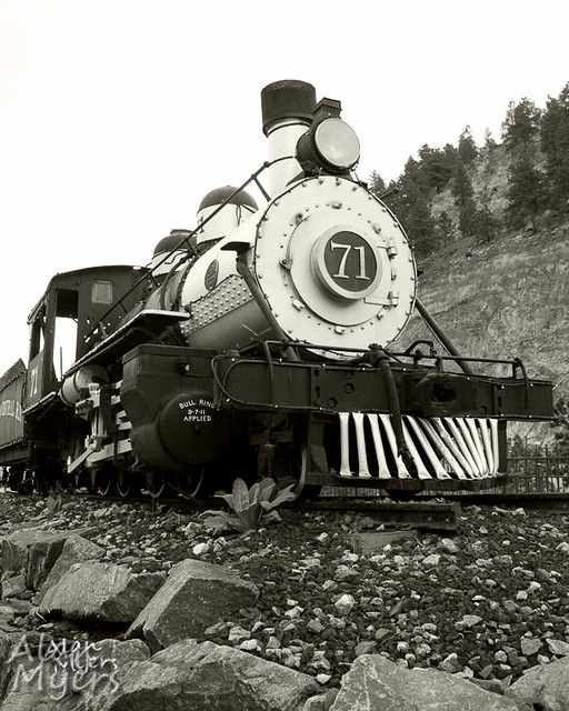
An overcast day made for a really boring white sky in the below locomotive image.... so I made it look "old timey" (seemed appropriate) by turning it black & white, then "sepia toning" it. It needed quite a lot of tweaks to the curves, too, due to the flat lighting.
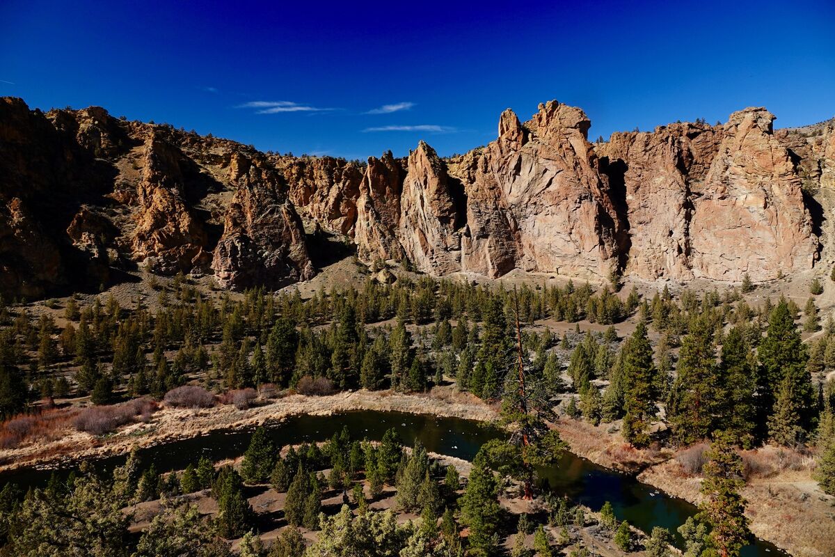
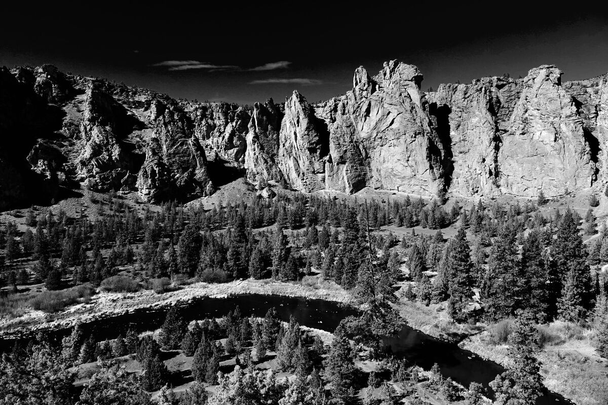
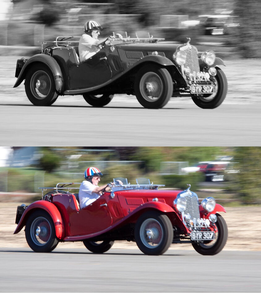
I happen to have available both color and B&W versions some images...
The vintage car image linked below required increased contrast and mid-tones brightened, mostly accomplished with a curves adjustment during the B&W conversion. Also the red was darkened a little and magenta was lightened.
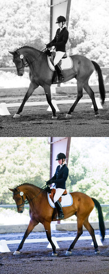
B&W is popular with dressage photography, as in the 2nd image. In this case there was little need to change contrast (the color image is slightly oversaturated due to the type of printing that was going to be used). But the red needed to be lightened to make the horse stand out out better in B&W against the background. (This image also is an example of an "HDR" technique in post-processing versus "old school" graduated neutral density filters. The color image is a composite of two differently processed images, done to recover some background detail. But that's another subject.)
Aug 25, 2022 14:20:29 #
See the blog www.macfolio.com. They just ran a terrific article by Mike Evans on this topic. It covers the best cameras and the best affordable alternatives. He also delves into the different B&W styles.
Aug 25, 2022 14:27:56 #

OR, I am very interested in your comment on having a converted Sony camera. I assume you somehow converted it into B&W only? Can you explain this in more detail? I have several Sony bodies, and I would be very happy to convert one of them to B&W only. How did you do this? Thanks.
If you want to reply, then register here. Registration is free and your account is created instantly, so you can post right away.