Multiple Choice Question
Aug 22, 2022 07:39:12 #
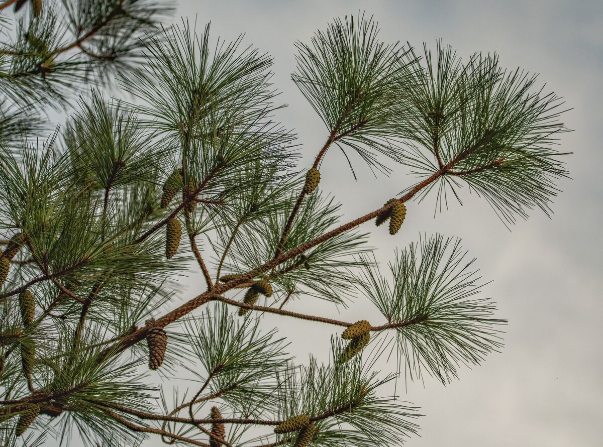
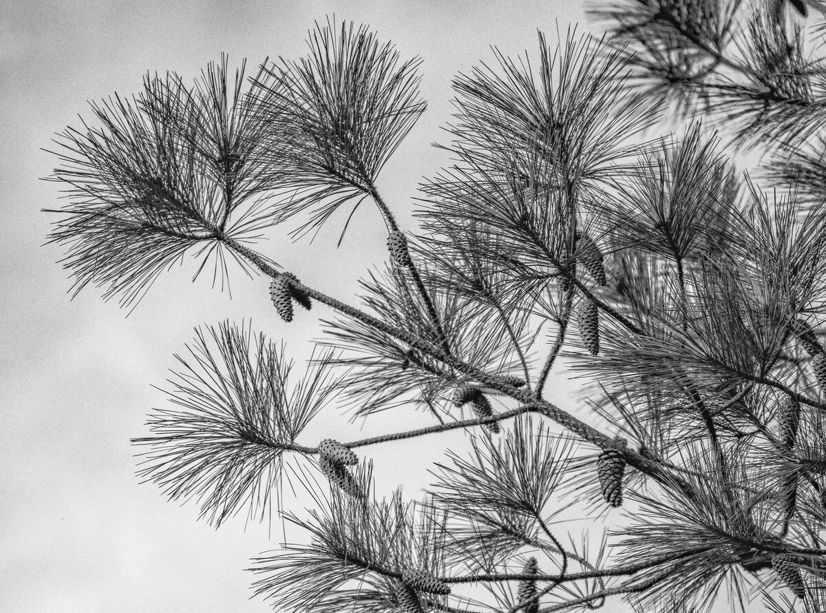
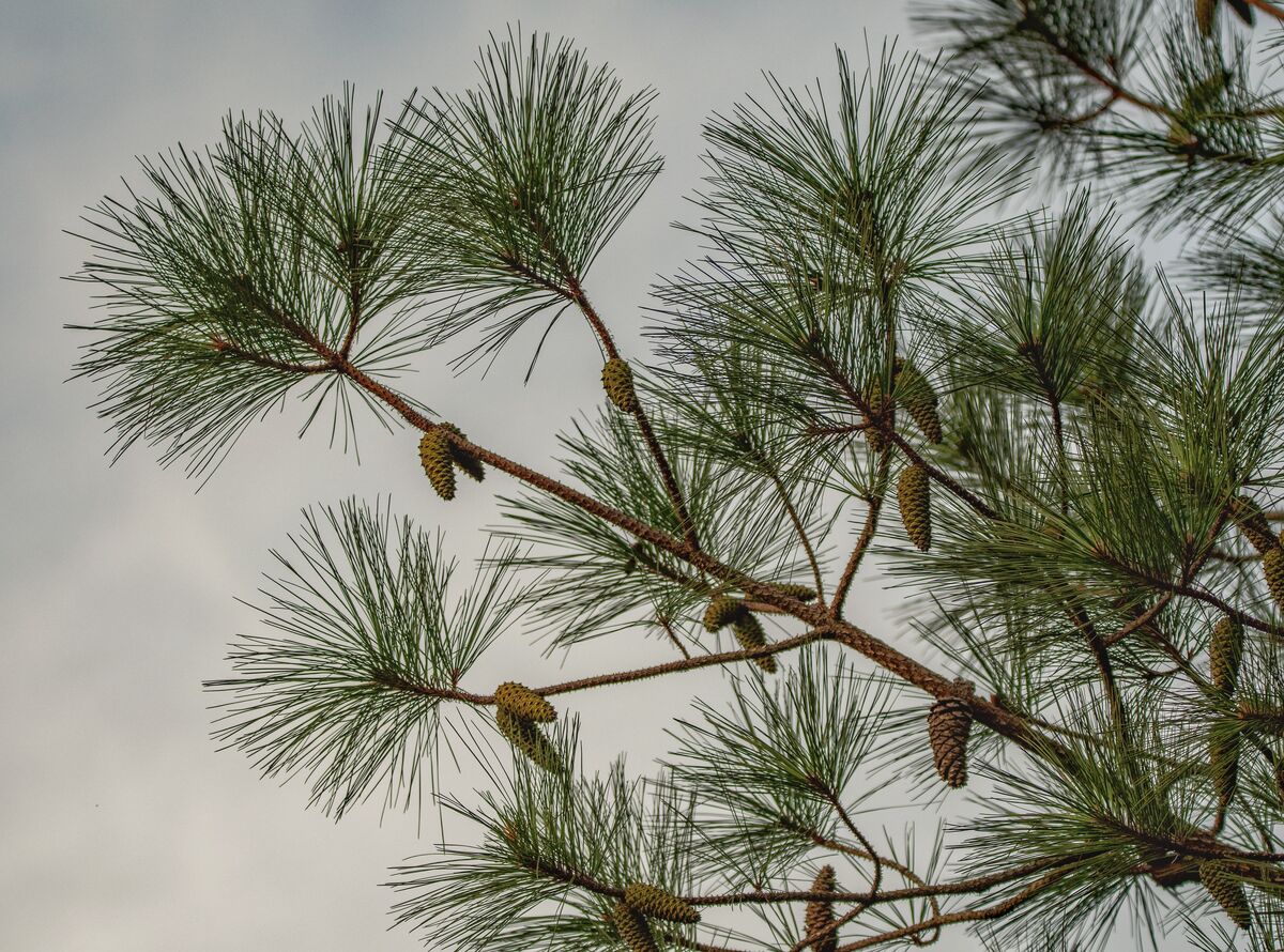
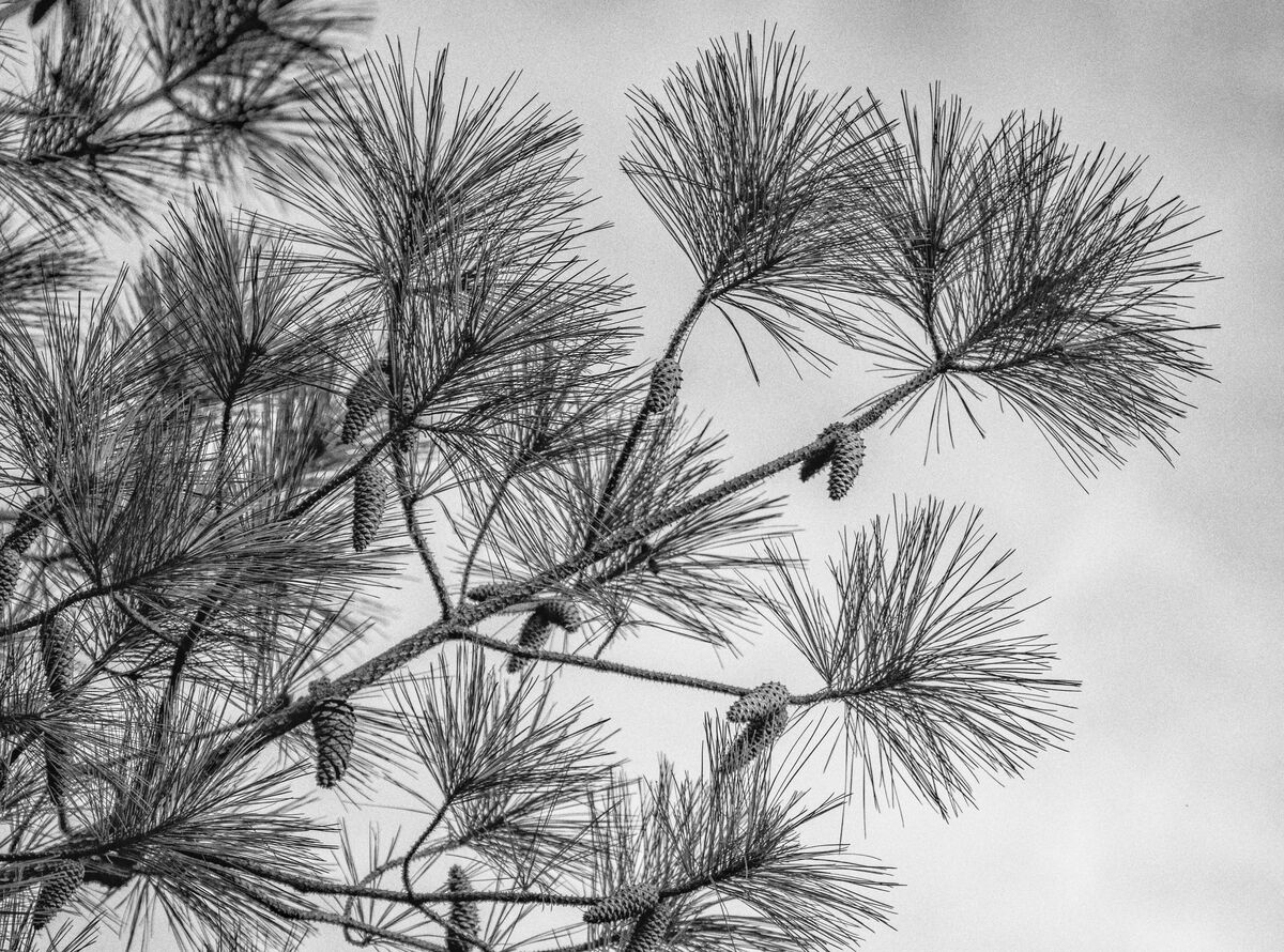
I recently took this photo. Then after processing it, I tried black and white and also flipping it. If you are willing to pick your favorite it may be interesting. I will tell you which shot was the original at a later time. Thank you.
Taken with a Sigma 150-600 C on a Nikon D7500.
Taken with a Sigma 150-600 C on a Nikon D7500.
Aug 22, 2022 07:50:40 #
Aug 22, 2022 08:03:57 #

Aug 22, 2022 08:07:27 #

I like the b&w a lot. There is a nice contrast between sky and needles, and the textures of the cones provide additional interest. I slightly prefer the branch facing left rather than right. The right-facing branch leads my eye to upper right corner - the edge of the frame.
But there's a little more to this preference in that I've always preferred space before a subject rather than after, when viewing left to right. I've hosted a couple of topics on flipping images that have helped me figure out that the anticipation of getting to the subject through empty space is more enjoyable than having it all "up front" and being left with nothing In your case, of course, there is very little empty space either way.
But there's a little more to this preference in that I've always preferred space before a subject rather than after, when viewing left to right. I've hosted a couple of topics on flipping images that have helped me figure out that the anticipation of getting to the subject through empty space is more enjoyable than having it all "up front" and being left with nothing
In your case, of course, there is very little empty space either way.Aug 22, 2022 08:21:29 #

I prefer numbers one and four.
Not sure if it's because we read from left to right or what.
I just find the "flow" more appealing, liking both the B&W and color.
(My web site has some flipping examples.)
Not sure if it's because we read from left to right or what.
I just find the "flow" more appealing, liking both the B&W and color.
(My web site has some flipping examples.)
Aug 22, 2022 08:30:51 #

1 and 4 for me.
--Bob
--Bob
deanfl wrote:
I recently took this photo. Then after processing it, I tried black and white and also flipping it. If you are willing to pick your favorite it may be interesting. I will tell you which shot was the original at a later time. Thank you.
Taken with a Sigma 150-600 C on a Nikon D7500.
Taken with a Sigma 150-600 C on a Nikon D7500.
Aug 22, 2022 08:58:03 #

deanfl wrote:
I recently took this photo. Then after processing it, I tried black and white and also flipping it. If you are willing to pick your favorite it may be interesting. I will tell you which shot was the original at a later time. Thank you.
Taken with a Sigma 150-600 C on a Nikon D7500.
Taken with a Sigma 150-600 C on a Nikon D7500.
1, 4, 3, 2 in that order. Had it been shot in some light with contrast I would have preferred the B&W conversions. I nearly always choose images with bottom left to upper right. Unless of course it is a documentary picture or a recognizable location. Then I leave it as is and would not flip. I usually leave flat, overcast or cloudy conditions for plant and flower close-ups and macros. I like your "images" in general there.

Aug 22, 2022 11:07:48 #

I like #2 because I think the image lends itself to B&W and I like to be brought into the image rather than being led out of the image. I do agree with other posters that this image begs for more contrast and I would like to see a bit more texture in the sky.
Aug 22, 2022 17:13:49 #

deanfl wrote:
I recently took this photo. Then after processing it, I tried black and white and also flipping it. If you are willing to pick your favorite it may be interesting. I will tell you which shot was the original at a later time. Thank you.
Taken with a Sigma 150-600 C on a Nikon D7500.
Taken with a Sigma 150-600 C on a Nikon D7500.
💚💚💚💚
Aug 23, 2022 08:56:39 #

Aug 23, 2022 10:35:27 #

I like them all, actually. I do think they give different emotive results. Going from lower left to upper right is supposed to be "uplifting" in our culture. For those who read opposite, I assume the opposite would be true. I think the B&W accentuates the detail in the cones better than the colour.
Aug 23, 2022 12:12:55 #
First of all thank you all for taking the time to view the photos and especially if you picked a favorite or commented.
Here is how the voting looks right now:
1. Color:open space on right(5 votes)
2. Black & White: open space on left(3 votes)
3. Color: open space on left(no votes)
4. Black & White:open space to right(2 votes)
The original photo was #3, which got no specific votes as the favorite(color:open space on left).
If anyone cares I agree with AzPic Lady…..I like them all.
Lessons learned? Try both black and white and flipping. Someone may like each better than the original.
Aug 23, 2022 12:28:33 #

Aug 23, 2022 12:33:23 #
Aug 23, 2022 17:38:19 #
If you want to reply, then register here. Registration is free and your account is created instantly, so you can post right away.