Intensity of the picture
Aug 15, 2022 23:38:19 #
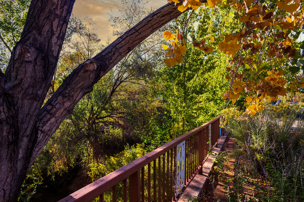
I would be curious to know if the majority of people think the colors in this picture are too intense or too dark, too heavily saturated.
Thanks in advance
Thanks in advance
Aug 16, 2022 00:01:12 #

gener202002 wrote:
I would be curious to know if the majority of people think the colors in this picture are too intense or too dark, too heavily saturated.
Thanks in advance
Thanks in advance
We all have our personal likes and dislikes. Therefore, all opinions will be subjective. My personal opinion is that the image is indeed a bit oversaturated. Nevertheless, a consensus will give you a more definitive answer.,

Aug 16, 2022 00:32:53 #
Aug 16, 2022 02:03:11 #
Aug 16, 2022 03:06:50 #
just a wee bit, but that will vary with the ambient lighting ... looking at it on eth computer is one deal... a print would be much different.
don't worry too much about the consensus... there was a "consensus" that the world was flat
don't worry too much about the consensus... there was a "consensus" that the world was flat
Aug 16, 2022 05:17:10 #

gener202002 wrote:
I would be curious to know if the majority of people think the colors in this picture are too intense or too dark, too heavily saturated.
Thanks in advance
Thanks in advance
I would say slightly over saturated, mainly due the the pink tint on the tree bark.
Aug 16, 2022 05:35:17 #

gener202002 wrote:
I would be curious to know if the majority of people think the colors in this picture are too intense or too dark, too heavily saturated.
Thanks in advance
Thanks in advance
To my thought, just slightly oversaturated, and again, the color not right - too pink. The real question is, though, what did YOU SEE when you snapped the shutter (assuming you want an exact representation). It's a pretty area!
Loren - in Beautiful Baguio City
Aug 16, 2022 06:01:58 #
Aug 16, 2022 06:35:57 #

Aug 16, 2022 07:07:09 #
BurghByrd
Loc: Pittsburgh
The clouds look a little weak by comparison but I do like the effect. Apparently this is the minority voice.
Aug 16, 2022 07:29:54 #
For me the colors aren’t the issue. To my eye it’s just too “busy”…to much stuff in the frame.
Aug 16, 2022 07:30:57 #

As with the deep blue skies of areas without humidity, appreciation of ruch autumn colors and greenery will depend on where you live. The fake sky is the weak point here and detracts from the pretty scene in several areas where it didn't blend correctly.
Aug 16, 2022 07:46:30 #

The answer depends in part on how you wish to express this scene to impress the eye of the viewer.
As presented here, image composition, not coloration, goes to the traditional concern for an unambiguous main subject. In this approach, the tree limbs dominate and compete with the fence line amid an array of wild vegetation. My eye picks up the plant life as the most attractive aspect of the image. These three elements, however, produce a visual imbalance.
You as the photographer must decide the main subject and then compose for its most effective arrangement within the frame.
My eye tells me the colors as exposed give a sense of place and speak to a mood resulting from apprehending natural life. This response then calls for removing the tree limbs as a distraction. Leaving the fence line in the frame provides a contrast between the natural and the artificial. This contrast itself could become the main subject.
gener202002 wrote:
I would be curious to know if the majority of people think the colors in this picture are too intense or too dark, too heavily saturated.
Thanks in advance
Thanks in advance
Aug 16, 2022 09:13:41 #

Its a beautiful composition. The intensity is up to your personal taste. I find it attractive.
Aug 16, 2022 09:24:36 #
StanMac
Loc: Tennessee
gener202002 wrote:
I would be curious to know if the majority of people think the colors in this picture are too intense or too dark, too heavily saturated.
Thanks in advance
Thanks in advance
Looks ok to me but the wood rail and tree bark seems a bit too magenta to me. Could be my iPad display or my eyes (they ain’t what they used to be).
Stan
If you want to reply, then register here. Registration is free and your account is created instantly, so you can post right away.