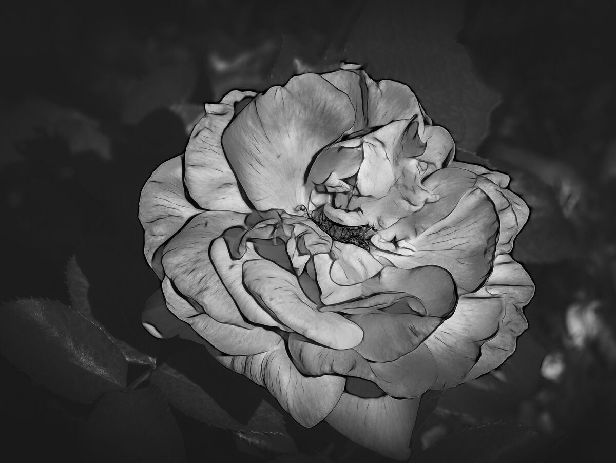
A Rose In B&W
Aug 11, 2022 19:15:49 #
First processed in DeNoise AI, then to ACR to adjust highlights and shadows and to add some texture. Next to NIK Silver Efex Pro for B&W conversion. All comments and suggestions welcome. This B&W stuff is not near as easy as one would expect
Aug 11, 2022 19:57:36 #


Aug 12, 2022 00:05:36 #
Aug 12, 2022 05:22:18 #

The delicate colors of a Rose do a lot more for me.
Sorry, but I find the B&W version quite ugly.
Sorry, but I find the B&W version quite ugly.
Aug 12, 2022 07:21:40 #
Curmudgeon wrote:
First processed in DeNoise AI, then to ACR to adjust highlights and shadows and to add some texture. Next to NIK Silver Efex Pro for B&W conversion. All comments and suggestions welcome. This B&W stuff is not near as easy as one would expect
Sorry but I agree with Delderby. Thanks BE SAFE!!
Tom
Aug 12, 2022 08:22:39 #

When I read the title, before I saw the photo, I didn't think it would look good. But after seeing the photo, in my estimation it looks great. The outline around the petals does the trick. Kudos.
Aug 12, 2022 08:26:32 #

Aug 12, 2022 08:29:33 #

Aug 12, 2022 09:22:35 #

Aug 12, 2022 11:56:36 #

Ok folks, HipCoyote, Administrator here. The intent of this section is to provide critique, both pro and needs improvement. Let's try to avoid the Photo Gallery-esq "nice shot" comments. What is good about the photo and what could be better..if anything? Also, in this case, the OP allows downloads...do you see anything you can change or improve on?
Aug 12, 2022 12:02:51 #
Aug 12, 2022 12:35:41 #

Aug 12, 2022 12:49:38 #
Greg from Romeoville illinois
Loc: Romeoville illinois
I like the stark nature of it but was wondering what would happen if you added a blush color back in after the fact. I think it would stand out even more.
Aug 12, 2022 12:53:53 #

First the negatives. I usually go for this sort of high contrast, high crunch approach, but I find this one a bit off for me, and I'm wondering what it is I don't like. I think it's the very dark shadows thrown by each petal onto the next, so I'm guessing I'd like it better if the darkest blacks around the petals were lightened just a bit, or maybe just reduce the contrast in the flower more generally. And if you don't mind my picking a couple of nits, the brighter spots in the lower right distract my eye a bit from the flower, and I think I'd prefer a little closer crop from the right.
So much for the negatives. Overall, I'd call this a very encouraging first run at it, and I'd expect that my problems could be resolved, leaving me loving it.
So much for the negatives. Overall, I'd call this a very encouraging first run at it, and I'd expect that my problems could be resolved, leaving me loving it.
Aug 12, 2022 14:31:05 #
Delderby wrote:
The delicate colors of a Rose do a lot more for me.
Sorry, but I find the B&W version quite ugly.
Sorry, but I find the B&W version quite ugly.
Don't be sorry, I asked for honest comments and that's what you gave
If you want to reply, then register here. Registration is free and your account is created instantly, so you can post right away.