second effort at Architectural Photography
Aug 10, 2022 13:08:45 #

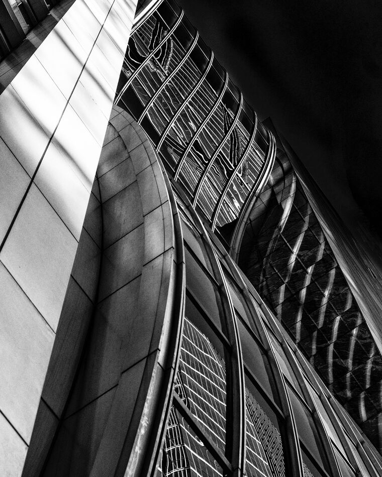
this is a second image that I thought was a "keeper". Any thoughts on how I could improve this? I am thinking of printing it.
Aug 10, 2022 15:10:10 #
This, and your previous post, are very captivating -- technically perfect. I would categorize them as "Urban Patterns" or "Urban and environmental art" -- as a detail of a building, not a portrait of a building on their own. As an architect, I would love to see these shots as part of a series that more fully documents the whole.
Aug 10, 2022 16:37:38 #
Thanks, I very much like the phrase "urban patterns." It's the abstraction that I find visually appealing
Aug 10, 2022 18:00:09 #
I'd love to see more from you... How about posting in our "Traditional Street and Architectural Photography" section?
Aug 10, 2022 18:05:01 #
mallen1330 wrote:
I'd love to see more from you... How about posting in our "Traditional Street and Architectural Photography" section?
Will do! I'll start with one now...
Aug 11, 2022 07:49:14 #

Both of the images you posted (this and the previous post) are very nicely done!
Aug 11, 2022 08:18:51 #

The white is overwhelming... perhaps crop to the gray tones portion of the photo only; that's where all the action is. That portion of the photo I find to be an intriguing complex visually that sucks you into a machine. 

Aug 11, 2022 09:12:52 #

I like it. I like shots that make me look around and try to figure out what is happening. I’m this case I do get a little stock on the dark triangle in the upper left. But not a biggie
I am also interested to see what other shots you have of this building or similar.
I am also interested to see what other shots you have of this building or similar.
Aug 11, 2022 16:57:19 #
TheShoe
Loc: Lacey, WA
dpullum wrote:
The white is overwhelming... perhaps crop to the gray tones portion of the photo only; that's where all the action is. That portion of the photo I find to be an intriguing complex visually that sucks you into a machine.
Is it the white, or is it the rectangles that are the problem? If it is the white, would selectively toning down the highlights in that area work? Personally, I do not object to the existence of that area. If it were my picture, I would try toning it down to see whether I liked it better.
Aug 11, 2022 17:07:11 #
MrMophoto
Loc: Rhode Island "The biggest little"
Both photos are well worth printing. My fav is the second, great contrasting patterns and forms, nicely diagonal composition.
For the first photo I think the most intriguing part is the lighter area in the background, it adds a surreal aspect to the image.
For the first photo I think the most intriguing part is the lighter area in the background, it adds a surreal aspect to the image.
Aug 12, 2022 18:25:25 #

Aug 15, 2022 17:36:45 #
RickH wrote:
this is a second image that I thought was a "keeper". Any thoughts on how I could improve this? I am thinking of printing it.
Verybintriguing. I would go tighter to lose the vast white-ish stone section. Theres plenty going on in the remaining section.
If you want to reply, then register here. Registration is free and your account is created instantly, so you can post right away.