new to Architectural Photography -- constructive criticism please
Aug 10, 2022 13:05:54 #

Last weekend I did a fabulous workshop, one day out in the field and one day post processing. Here are some of my results and I would welcome constructive criticism
Aug 11, 2022 08:37:53 #

I really like this photo... eye grabbing... you Rick perhaps see what others do not see... that separates amatures from the eternal.
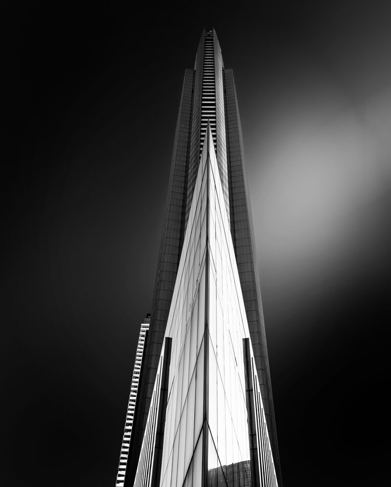
This photo is not of our modern era... it is a classic Art Deco... an excellent example. "The main characteristics of Art Deco architecture are its sleek, linear, often rectangular geometric forms arranged and maybe broken up by curved ornamental elements."
https://www.designingbuildings.co.uk/wiki/Art_Deco
This photo is sticking ... high impact... well done. How would I change it:
1 make sure the vertical central line is truly 90*
2 Do another with black at the top is equal left and right .. the bottom black appears to be. That top/bottom unequal appearance may be why I mentioned checking 90* in comment 1
3 Do an alternative with the base of the building snug to the right border so there is a competition of negative space dark with the white.
Aug 11, 2022 08:56:12 #
dpullum wrote:
I really like this photo... eye grabbing... you Ri... (show quote)
thanks! all good points
Aug 11, 2022 09:14:36 #

This has the potential to be a very good shot. I like the building and the black and white presentation.
To improve then shot perhaps darken the background completely. The uneven background with the lighter background feature on the right detracts from the scene.
To improve then shot perhaps darken the background completely. The uneven background with the lighter background feature on the right detracts from the scene.
If you want to reply, then register here. Registration is free and your account is created instantly, so you can post right away.