Post storm clouds
Aug 7, 2022 12:24:44 #
jpgto
Loc: North East Tennessee
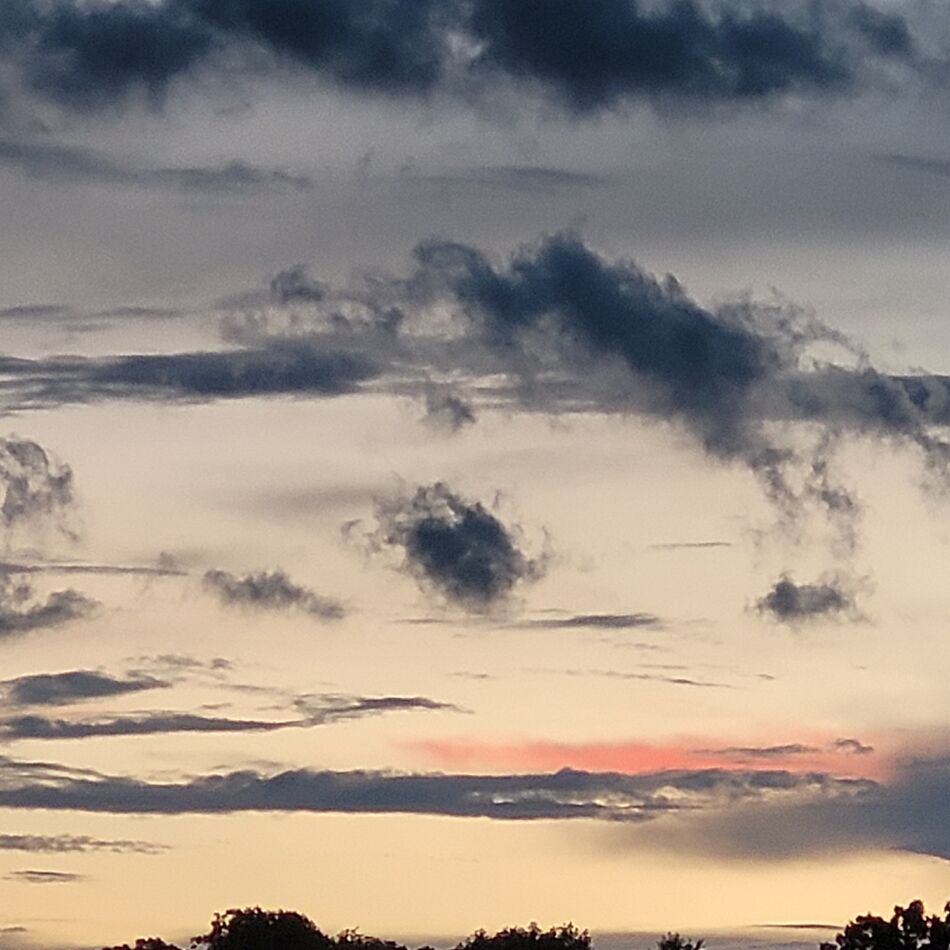
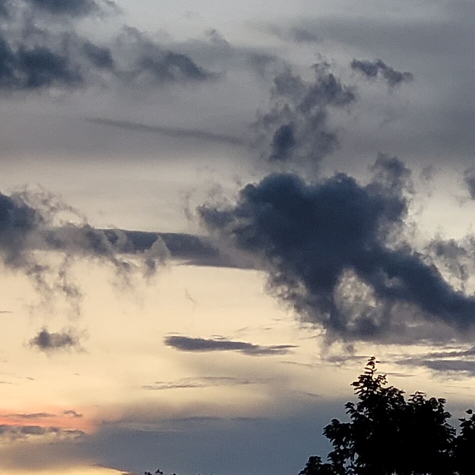
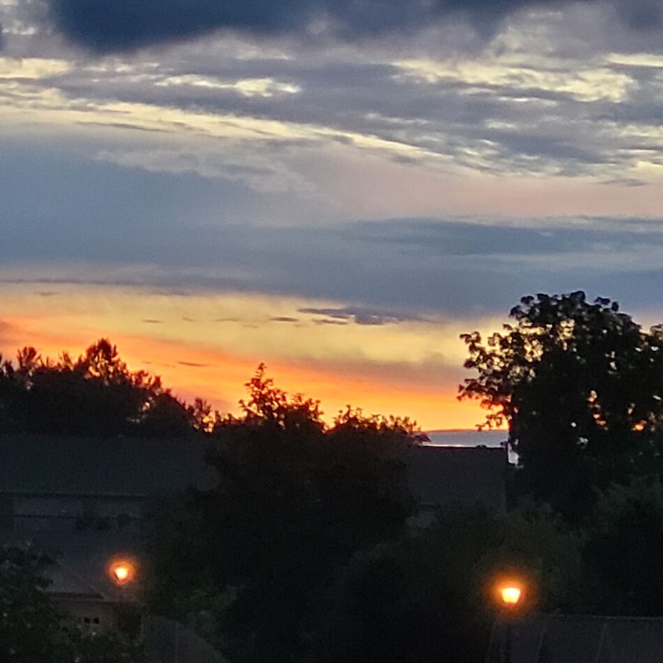
During our evening walk between rain drops the clouds became appealing so I took the opportunity with the Samsung G20fe cell phone and these are the result.
Taken in the Village in Gray, TN.
Please enjoy.
Taken in the Village in Gray, TN.
Please enjoy.
Aug 7, 2022 12:47:43 #

The first two are great shots. Very, very nice.
The last one, IMHO, not so much. The lights at the bottom are an unneeded distraction and the centered horizon doesn't help. Try cropping it just above the light on the left. Makes a much better image. Again, just my opinion. Your results may vary.
The last one, IMHO, not so much. The lights at the bottom are an unneeded distraction and the centered horizon doesn't help. Try cropping it just above the light on the left. Makes a much better image. Again, just my opinion. Your results may vary.
Aug 7, 2022 12:48:03 #

Aug 7, 2022 13:21:22 #
jpgto
Loc: North East Tennessee
stanikon wrote:
The first two are great shots. Very, very nice.
The last one, IMHO, not so much. The lights at the bottom are an unneeded distraction and the centered horizon doesn't help. Try cropping it just above the light on the left. Makes a much better image. Again, just my opinion. Your results may vary.
The last one, IMHO, not so much. The lights at the bottom are an unneeded distraction and the centered horizon doesn't help. Try cropping it just above the light on the left. Makes a much better image. Again, just my opinion. Your results may vary.
I agree not happy with the lamp posts. Thanks for stopping by and expressing your thoughts.
Aug 7, 2022 13:22:45 #
jpgto
Loc: North East Tennessee
UTMike wrote:
Nice set, Jeff!
Thanks Mike. The cloud formations here are amazing at times. Y'all can wait a couple of minutes and it all
changes!!!
Aug 7, 2022 13:24:57 #
gmontjr2350
Loc: Southern NJ
jpgto wrote:
During our evening walk between rain drops the clouds became appealing so I took the opportunity with the Samsung G20fe cell phone and these are the result.
Taken in the Village in Gray, TN.
Please enjoy.
Taken in the Village in Gray, TN.
Please enjoy.
Love cloud action! Well-captured!
George
Aug 7, 2022 13:28:42 #

Aug 7, 2022 17:18:42 #
jpgto
Loc: North East Tennessee
gmontjr2350 wrote:
Love cloud action! Well-captured!
George
George
Thank you George. Glad you enjoyed.
Aug 7, 2022 17:19:28 #
Aug 9, 2022 22:17:05 #

jpgto wrote:
During our evening walk between rain drops the clouds became appealing so I took the opportunity with the Samsung G20fe cell phone and these are the result.
Taken in the Village in Gray, TN.
Please enjoy.
Taken in the Village in Gray, TN.
Please enjoy.

Aug 10, 2022 18:55:33 #
Aug 11, 2022 15:44:00 #

Aug 11, 2022 15:57:32 #
jpgto
Loc: North East Tennessee
Sylvias wrote:
Excellent set Jeff love those wispy clouds. 
Why Thank you Sylvia. Wait a couple of minutes...they change!!!! LOL
Aug 11, 2022 15:58:31 #
jpgto wrote:
Why Thank you Sylvia. Wait a couple of minutes...they change!!!! LOL

If you want to reply, then register here. Registration is free and your account is created instantly, so you can post right away.