Check out Black and White Photography section of our forum.
Monochrome help.
Jul 12, 2022 13:39:00 #

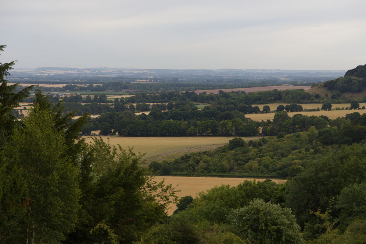
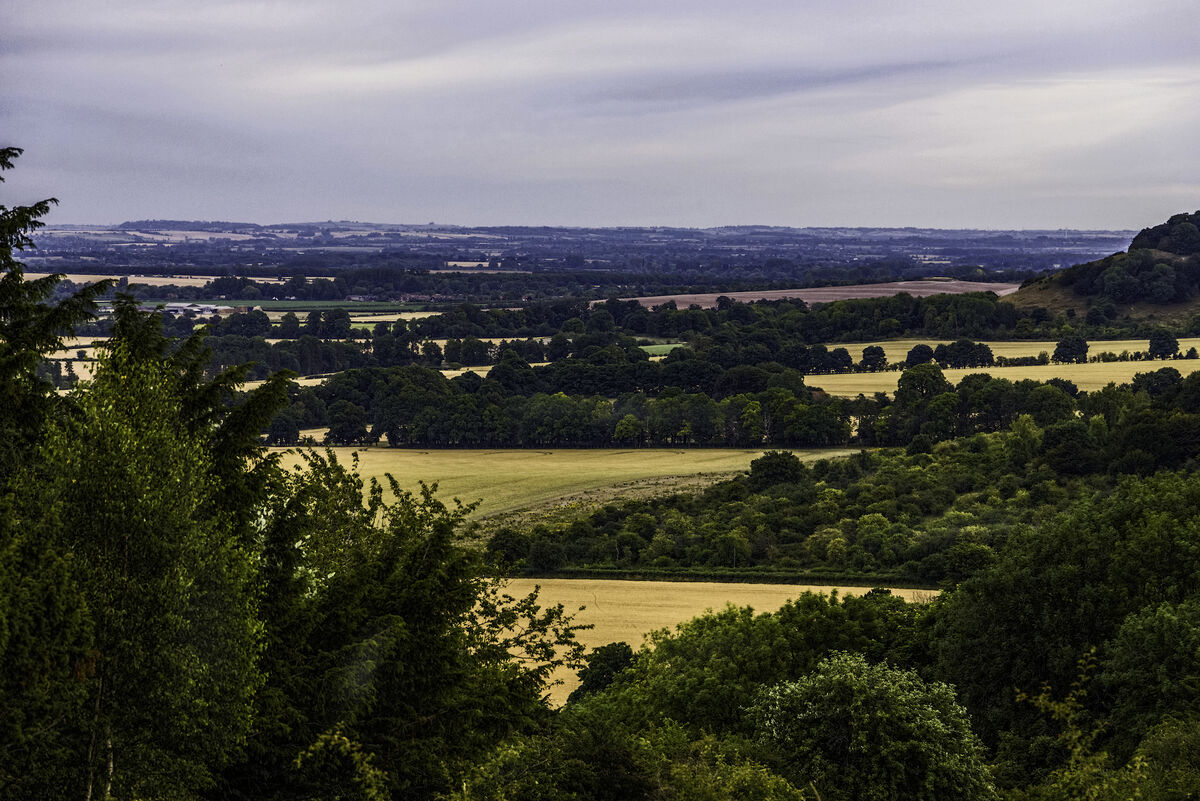
A while back I posted a couple of monochrome images inspired by the skies of rmalarz (I've been rmalarzing).
http://www.uglyhedgehog.com/t-735049-3.html
I soon realised that the real trick with monochrome is to get some life into a flat scene.
A warm, sultry, overcast morning gave me a chance to snap something from the same area to try with.
Comments please on my efforts (all done in AFFINITY) and feel free to have a stab at the original so long as you tell me what you've done and how you've done it.
thanks.

Jul 12, 2022 13:45:51 #
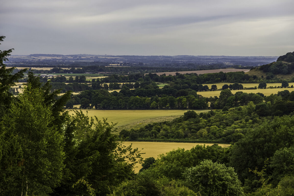
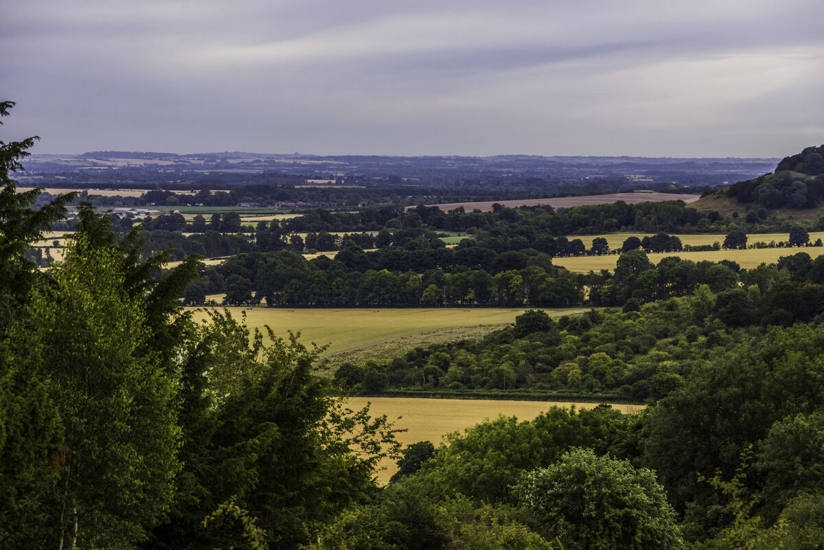
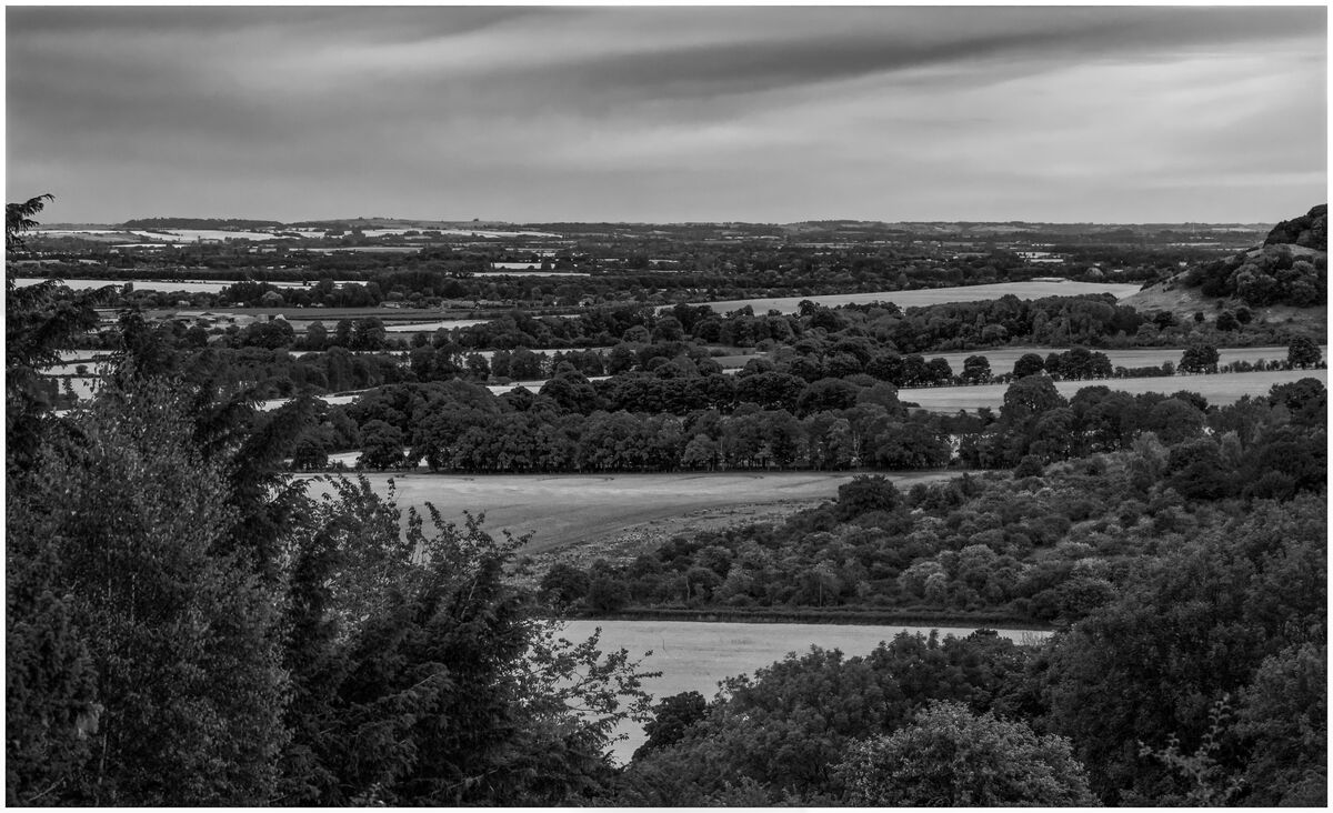
I think it looks a little better on UH. Using AFFINITY I went B&W and played with the sliders, added a bit of brightness and contrast, closed up on the histogram and added a bit on the gamma slider.
It may be me, but I don't seem to be able to get a good reproduction to the crop fields. I toned them down with the burn brush on an 85% opacity and I did a similar sweep over the sky.
It may be me, but I don't seem to be able to get a good reproduction to the crop fields. I toned them down with the burn brush on an 85% opacity and I did a similar sweep over the sky.
Jul 12, 2022 15:35:20 #

John, IMO you don't have enough detail in the clumps of trees. Rather than brightness and contrast, try levels or curves to tweak the tones more selectively.
I did this edit with Nik Silver Efex. I think I tried b&w when I was attempting to learn Affinity, but don't recall. I am now where I have to decide whether to purchase the newest Nik Collection for $150 (I've already gone back to my tried and true PS Elements ). There is no denying that Silver Efex is very, very powerful, as you can see below by screenprints of most of the tools.
I converted your original using many of the sliders available, doing small adjustments at a time.
btw, I didn't bother trying to do any dehaze or intense sharpening; this exercise was more about tonal range and using color filters to enhance or subdue the yellows, greens and reds.
I did this edit with Nik Silver Efex. I think I tried b&w when I was attempting to learn Affinity, but don't recall. I am now where I have to decide whether to purchase the newest Nik Collection for $150 (I've already gone back to my tried and true PS Elements
). There is no denying that Silver Efex is very, very powerful, as you can see below by screenprints of most of the tools.I converted your original using many of the sliders available, doing small adjustments at a time.
btw, I didn't bother trying to do any dehaze or intense sharpening; this exercise was more about tonal range and using color filters to enhance or subdue the yellows, greens and reds.


Jul 12, 2022 15:51:05 #
Selective dodge and burn of my first edit (reduced file size for this post):

Jul 12, 2022 22:44:17 #

John, to start with, I saved the original photograph as a .tif file. I opened that in Adobe Camera RAW (ACR). I changed the brightness downward just a bit, increased the contrast to about 33%, changed the Hightlights downward, changed the Shadows upward, then adjusted the Whites to just below blowing out, adjusted the Blacks downward to add just a bit of shadows. (1)
In Photoshop (Ps), I corrected for hue contamination, then applied a bit of pre-sharpening (2). I then applied masks to isolate the different luminance levels and adjusted each level to suit (3). I think applied a darken the edges, and added a mild selenium toning (4).
In Photoshop (Ps), I corrected for hue contamination, then applied a bit of pre-sharpening (2). I then applied masks to isolate the different luminance levels and adjusted each level to suit (3). I think applied a darken the edges, and added a mild selenium toning (4).
John N wrote:
A while back I posted a couple of monochrome image... (show quote)

Jul 13, 2022 02:38:45 #
With the presentation of these two editions I can see immediatley where I've gone wrong. I think.
I've gone for a far to contrasty look, losing detail in the trees and taking the crop away from the fields.
Both have used editors I don't have but with clear instructions I'm in with a chance of replicating thier work.
I have the benefit of seeing the scene for real, and feel my original goes someway to conveying the heavy atmosphere but still falls a bit flat.
Somewhere between the two is what I'll be aiming and using notes from both Linda and Bob I'll be doing some revisions later and hopefully posting my revisions here. I think Linda has more details in the trees and an overall brighter image whereas Bobs has a later in the day, perhaps even cooler look to it.
I would have been very pleased to have produced either of these without having to ask for help.
Plenty of time for further comments / suggestions / revisions as I'm on Chauffeur duties this morning. And getting ready for tonights Supermoon - although our forecast is a bit iffy. Fingers crossed.
Jul 13, 2022 09:50:27 #
Guyserman
Loc: Benton, AR
Linda From Maine wrote:
Selective dodge and burn of my first edit (reduced file size for this post):
Linda From Maine, you are the queen of black and white.
Check out Astronomical Photography Forum section of our forum.
Jul 13, 2022 10:42:49 #
Guyserman wrote:
That's very kind of you, but I'm just channeling what I've learned on UHH and have a long path ahead still Linda From Maine, you are the queen of black and white.
In the meantime, I just discovered some exciting news: we finally have a UHH section dedicated to black and white:
https://www.uglyhedgehog.com/s-140-1.html
.
Jul 13, 2022 11:17:19 #

John N wrote:
.....I've gone for a far to contrasty look, losing detail in the trees and taking the crop away from the fields.....
I don't think your approach was wrong, but I do think your application of the idea needs tweaking. B&W is all about contrast, and when it's done properly, contrast should never cause a loss of detail - in fact it should do the opposite.
Contrast means increasing the difference between darks and brights, but in the process of doing that it's possible to force the darks into becoming too heavy and solid, and forcing the brights into becoming too harsh. Both of those effects can result in a loss of detail. It might seem a bit counterproductive to add contrast and then lower the highlights and brighten the shadows, but it's all about finding balance, and when you do that the result will look balanced but at the same time the details will be more visible, and overall the image will have more contrast.
In this situation, flat is the opposite of contrasty and adding more contrast is the thing to do. However, in your edit the darks are pushed just a bit too far and are on the verge of becoming too solid and heavy (i.e. too dark). In my edit below I added overall contrast and lifted the shadows to reveal more detail. Apart from lowering the highlights for the fields and adding a bit of sharpness for texture, I didn't think they needed much else. Mushy mid-grey isn't a good look for them so I moderated the darkening just enough to take away the harshness.
I thought your edit was about 90% right so I edited your edit rather than starting from scratch. B&W is all about contrast but because the luminosity spectrum is limited (black at the dark end and white at the bright end), there's a limit to how much contrast can be added to an image. The challenge then becomes where on the luminosity spectrum to add the contrast for the best effect and doing that without losing details in the shadows and (to a lesser extent) the highlights. It's also possible to cheat by adding contrast locally via selections
 .
..
Jul 13, 2022 11:40:07 #

You guys are great and this tutorial/thread is an illustration of why UHH is so helpful.
Jul 30, 2022 21:11:47 #
John N wrote:
A while back I posted a couple of monochrome image... (show quote)
There is a lot of really good information in this thread; and I don't think I have much to add to that other than finding a white point and a black point. When I Process digital conversions or black an white film images, I use the black and the white sliders in Lightroom and find the point just before they are clipping. That gives me a ranged from almost pure black to almost pure white. For me that is a good starting point.
Erich
If you want to reply, then register here. Registration is free and your account is created instantly, so you can post right away.
Check out Street Photography section of our forum.