Pond Scene (fantasy)
Jul 10, 2022 17:46:17 #

Feedback welcomed.
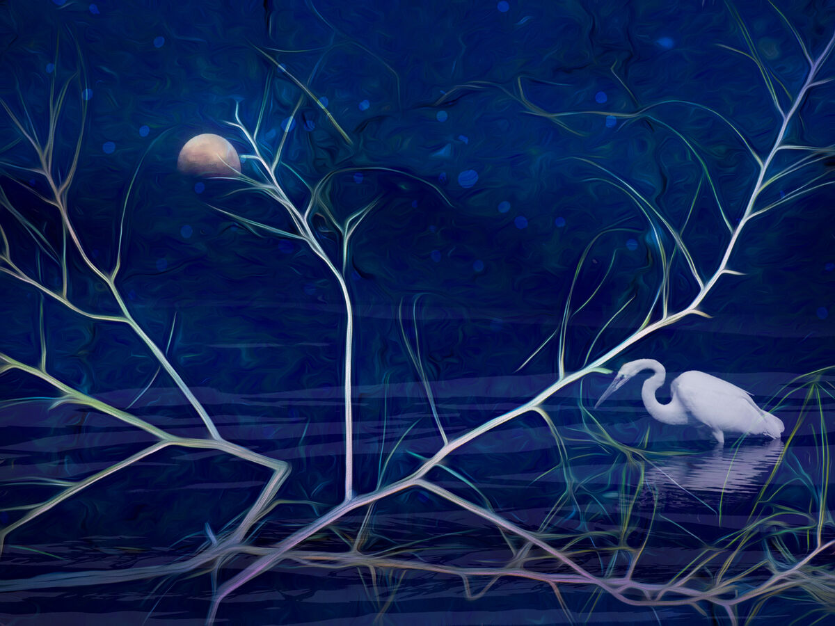
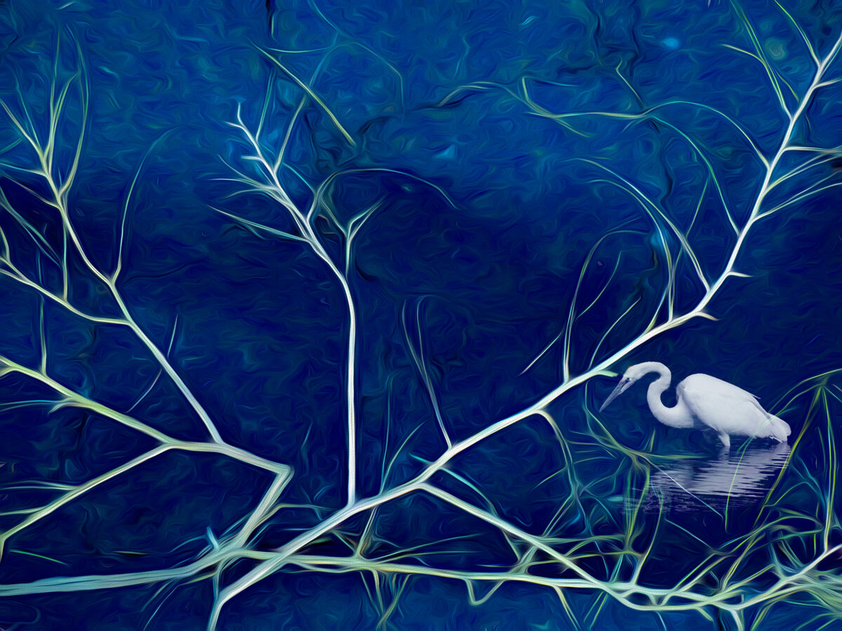
I couldn't decide between #1 and #2 - and tomorrow may find me with 3 or 4
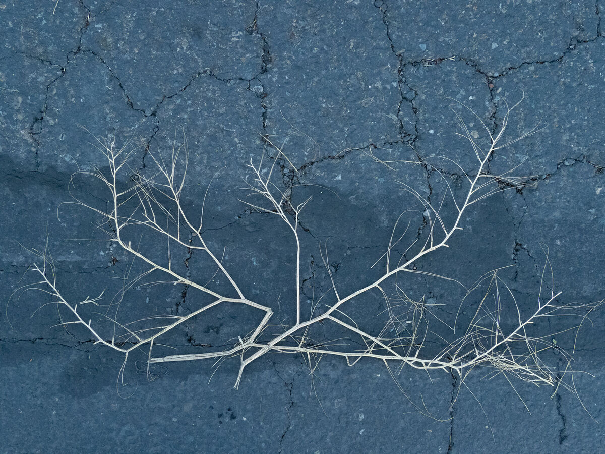
Also attached is the photo I started with. I call this "harvesting pixels" per MinnieV's term a few years ago. The design of the flattened dead weed lying on the pavement caught my eye, so I photo'd!
The bird is a brush, the primary design is a preset from Studio 2, the moon is mine, as is the brush I used to make the patterns in the water.
I couldn't decide between #1 and #2 - and tomorrow may find me with 3 or 4
Also attached is the photo I started with. I call this "harvesting pixels" per MinnieV's term a few years ago. The design of the flattened dead weed lying on the pavement caught my eye, so I photo'd!
The bird is a brush, the primary design is a preset from Studio 2, the moon is mine, as is the brush I used to make the patterns in the water.
Jul 10, 2022 17:54:02 #

Jul 10, 2022 18:09:03 #

Jul 10, 2022 19:30:46 #
Jul 10, 2022 21:24:27 #

Jul 11, 2022 06:34:05 #

Jul 11, 2022 07:41:56 #

Well Done !!! If I were deciding between the 2 of them #2 would be my choice.
Jul 11, 2022 08:10:56 #
I was originally drawn to #2, but in comparison found it too bright, especially the branches which make them the primary focus. #1 sets a better mood with the moon, darker background, and added detail. Great foresight, imagation, and finished product. I would hang it on a wall!
Jul 11, 2022 08:47:38 #
Many thanks to everyone for your time and interest. Lazy J, I very much appreciate your mentioning the bright branches in #2 and the reasons #1 works better for you. It helps a great deal to understand the "why" of other people's preferences.
Jul 11, 2022 09:35:05 #

The colours in #2 seem to hang together better, plus I don't care for the bubbly sky in #1 and the moon isn't quite round. Pinkish moons don't work for me either. Perhaps a fainter and more blue moon would work well in #2.
Jul 11, 2022 09:40:41 #
Linda From Maine wrote:
Feedback welcomed. br br I couldn't decide betwee... (show quote)
Welcome to my world...


Jul 11, 2022 10:51:14 #
Jul 11, 2022 11:15:52 #
Linda From Maine wrote:
Feedback welcomed. br br I couldn't decide betwee... (show quote)
Really excellent
Jul 11, 2022 11:19:09 #

It appears to me that you accomplished what you desired technically in #1.
In MO I like.
In MO I like.
Jul 11, 2022 12:52:52 #
R.G. wrote:
Thanks for the feedback and suggestion, R.G. Gonna try your blue moon!The colours in #2 seem to hang together better, plus I don't care for the bubbly sky in #1 and the moon isn't quite round. Pinkish moons don't work for me either. Perhaps a fainter and more blue moon would work well in #2.
If you want to reply, then register here. Registration is free and your account is created instantly, so you can post right away.