Summer Flowers
Jul 6, 2022 09:54:58 #

Jul 6, 2022 10:38:22 #

I wouldn't have thought to line them up like that, but I find this quite appealing. Red, orange and yellows - such a happy result. And a super textured background!
Jul 6, 2022 11:12:54 #
Linda From Maine wrote:
I wouldn't have thought to line them up like that, but I find this quite appealing. Red, orange and yellows - such a happy result. And a super textured background!
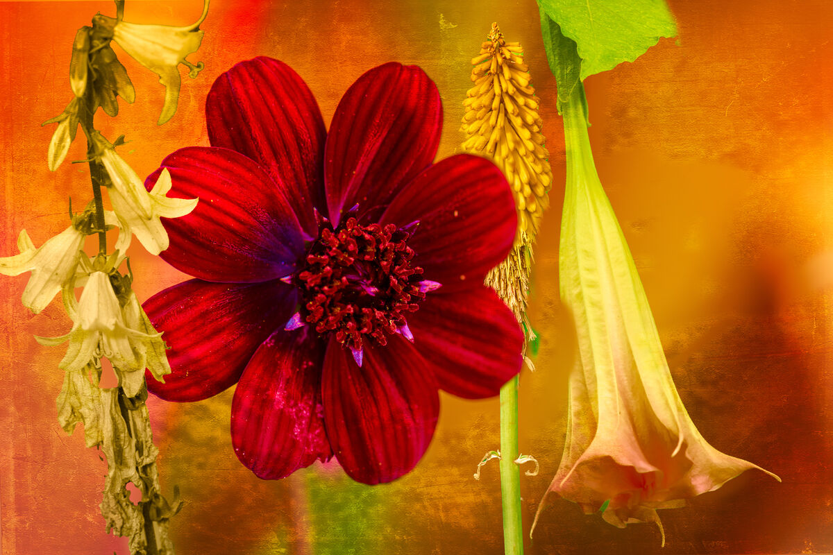
Thanks Linda. The background is part of the base shot of the red flower. I shot it using my new well at least new for me Nikon 105MM macro. I wanted it for a while and it is s refurbished from Nikon and as an added bonus it was on sale. The other three flowers were shot with my Z5 with a 50MM 1.8 lens. I toped it off with a final textured layer.
Jul 6, 2022 11:38:20 #
NJFrank wrote:
I am very glad to hear you gave yourself a nice gift and that it is working well for you!Thanks Linda. The background is part of the base shot of the red flower. I shot it using my new well at least new for me Nikon 105MM macro. I wanted it for a while and it is s refurbished from Nikon and as an added bonus it was on sale. The other three flowers were shot with my Z5 with a 50MM 1.8 lens. I toped it off with a final textured layer.
Jul 6, 2022 12:06:51 #
Cany143
Loc: SE Utah
I can rationalize --or intellectualize, actually-- a number of reasons why it might be thematically/symbolically/metaphorically purposeful for the dominant red flower to be without a stem that 'naturalistically' anchors it within the picture as the stems on the yellow flowers do, but intuitively, I find that it's stemless-ness leaves that flower visually unmoored, and --to me if not to you or others-- unsatisfying.
Several other areas are visually concerning as well: a portion of the left edge of the yellow flower on the right went missing somehow (an over-brushed portion of a mask would be my guess), the bit of bright green that intrudes between the edges of the petal close to the bottom, and at the top of that flower, the soft, undefined edge of a leaf toward the stem edge. Then, on the second (from the right) yellow flower, it's stem intrudes into the petal of the red flower and, again, there's an obscuring bit of green overlaying the lowermost portion of that flower which, though small and somewhat unobtrusive, creates a false visual cue, and obscures what should be textured background.
What Linda calls 'appealing' I'd instead call a bold and pleasantly striking image, and a highly effective use of complimentary colors to good effect. At first blush, these create a visual feast. Though as mentioned above, portions of that feast may not have been completely cooked.
Jul 6, 2022 12:58:57 #
Cany143 wrote:
Once upon a time I could write and speak as eloquently and as effortlessly as you, Jim. Alas, those brain cells are no longer accessible ...What Linda calls 'appealing' I'd instead call a bold and pleasantly striking image, and a highly effective use of complimentary colors to good effect...

Jul 6, 2022 13:15:21 #
Cany143 wrote:
br br Several other areas are visually concernin... (show quote)
Thank you for taking the time to detail how you see this composite. No matter how many times I revisit a composite before posting I seem to miss something. Once you pointed them out, they became very glaring to me. I went back and corrected on those areas that you pointed out to me.
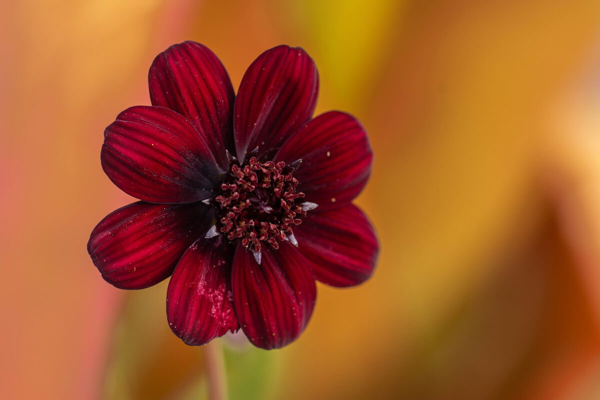
I am attaching the red flower as it was shot. The stem is not very dominate even as a stand alone image. If you look at the composite you can see the stem. Though it is not very dominage.
Once again thanks for your time and effort.
Jul 6, 2022 13:56:49 #

Jul 6, 2022 14:27:56 #
UTMike wrote:
So, you can do pretty as well as weird!
LOL, yeah I am multifaceted.
Jul 7, 2022 06:01:44 #

Jul 7, 2022 07:18:11 #
Jul 7, 2022 08:07:21 #

A very attractive image Frank. Don’t kick yourself too hard over the points raised by Cany, we all miss things like that first time round and I know you’ll correct them. I really like the unusual composition.
Jul 7, 2022 08:49:49 #
magnetoman wrote:
A very attractive image Frank. Don’t kick yourself too hard over the points raised by Cany, we all miss things like that first time round and I know you’ll correct them. I really like the unusual composition.
Thanks, it’s always good to have didn’t eyes viewing am image. When reviewing my flower shots I saw a”theme” so I ran with it. Once those areas were pointed out I corrected them. It was an easy fix
Jul 7, 2022 09:21:29 #

NJFrank wrote:
A composite of four flowers I took over the last week or two.
Very well done. The only issue for me is the size and position of the red flower. It overwhelms the others not only in size but being smack in the center in bold color it "hogs" all the attention. But again, skillfully executed.

Jul 7, 2022 09:39:15 #
FotoHog wrote:
Very well done. The only issue for me is the size and position of the red flower. It overwhelms the others not only in size but being smack in the center in bold color it "hogs" all the attention. But again, skillfully executed.
Thanks, and I understand how you could take the flower as being a hog. The way I see it is in contrast not only in color and shape with the other flowers. The other three are long and narrow, as opposed to round and bold. I even changed the color of the flower on the left from purple so it would fit in color wise with the other three flowers.
If you want to reply, then register here. Registration is free and your account is created instantly, so you can post right away.