Photographing art
Jun 1, 2022 16:27:47 #
Requesting suggestions from Hoggers who are experienced in photographing art - specifically, painting.
There are times that the precise color balance achieved by the artist seems elusive. Using my Nikon D5, I find that very subtle tones in the red-orange spectrum come across as grey in the NEF. Greens are also difficult to nail down. I've tried several combinations of settings, but none of them satisfy either my eye or the artist's. My window is on a high floor facing east. I do my work in the afternoon, taking advantage of daylight. I've adjusted the color temperature settings, to the point of making fine changes in degrees Kelvin, and have experimented with the "set picture control" settings. I have not used bounce flash, nor have I shone pure 5500 degree lamps, since daylight is already in the range of 5500. Suggestions, please. Thank you.
There are times that the precise color balance achieved by the artist seems elusive. Using my Nikon D5, I find that very subtle tones in the red-orange spectrum come across as grey in the NEF. Greens are also difficult to nail down. I've tried several combinations of settings, but none of them satisfy either my eye or the artist's. My window is on a high floor facing east. I do my work in the afternoon, taking advantage of daylight. I've adjusted the color temperature settings, to the point of making fine changes in degrees Kelvin, and have experimented with the "set picture control" settings. I have not used bounce flash, nor have I shone pure 5500 degree lamps, since daylight is already in the range of 5500. Suggestions, please. Thank you.
Jun 1, 2022 16:48:39 #
Traveller_Jeff wrote:
Requesting suggestions from Hoggers who are experi... (show quote)
Window light is a poor choice.
Use artificial light.
Jun 1, 2022 16:49:38 #

To get accurate color, you'll need an X-Rite Color Checker Passport and included software to nail all the colors.
White balance is one thing- getting the colors accurate is another.
Nikon, Canon, Fuji, et al render colors differently- heck, even within the same brand and model there are differences. And lenses affect the outcome as well.
The light will need to be even and consistent while you're shooting.
I use matching flashes (Bowens) in softboxes, one on either side of the artwork.
Color Checker Passport link
How to use the Passport
Jun 1, 2022 19:34:06 #

I do art reproduction frequently. I am assigned this work by museums, galleries, art collectors, and folk who need to send images to art experts for authentication and identification as the first step before actually crating and shipping the art overseas, and for further lithographic reproduction in prints, publications and books.
The method I use is recommended and used by major museums and archives.
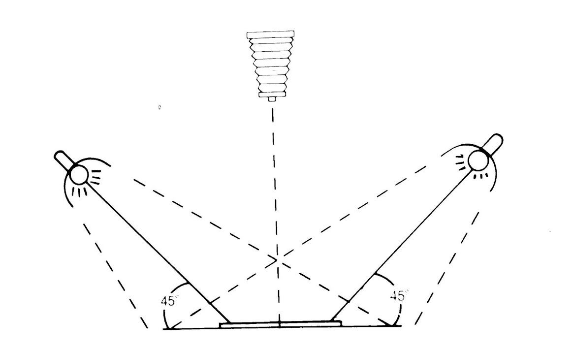
The lighting is electronic flash. The method involves cross-polarization. which entails acetate polarizing filters on the lights and a high-quality circular polarizer on the camera lens.
In most cases, 2 lights are used, each at 45 degrees to the flat artwork and feathered so the beams cross each other.
The filter that is placed over the lights is oriented so they are polarizing in the same direction. My filters are in cardboard frames with orientation marks.
The camera filters rotate until you see the maximum degree of unwanted reflection negation and good colour saturation.
The camera is exactly parallel to the artwork and precisely centred.
Incident light meter readings are made in each corner of the painting- slight distance and feathering adjustments may have to be made to get identical readings, A reading from the center may show as a stop higher but that is OK.
I include a colour bar and gray card strip on the edge of the frame- out of the main field of the painting to assist with colour matching and lithographic reproduction.
Everything on the computer and screen needs to be calibrated.
I use a flat field lens with a known "sweet spot and try to stick that f/stop. Most high-quality norma or slightly longer than normal will usually suffice.
I use this method for everything from miniature paintings to extremely large works. Since the polarizers on the lights and the camera both add neutral density and I want to use a low ISO setting, I use fairly powerful lights. My main kit for studio and location artwork is a 2400 watt/second Speedotron pack and 2 direct lamp heads- no modifiers.
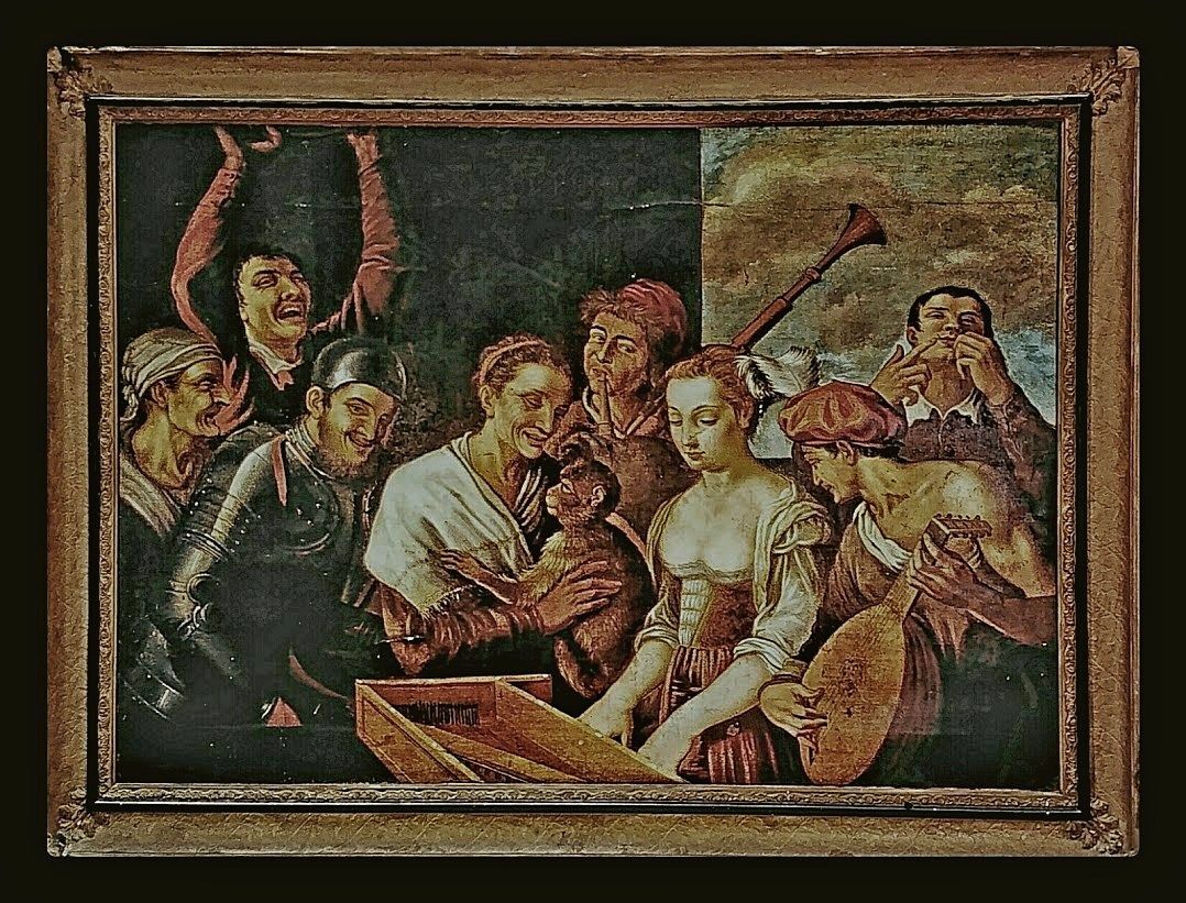
The shot of the oil painting attached here is about 80x100 inches.
This method works equally well on oil paintings, acrylics, watercolours, etchings, pen and ink drawings, etchings, pencil sketches, pastels, and many other graphics. It works especially well on very old works that were done in underpainting techniques (it records the illusion of depth and texture), paintings that are warped with canvas, checked paint or surface damage, and it cuts through Damar varnish and some hazing. It also works effectively if there's glass over the artwork that can not be removed
If the painting is a Bas Relief or you want to show a very deep texture that appears on palette-knife works, there's an interpretive alternative- you simply use one light rather than two.
Electronic flash will provide constant and even colour temperature if both ligh is at the same power and both lamp heads and flash tubes are the same age. Two powerful monolights are also a good basic kit. My backup kit is two older Bowens 1200-watt-second units. Electronic flash can not overheat the artwork
This is not to say that you can never use natural light but it will be difficult to get even well controls light void of unwanted reflections, and consistent colour temperature.
Shot RAW, bracket, and tweak in post-processing.
The method I use is recommended and used by major museums and archives.
The lighting is electronic flash. The method involves cross-polarization. which entails acetate polarizing filters on the lights and a high-quality circular polarizer on the camera lens.
In most cases, 2 lights are used, each at 45 degrees to the flat artwork and feathered so the beams cross each other.
The filter that is placed over the lights is oriented so they are polarizing in the same direction. My filters are in cardboard frames with orientation marks.
The camera filters rotate until you see the maximum degree of unwanted reflection negation and good colour saturation.
The camera is exactly parallel to the artwork and precisely centred.
Incident light meter readings are made in each corner of the painting- slight distance and feathering adjustments may have to be made to get identical readings, A reading from the center may show as a stop higher but that is OK.
I include a colour bar and gray card strip on the edge of the frame- out of the main field of the painting to assist with colour matching and lithographic reproduction.
Everything on the computer and screen needs to be calibrated.
I use a flat field lens with a known "sweet spot and try to stick that f/stop. Most high-quality norma or slightly longer than normal will usually suffice.
I use this method for everything from miniature paintings to extremely large works. Since the polarizers on the lights and the camera both add neutral density and I want to use a low ISO setting, I use fairly powerful lights. My main kit for studio and location artwork is a 2400 watt/second Speedotron pack and 2 direct lamp heads- no modifiers.
The shot of the oil painting attached here is about 80x100 inches.
This method works equally well on oil paintings, acrylics, watercolours, etchings, pen and ink drawings, etchings, pencil sketches, pastels, and many other graphics. It works especially well on very old works that were done in underpainting techniques (it records the illusion of depth and texture), paintings that are warped with canvas, checked paint or surface damage, and it cuts through Damar varnish and some hazing. It also works effectively if there's glass over the artwork that can not be removed
If the painting is a Bas Relief or you want to show a very deep texture that appears on palette-knife works, there's an interpretive alternative- you simply use one light rather than two.
Electronic flash will provide constant and even colour temperature if both ligh is at the same power and both lamp heads and flash tubes are the same age. Two powerful monolights are also a good basic kit. My backup kit is two older Bowens 1200-watt-second units. Electronic flash can not overheat the artwork
This is not to say that you can never use natural light but it will be difficult to get even well controls light void of unwanted reflections, and consistent colour temperature.
Shot RAW, bracket, and tweak in post-processing.
Jun 2, 2022 06:57:53 #
Many of the pigments used in paintings have colors that are well beyond the limited sRGB color space. Using ProPhoto and 16 bits per channel all the way through to a good inkjet photo printer will give you the largest possible color gamut. Of course, for web use, you’ll need to convert down to sRGB.
Jun 2, 2022 07:21:02 #

I do this as part of my service. I use natural, INDIRECT light. One of the contributors to colour shift is the colour of the walls in the room, as they affect the colour of the light. I also explain to my clients that their colour possibilities are infinite while those of a computer are finite. My friend had a painting reproduced by a top national company and they could not match her orange. Reds can be hard, also any colour containing it.
Jun 2, 2022 08:30:28 #
Jun 2, 2022 08:37:43 #
Thank you, E.L. for your extensive explanation. Really impressive. One question: you wrote "I use a flat field lens." Talk more about that. Which camera and, specifically, which lens are you referring to? Your graphic depicts your camera as one of the classic old-style with bellows. As I wrote, I use Nikon gear - have four cameras all in the D series, from D-80 all the way through to the D5 which I recently acquired. I'm just wondering which of the many Nikkor lenses would have the least pincushion/barrel distortion? Lightroom and Photoshop both have means of straightening out those distortions, BUT I've found they aren't perfect. Your thoughts?
Jun 2, 2022 08:53:23 #

I worked with a photographer who specialized in photographing artwork. The giclee prints we made were sold by the artist.
E.L.. Shapiro pretty much nailed the process we used. You can't go wrong if you follow his directions.
--Bob
E.L.. Shapiro pretty much nailed the process we used. You can't go wrong if you follow his directions.
--Bob
Traveller_Jeff wrote:
Requesting suggestions from Hoggers who are experi... (show quote)
Jun 2, 2022 09:01:56 #
E.L.. Shapiro wrote:
I do art reproduction frequently. I am assigned th... (show quote)
IMHO a person possessing a very high skill level may accomplish wonderful things.
They can also plainly explain what, how, and why they accomplished the task to the novice.
E. L. Shapiro, I salute you and the other handful of UHHers that unselfishly share their skill and talents with the rest of us.
Your posted "Lessons" always make me . . . .
Smile,
JimmyT Sends
Bravo Zulu

Jun 2, 2022 10:24:09 #
Traveller_Jeff wrote:
Thank you, E.L. for your extensive explanation. Re... (show quote)
My favourite lens for copy work and art reproduction is the Nikon Micro-NIKKOR 55mm f/2.8 .
I used the view camera in the film days and the diagram is an old one from my files. In the olden days, I use process lenses which are specifically designed for graphic arts and lithographic reproduction. I still have a few that I use via a bellows adaption for very small pieces such as minatur paintings. That lense is razor-sharp with minimal abberations, however, they are difficult to use, some have a maximum operator of f/12.5 and are of very long focal lengths. I have also used reversed enlarging lenses which are intrinsic flat fields.
Most fine lenses for Nikon, Canon, Fuji, Schneider, and Rodenstock will suffice for art reproduction. The better lenses shod not exhibit serious barrel distortion that requires very much post-processg correction. Avoid wide lenses unless the art is paid directly ion a well in narrow rooms, such as in a church or in a situation whereit can not be removed.
Making certain that the camera is parallel to and centred on the artwork will negat any linear distortion or converging lines.
Some of the folks here are concerned with colour accuracy. We use the od disclaimer that Kodak used to pack with its colour films with a few revisions. "The colour generated by electronic/digital photographic equipment, the dyes and pigment in film, inks, and lithographic processes are not precisely the same as this in the paints and other medius in the artwork so there may be some unavoidable minor inaccuracies in some colours"
We never get any complaints from cleits, or lithograph printing companies.
In the film days, there were some issues with ultraviolet fluorescence in some paints- certain pain and pigment would reproduce with a blue or cyan case because of UV brighteners in the paint. The UV content in electron flash wod activate the effect and a UV-16 filer on the lights and copper was required. Since we are on digital that has not occurred. If everything is calibrated, colour matching is no problem.
Jun 2, 2022 14:05:51 #
Timmers
Loc: San Antonio Texas.
Traveller_Jeff wrote:
Requesting suggestions from Hoggers who are experi... (show quote)
A color reference scale should always be included with any flat copy being made. The standard is The Kodak Color Separation Guide. If you look at any documentation in the National Archive or sours like The Smithsonian you will see this displayed along the edge of the art/subject document. It has two advantages, every professional is use to seeing this and any one of the pigments shown have a clear indication when even a slight change in that pigment is at fault.
The standard illumination is 3200K, and is usually incandescent illumination.
For 'art' works and most documents, direct illumination in a criss cross illumination is best for even illumination of the flat copy work. There is no explanation for the following bit of trivia, but, when even illumination has been achieve the illumination will be even across the copy, yet one finds that at the dead center there is a loss of 1/10 stop.
Another important piece of trivia is that The Eastman Kodak Research Facility determined back in the mid 1930's that the best angle for lamps illuminating copy was in fact 35 degrees and not 45 degrees.
For documents, never use polarized light as this will effect color and depth of most flat copy. Polarized illumination should only be used with 'specialty' copy materials and for certain special effects. Art works that are produced by roto gravure and flat gravure type printing will require a 1/3 to 1/2 stop increase of exposure when being copied (outer wise the result will appear dark).
Glazed or highly reflected surfaces on art work (Works under clear glass) should be made with the camera and support (including the copies) behind a matt black cloth drape to even and reduce any changes in density showing in the surface of the art work (again, avoid polarized light).
The proper optics for copy work are of the 'flat field' or process lens type.
Jun 2, 2022 14:42:25 #
E.L.. Shapiro wrote:
My favourite lens for copy work and art reproduction is the Nikon Micro-NIKKOR 55mm f/2.8 .
Thank you so much for all this valuable information. I agree with your statements regarding teaching and learning which are at the bottom of your messages. You are a fine teacher. One makes assumptions all the time, and often they are dead wrong. I've always reasoned that since Nikkor's 35mm is mathematically equivalent to the pre-digital 50mm, that using the 35mm would be the normal lens to use if one wanted to avoid lens distortion. and yet, I've been having to correct for slight pincushion distortion even after applying the correctives available in LR and PS. However, from what you said, I guess I should have been using my Nikkor 50mm instead. I'm considering acquiring the 105mm micro lens which friends tell me is equally useful for macro and for portrait photography. In your opinion, would it also be suitable for shooting 30x36" paintings? Thanks in advance for your advice.
Jun 2, 2022 14:45:55 #
Traveller_Jeff wrote:
Requesting suggestions from Hoggers who are experi... (show quote)
You are not working by daylight. You are working by skylight. Skylight is the blue sky minus the yellow sunlight. Its much bluer than 5500. No wonder your orange colors go dead. Skylight is about 10,000K to 12,000K. Worse yet, its a red deficient spectrum so you cant fully "correct" it just by simply shifting its Kelvin temp with subtractive means. You need to add a red-yellow source.
Incandescent bulbs have a low-ish Kelvin temp but the spectrum has no significant deficiencies within the visible spectrum.
Jun 2, 2022 14:56:14 #
I'd agree with you but for one fact. The skies over NYC have been cloud-covered for the most part, so a lot of my photographic work has been done in that lighting context. However, your point is well taken and I appreciate your input. I think that once I start using those kodak color reference cards, as well as applying E.L.'s input, that I'll begin to see substantial improvement in color accuracy.
If you want to reply, then register here. Registration is free and your account is created instantly, so you can post right away.