Comments please
May 14, 2022 01:10:00 #
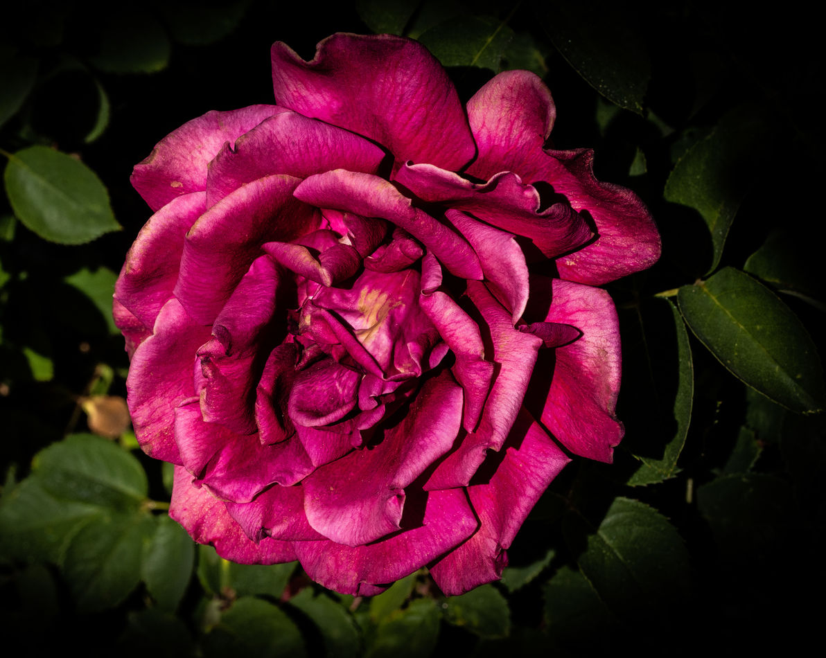
I always process my images in Photoshop, however, this is my first image processed entirely in Lightroom
May 14, 2022 02:48:36 #

Only you can tell how close it comes to your intentions, but from my point of view I see a good edit. The lighting seems a bit extreme, maybe even a bit harsh, but I suspect you weren't going for soft lighting.
Another opinion-based comment - yellow can end up looking a bit "heavy" when you darken it. If it was mine I'd either brighten yellow a bit or tint-shift the BG towards blue a little using the WB slider, perhaps a bit of both. I'd also brighten it overall a bit and moderate the highlights, but that's probably not your intention.
Another opinion-based comment - yellow can end up looking a bit "heavy" when you darken it. If it was mine I'd either brighten yellow a bit or tint-shift the BG towards blue a little using the WB slider, perhaps a bit of both. I'd also brighten it overall a bit and moderate the highlights, but that's probably not your intention.
May 14, 2022 07:35:58 #
PoppieJ
Loc: North Georgia
my opinion you did a good job with the PP and the flower is well in focus, but I think that you could have picked out a fresher bloom and it would have been a more successful picture
May 14, 2022 11:36:41 #

Curmudgeon wrote:
I always process my images in Photoshop, however, this is my first image processed entirely in Lightroom
I think your vignetting is too tight and too much and actually covers part of the flower at the top. Everything should be much more subtle.
…Cam
May 14, 2022 14:33:27 #
R.G. wrote:
Only you can tell how close it comes to your inten... (show quote)
Thanks for taking the time to comment R.G. I think I see what you mean about the yellow, I'll play with that a bit and see how I like it.
May 14, 2022 14:35:33 #
PoppieJ wrote:
my opinion you did a good job with the PP and the flower is well in focus, but I think that you could have picked out a fresher bloom and it would have been a more successful picture
Thanks for looking and commenting Poppie. I understand what you mean about the flower but it is getting to be summer here in SE Arizona and it was the best one available

May 14, 2022 14:41:16 #
CamB wrote:
I think your vignetting is too tight and too much and actually covers part of the flower at the top. Everything should be much more subtle.
…Cam
…Cam
Thanks for looking Cam. I see what you mean about the vignetting . Subtly was not my intent in this picture but I can see where you are coming from. My non wildlife pictures tend to be dark and more or less "In your face". Just my style
May 14, 2022 19:06:35 #

May 14, 2022 19:24:52 #
May 15, 2022 06:13:49 #

I used to use Lightroom exclusively before I got into composites, it’s a very powerful programme and I often tussled with he who shall not be named but is now banned from these hallowed grounds. He advocated Ps but it just isn’t necessary for ‘straight’ images, Lr has it all. Unfortunately, more recently I’ve not kept up with Lr other than for file management and, having been asked for some b&w images by a friend, I struggled with the new version - I’m sure the changes are worth it, I just haven’t mastered them yet!
All that waffled, to get to your image, I’m thinking RG is right about the harshness of the light for this particular subject but you’ve processed the image very well indeed. I like it.
All that waffled, to get to your image, I’m thinking RG is right about the harshness of the light for this particular subject but you’ve processed the image very well indeed. I like it.
May 15, 2022 06:37:43 #

May 15, 2022 08:27:54 #

indeed beautiful ... especially the metallic sheen. My only suggestion, supress the green.
I have Topaz Clarity and therein I can select green and adjust saturation, shade, and luminosity. Probably 1001 other programs/plugins to do the job.
I have Topaz Clarity and therein I can select green and adjust saturation, shade, and luminosity. Probably 1001 other programs/plugins to do the job.
May 15, 2022 12:30:30 #
magnetoman wrote:
I used to use Lightroom exclusively before I got i... (show quote)
Thanks for commenting. I am very uncomfortable in LR. I have been using it as a data base for a few years now but I guess it's that old saw about teaching old dogs new tricks. I have been using PS since release 2 or 3.
I guess I'm not sure what "harsh light" really means. Is it too bright or is the light too white?
May 15, 2022 12:30:53 #
May 15, 2022 12:32:24 #
dpullum wrote:
indeed beautiful ... especially the metallic sheen. My only suggestion, supress the green.
I have Topaz Clarity and therein I can select green and adjust saturation, shade, and luminosity. Probably 1001 other programs/plugins to do the job.
I have Topaz Clarity and therein I can select green and adjust saturation, shade, and luminosity. Probably 1001 other programs/plugins to do the job.
I can do the same thing in LR and I will play with that idea, thanks
If you want to reply, then register here. Registration is free and your account is created instantly, so you can post right away.