Engine Face Off
Apr 27, 2022 13:39:58 #

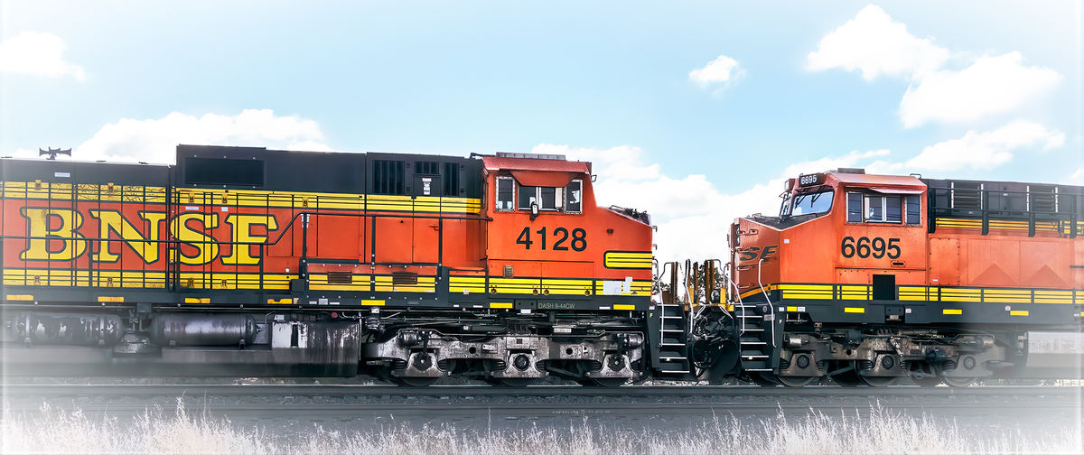
I always thought that engines facing each other on the same track as part of a freight train, was humorously anti-logical. I worked on this image a long time trying to make it more than a snap shot by working many different looks, filers, styles, etc. I decided on the light vignette as it was lighter, airier, more daylight (to show the sky and clouds a bit) like than a darker one yet I wanted to draw the eye mainly to the 2 engines meeting. I tried filters like blurs, radial blurs, motion blurs, etc. they just didn't feel right. I went with the pano crop to emphasize the power of at least one engine. I'm drawing a blank on ideas and open to suggestions as to how to better make my point of the engines facing each other on the same track. Thanks in advance, Bev
Apr 27, 2022 19:25:34 #
I'[m not sure that this is any better. 🥴
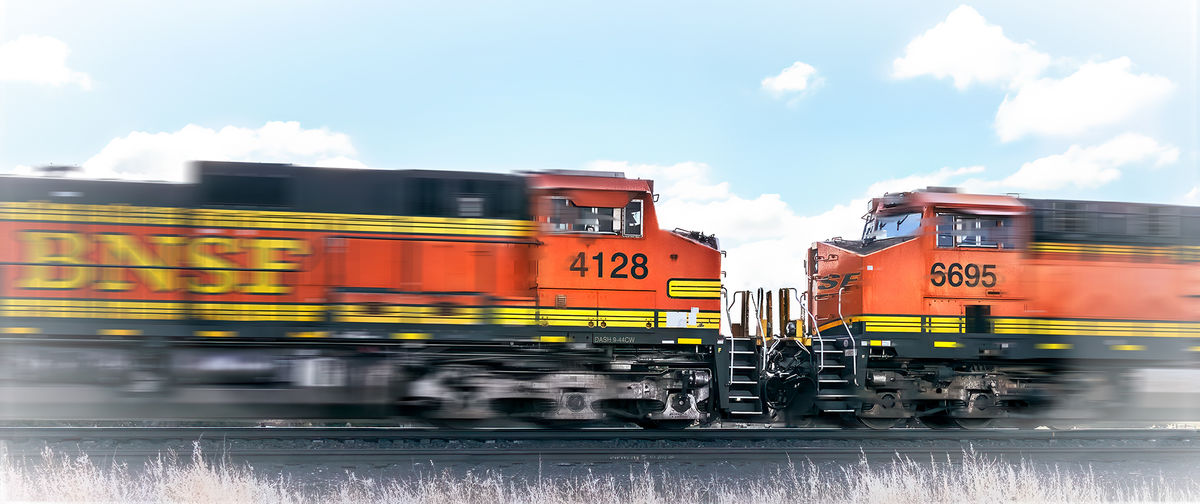
I did a motion blur layer with a gradient mask knocking out where the two engines meet. I also took out a bit of the background to show more of the railing of the trains.
I did a motion blur layer with a gradient mask knocking out where the two engines meet. I also took out a bit of the background to show more of the railing of the trains.
Apr 28, 2022 06:26:03 #

I think to emphasise the effect you’re after you would need to be square to the track with the point of meeting smack in the centre of the width. If you could also get your camera at track height (there’s that folding screen again!) it might help further?
Apr 28, 2022 11:49:53 #

[quote=Jim-Pops]I'[m not sure that this is any better. 🥴
I did a motion blur layer with a gradient mask knocking out where the two engines meet. I also took out a bit of the background to show more of the railing of the trains.[/quote]
They are simply engines. Direction is a switch or lever position. They pull in either direction, and push that away also.
Apr 28, 2022 13:39:15 #

I am in agreement with Magnetoman. The nose of engine 4128 is missing due to the point of view and detracts from the picture. A flat-nosed engine is just too distracting.
Apr 28, 2022 14:32:07 #
Apr 28, 2022 14:35:01 #
Thank you for your ideas. I didn't think of getting at track level. Bev
Apr 28, 2022 14:36:12 #
Thank you, I'll remember next time to get both engine noses squared. Bev
Apr 28, 2022 17:02:01 #
Way too many layers to recall or to even put into words.
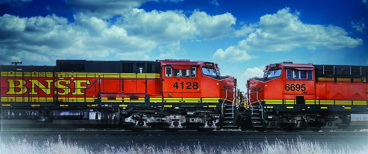
Not perfect of course but it may give a little better rendition of what you had invisioned.
Not perfect of course but it may give a little better rendition of what you had invisioned.
Apr 29, 2022 12:01:42 #
SoHillGuy wrote:
Way too many layers to recall or to even put into words.
Not perfect of course but it may give a little better rendition of what you had invisioned.
Not perfect of course but it may give a little better rendition of what you had invisioned.
Thank you SoHillGuy, that does look better. I see you also squared the nose of the right engine. Thanks for your time and suggestions. Bev
If you want to reply, then register here. Registration is free and your account is created instantly, so you can post right away.