I'm not sure about this image
Apr 24, 2022 20:42:24 #

I've always wanted to get a picture of a lantern in a window. Last Friday, an opportunity presented itself. I had to shoot upward, as the window was up sort of high. I like the colour version because of the richness of the browns in the wood. I like the B&W because it fits the tenor of the scene. I'm also attaching the original image so that you can see where I started and maybe give me pointers on how to handle this image better. I'm not totally pleased with the angle of the shot, but if I moved around to get it more squarely, I lost the lantern.
Your comments and suggestions for improvement are most welcome.
Your comments and suggestions for improvement are most welcome.
This is the original RAW file, nothing done except to export it as a jpg from LR.
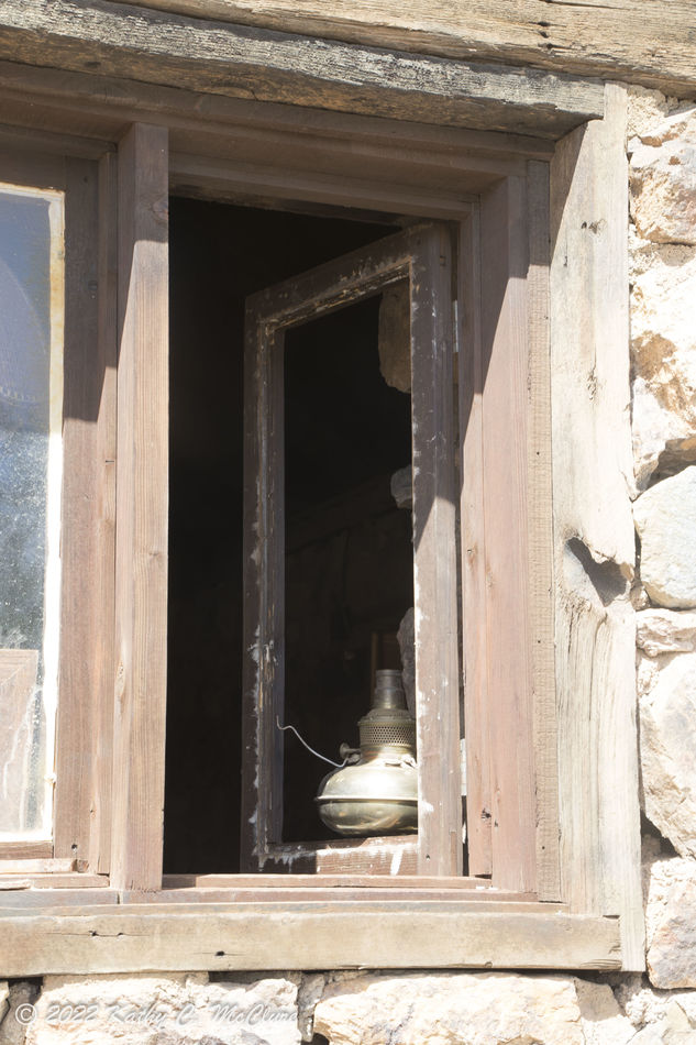
(Download)
I cropped this, straightened it a tad, took the exposure down and added clarity.
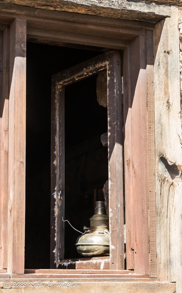
(Download)
This was converted to B&W in LR, I played a bit with the colour sliders, but I honestly don't remember what I did. Sorry.
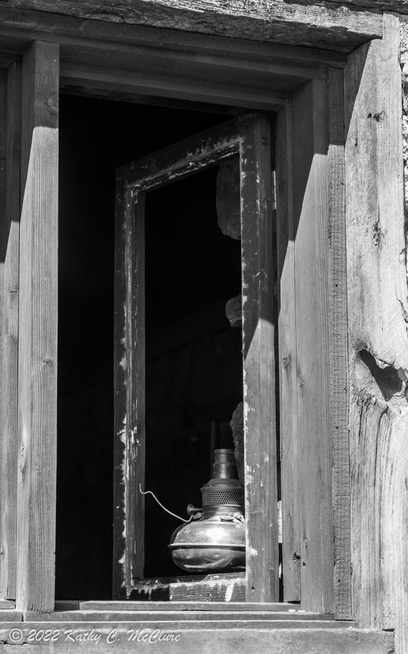
(Download)
Apr 24, 2022 20:54:04 #
Apr 24, 2022 20:57:28 #
lukevaliant wrote:
2nd one is best,i think.
Thank you. I do like the colour version also.
Apr 24, 2022 23:51:53 #

Nice find. I really like the second one. And, you might have taken it down a bit further. The b&w, to me, needs more contrast.
Apr 25, 2022 00:05:35 #
jaymatt wrote:
Nice find. I really like the second one. And, you might have taken it down a bit further. The b&w, to me, needs more contrast.
Thanks, John. As I was posting these, I thought perhaps taking it down a bit might help. Contrast on the b&w is easily done. Thanks again.
Apr 25, 2022 07:35:00 #

AzPicLady wrote:
I've always wanted to get a picture of a lantern i... (show quote)
Wow, Kathy, that’s a mighty tough scene to handle- bright, direct sunlight and a deep, dark shadow too- but your exposure appears pretty good. I’m OK with the perspective- angle/point of view…
Neither the stonework nor the wooden window have much color- being all faded and pale- so there’s not much in the way of color contrast and except for the “off-the-cliff” black-hole of a shadow- tonal range is pretty narrow, too. And I’d be careful with the “clarity slider”
Visually, darks advance and lights recede- that’s reversed in this image- lighter objects are the foreground while the darkest is the background- which makes for psychological tension but also adds interest to the image. That’s cool.
The partial window on the left is a big attention getter- that vertical white stripe with a right-angle corner screams for attention but doesn’t bring any value to the image… and could be cropped out. While looking at the image, cover that partial window with your finger… you’ll notice the image uncomplicates and the lamp base gains significance. Speaking of which, I’d darken the lamp base considerably… making that highlight the brightest and most contrast-y part of the entire image. Remember there’s textural contrast, too – smooth metallic against rough stone and coarse wood…
Finally, and this is the biggy- try a texture overlay… an overlay will reduce overall contrast but not affect local contrast much at all. That is, it won’t affect mid tones or highlights but adds density and variation within the shadow and suggests to the viewer there is indeed a real world within. I do that a lot when I get into a similar pickle…
So push black and shadow sliders to the right while highlight and white sliders move to the left- you know that already… Do you use Photoshop? That’s how I do the overlays and play with blend modes. If- by chance- something objectionable appears in the overlay, it can be easily removed via mask or the “blend-if” option…
Apr 25, 2022 10:27:30 #
fuminous wrote:
Wow, Kathy, that’s a mighty tough scene to handle-... (show quote)
Thank you so very much for all your suggestions and comments. I think I can follow them all - except for the texture overlay. I do have PS (it's an older version), but I've never been very good at doing layers, and I don't know how to do a texture one. Again, thank you so much for your detailed consideration.
Apr 25, 2022 16:20:19 #

Apr 25, 2022 16:56:32 #
Sylvias wrote:
#2 for me Kathy. 
Thanks, Sylvia. I appreciate the comment
If you want to reply, then register here. Registration is free and your account is created instantly, so you can post right away.