Motion - Its you against the pro
Mar 27, 2022 16:42:11 #

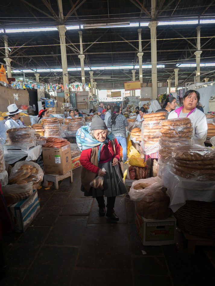
I submitted this to my camera club for evaluation by the pro...a well respected working photog. The theme was, "Motion."
What are your thoughts? CC
After a while, I will divulge what the pro said.
Hip
What are your thoughts? CC
After a while, I will divulge what the pro said.
Hip
Mar 27, 2022 19:18:37 #
PoppieJ
Loc: North Georgia
good street scene. for me a little to much rafter. but, i don't see any movement going on, everyone looks static
Mar 28, 2022 00:09:58 #

I agree there is a lot going on, but I don't see any motion or suggestions of motion. Overall it is a nice imagge that might look better in b/w.
OK, now I will act like the judge suffering from a jalapeno/anchovy pizza.
1. One of the first things that caught my eye was out of level horizontals and diverging verticals (posts). Was this shot with a wide angle lens?
2. The dark foreground almost completely obscures the elderly lady's legs and feet. It looks a bit like she was about to fall. Was this the motion being captured?
3. On a related note, the light on her face seems extreme, especially when the dark foreground is considered.
4. Not totally sure if the subject is the elderly lady or the slightly brighter stack of breads to the right.
Please don't take offense, I'm trying to act like a judge in a bad mood.
Bill
Mar 28, 2022 00:39:18 #
wjones8637 wrote:
I agree there is a lot going on, but I don't see a... (show quote)
No offense take. I’ll reveal the results and my opinions later!
Mar 28, 2022 06:57:14 #
Every person in your photo appears to be in motion. I like it as a perfect example of daily life.
Ken
Ken
Mar 28, 2022 14:16:40 #

Hip Coyote wrote:
I submitted this to my camera club for evaluation by the pro...a well-respected working photog. The theme was, "Motion."
What are your thoughts? CC After a while, I will divulge what the pro said.
Hip
What are your thoughts? CC After a while, I will divulge what the pro said.
Hip
Hi Hip! Ed Lee from PWCC here. I'll give it a stab.
1. The image is not level and too much ceiling. Although a more exaggerated angle might have added to "motion."
2. The subject's face is too "hot."
3. The floor could be lightened.
4, Perhaps use a slower shutter speed and pan the scene to create "motion."
5. Landscape format might be better.
Be well! Ed
Mar 28, 2022 14:29:47 #
elee950021 wrote:
Hi Hip! Ed Lee from PWCC here. I'll give it a stab.
1. The image is not level and too much ceiling. Although a more exaggerated angle might have added to "motion."
2. The subject's face is too "hot."
3. The floor could be lightened.
4, Perhaps use a slower shutter speed and pan the scene to create "motion."
5. Landscape format might be better.
Be well! Ed
Hey Ed! Hope all is well...see the upcoming post!
Mar 28, 2022 14:35:06 #

It's an achievement for the elderly woman to be capable of that much motion so I suppose that makes motion the subject in a roundabout way, in a "you don't know what you've got till it's gone" sort of way (thank you Joni). My guess is they were looking for something more direct.
Mar 28, 2022 14:40:41 #
To all, the pro dismissed the photo as not having anything to do with motion. He did not critique the shot much more than that. IMO, and the opinion of quite a lot of other people was that he entirely missed the point of the shot. The elderly lady was having a tough time moving. The one worker to picture right even seems to be troubled by the difficulty the lady was having. So the entire shot was about motion...just not fast motion! So, I strongly disagreed.
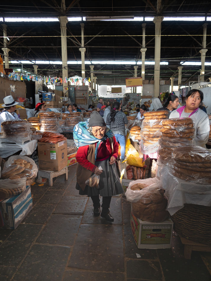
Oddly, I went back to look at the shot and saw what a lot of you saw...the light in the rafters were not straight and my eye went right to that area. So, I guess I am getting a better eye. I also agree that the lady's feet were part of the story and were not really visible, so I edited the shot a bit. I think showing the feet makes for a better photo.
This was shot with a 17 mm (34mm ff equivalent) prime lens. It was in a very active market, so standing around and taking multiple shots simply was not an option...it was a one and done deal. I looked at the photo and rejected the idea of black and white...the lady has a red sweater, the bread is kind of golden, nice light. I lowered the highlights on the lady's face as well. I wanted the rafters in there simply to show the size of the market, so I did not crop that out...but it did need straightening!
I guess that this proves a few things..first as we progress in our photography, we should go back and take a look at our pics...maybe we can improve them. Second, pros are not always right...I got a lot of comments from very good photogos who said he missed the point. That is ok. Third, the photo critique process is good for everyone. I learned something and will carry that on into my future efforts.
IMO, the shot is a good street capture. It does capture the mood and life of the market in Cuzco, Peru. It is perfect shot or warrant a "9"? Nope, but the improvements certainly pushed it up a notch.
Happy shooting to all
Hip
Mar 29, 2022 01:55:53 #
Hip!
Major improvement! Even if the image doesn't show "motion," it's still a keeper! BTW, I believe PS has a blur type of tool which creates a "motion" movement with secondary blurring.
Be well! Ed
Major improvement! Even if the image doesn't show "motion," it's still a keeper! BTW, I believe PS has a blur type of tool which creates a "motion" movement with secondary blurring.
Be well! Ed
Mar 29, 2022 11:11:50 #
elee950021 wrote:
Hip!
Major improvement! Even if the image doesn't show "motion," it's still a keeper! BTW, I believe PS has a blur type of tool which creates a "motion" movement with secondary blurring.
Be well! Ed
Major improvement! Even if the image doesn't show "motion," it's still a keeper! BTW, I believe PS has a blur type of tool which creates a "motion" movement with secondary blurring.
Be well! Ed

If you want to reply, then register here. Registration is free and your account is created instantly, so you can post right away.