Yosemite - There is something I dont like about both these photos -Why do I not display them?
Mar 27, 2022 16:14:38 #

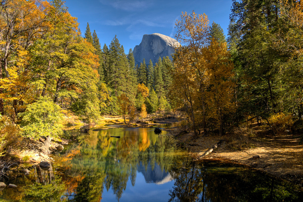
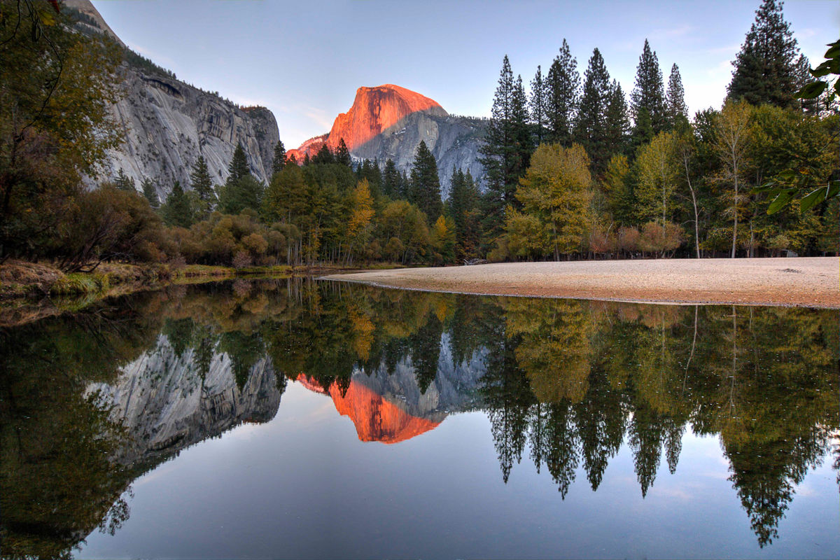
Just for fun, try to guess why these are not amongst my favored shots.
You can cc also. Note, the red peak acutally turns red at a certain time of the day, so its not bogus.
Hip
You can cc also. Note, the red peak acutally turns red at a certain time of the day, so its not bogus.
Hip
Mar 27, 2022 18:13:17 #
Hip Coyote wrote:
Just for fun, try to guess why these are not amongst my favored shots.
You can cc also. Note, the red peak acutally turns red at a certain time of the day, so its not bogus.
Hip
You can cc also. Note, the red peak acutally turns red at a certain time of the day, so its not bogus.
Hip
Both are great shots but what may turn you off to them is that about a zillion people have taken shots of those scenes in all seasons from the same places including a bunch of the greatest landscape photographers in history to the point they are cliches now. Also to many people the colors will seem over cooked though when the air is clear and the light is "just so" the colors will appear that way. And whatever camera you are using it has a very high detail making things look so smooth it is almost like they were paintings instead of photos.
Mar 28, 2022 07:58:35 #
Mar 28, 2022 08:28:32 #
Mar 28, 2022 14:40:02 #

Hip Coyote wrote:
Just for fun, try to guess why these are not amongst my favored shots.
You can cc also. Note, the red peak acutally turns red at a certain time of the day, so its not bogus.
Hip
You can cc also. Note, the red peak acutally turns red at a certain time of the day, so its not bogus.
Hip
Hip! Ed Lee from PWCC again!
The images are lovely and as Robert said in a previous post, maybe too generic. I think the trees on the left of 1st image should be darkened and equalized to the right side's trees. What is that dark circular thing near the center?
I would clone that out as well as the fallen tree trunk around the water. I also feel the reflection of the tree obscures the sky's reflection too much. I would darken the image overall a little bit to make scene more dramatic.
Second Image: The sandbar (?) on the right, horizontal, is too hot and needs to be toned down. The sky and its reflection could use some clouds. A hair darker and a little more contrasty too. Otherwise, a lovely image!
Just my 2 cents!
Be well! Ed
Mar 28, 2022 14:50:13 #
Ok, so the colors are really a close version of what was there. There is a time during the day that things look like they are on fire. I don't know why. In any event, you hit the nail on the head. I was standing next to perhaps 75 other photographers. This was a compilation of about 7 shots merged. No matter what the shot looks like, it will look like everyone else's shot on that day. Not for me.
Very early in my photo journey, I did submit these pics to my club evaluation thing. Both shots received a 9. But the pro said something that resonated with me...he said they photos are outstanding...but like every other photo taken at the same spot.
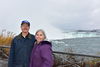
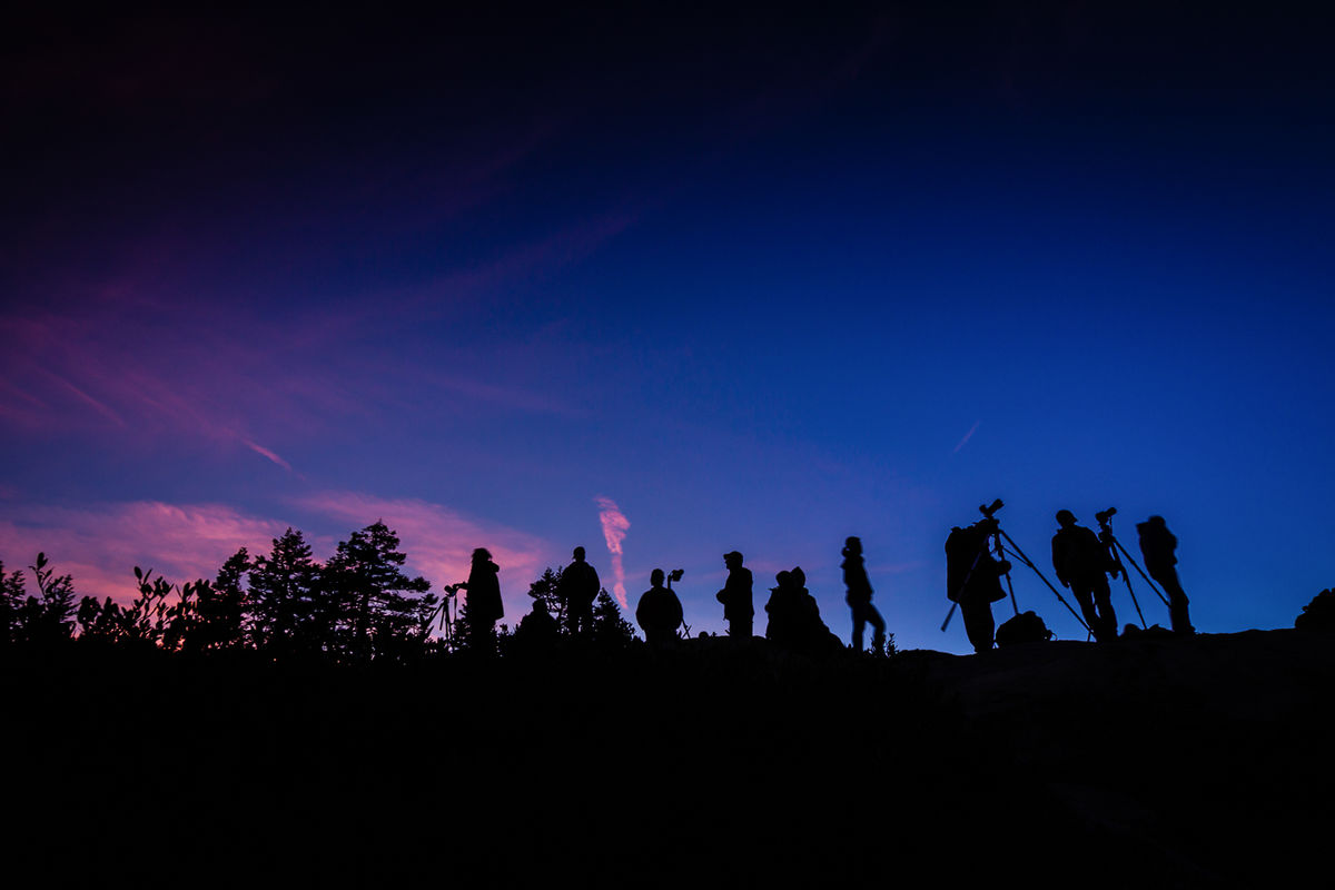
In fact, I am actually a bit prouder of the photo attached...we were shooting in Yosemite. I turned and saw this scene...everyone lined up to take the same shot at the same time of the same subject...most with the same camera systems! I turned and took the photo...a few photogs saw me do this, and immediately turned to do the same thing! I had to laugh because the photo tour leader highlighted one copycat pic on his website! And it was my eye that caught it first!
Anyhoo, fun for discussion purposes.
Very early in my photo journey, I did submit these pics to my club evaluation thing. Both shots received a 9. But the pro said something that resonated with me...he said they photos are outstanding...but like every other photo taken at the same spot.
In fact, I am actually a bit prouder of the photo attached...we were shooting in Yosemite. I turned and saw this scene...everyone lined up to take the same shot at the same time of the same subject...most with the same camera systems! I turned and took the photo...a few photogs saw me do this, and immediately turned to do the same thing! I had to laugh because the photo tour leader highlighted one copycat pic on his website! And it was my eye that caught it first!
Anyhoo, fun for discussion purposes.
Mar 28, 2022 14:52:06 #
elee950021 wrote:
Hip! Ed Lee from PWCC again! br br The images ar... (show quote)
Hey Ed! These colors were pretty close to what was there. They sky is what it was. Clouds would have been nice, but they were not there...and I didnt think to change that out.
Say hi to your club for me.
Apr 2, 2022 10:59:24 #

I think the top photo is "typical" and overly saturated, so it's not to my taste.
Now, the bottom photo - WOW!!!! The colors are wonderful and the lines make the photo look so modern. I love it.
Now, the bottom photo - WOW!!!! The colors are wonderful and the lines make the photo look so modern. I love it.
Apr 2, 2022 11:07:16 #
ediesaul wrote:
I think the top photo is "typical" and overly saturated, so it's not to my taste.
Now, the bottom photo - WOW!!!! The colors are wonderful and the lines make the photo look so modern. I love it.
Now, the bottom photo - WOW!!!! The colors are wonderful and the lines make the photo look so modern. I love it.
The first pic was an early hdr effort. But the colors of the mountains were pretty close. On the second pic the red peak was pretty close too. I’m not a real fan of either. But I proud of the line of photographers. It was a difficult hand held shot and took some editing. Thanks!
If you want to reply, then register here. Registration is free and your account is created instantly, so you can post right away.