It's you against the pro v 2
Mar 11, 2022 21:54:56 #

Just as prior post, this shot was submitted to my photo club for evaluation by a pro. This was in the open category, so there was no theme.
After you critique, I will tell you what the pro said.
No repost and small file size on this.
After you critique, I will tell you what the pro said.
No repost and small file size on this.
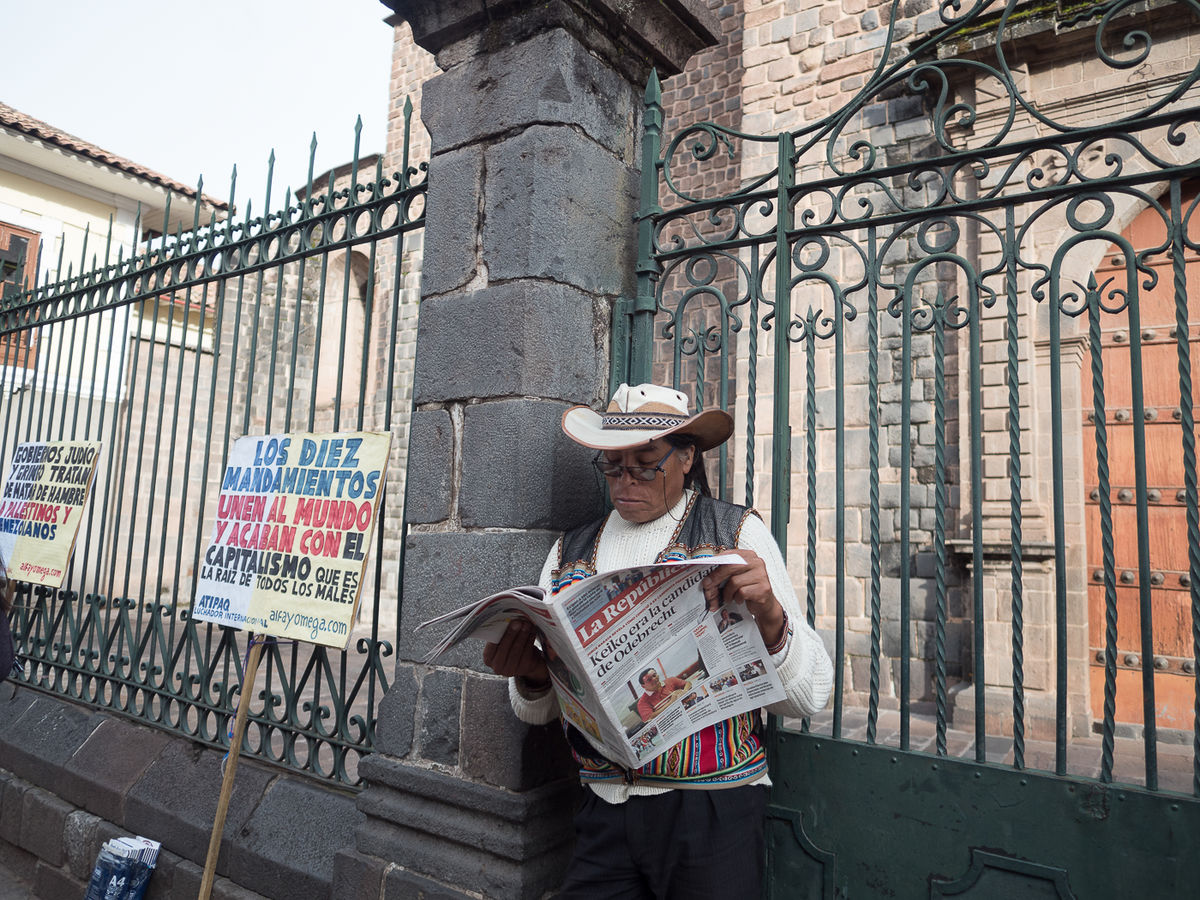
Title: Rebel Takes a Break in Cuzco
Mar 11, 2022 21:57:41 #
Mar 11, 2022 22:06:05 #
jim quist wrote:
looks like a snapshot to me and not very interesting
In what way? What is interesting, if anything. What is not interesting, if everything. Notice the Spanish signs? Are they relevant? What is happening? Is the shot relevant now since Peru is kind of in upheaval?
And what about presentation, landscape v portrait, colors, the angle of the shot?
The pro had one very (now obvious) observation that I totally missed but cannot not see once he said it.
Mar 11, 2022 22:47:19 #

I'm going to disagree with jim quist that the photo is uninteresting. This gentleman has a message to deliver and should be the strong focal point.
I would like to see less space above the gentleman. With him not so prominent in the photo it makes him seem incidental. If he and his signs are the main subject I would like to see him further to the right and the last sign not cut off and, of course, less space above him. He should be more prominent.
Is the bag on the bottom left that has A4 on it part of his protest? If so, then I would prefer that the bottom be included.
Just my opinion!!
Dodie
Mar 11, 2022 22:56:21 #
Hip Coyote wrote:
Just as prior post, this shot was submitted to my photo club for evaluation by a pro. This was in the open category, so there was no theme.
After you critique, I will tell you what the pro said.
No repost and small file size on this.
After you critique, I will tell you what the pro said.
No repost and small file size on this.
I think Dodie has hit all the right notes and I agree with everything she said. I would only add that in my opinion the face should be just a little lighter.
Mar 12, 2022 06:22:26 #

I would crop out the leftmost sign and much of the right and top making him and the one protest sign more prominent, and make the fence on the left vertical.
Hip Coyote wrote:
Just as prior post, this shot was submitted to my photo club for evaluation by a pro. This was in the open category, so there was no theme.
After you critique, I will tell you what the pro said.
No repost and small file size on this.
After you critique, I will tell you what the pro said.
No repost and small file size on this.
Mar 12, 2022 09:09:12 #
I like the shot and feel it tells a story. Photo wise I'd crop out some fence on the right side.
Mar 12, 2022 09:16:04 #

It’s a nice street shot, but I believe it would look better in black and white.
Mar 12, 2022 13:10:54 #
The first thing I notices is the tilted picture. I think it should be straightened making the post he is leaning on vertical. Once you straighten it you will need to make a new crop, as you do the man becomes more of the central theme. I see he is reading a paper and wonder if it has information about the picketing that happened and why the signs are still there. I'm sure they are picket signs because of the wood they are fastened to for holding. I like the colors, the composition. The photo has excellent focus and exposure.
Mar 12, 2022 14:02:41 #
Here is what the pro said. And this pro is actually a working professional, mostly wildlife, but is an excellent photographer and seasoned judge. By the name of the title, he understood that this was from Peru where colors are vibrant. This photo lacked some vibrancy. He liked the moment and understood this to be a street scene portrtait. Given Peru's current situation, a protestor is actually interesting.
Like others he said that there was some wasted space to the picture-right. And the one thing he noticed, which I cannot not now notice, is that we do not see what is on the ground, the subject's feet, etc...which were probably crossed. The shade on the face needed some work as well. If I had captured that AND considered using a portrait rather than landscape orientation, the picture would have merited a higher score. This shot got a 7.
Like others he said that there was some wasted space to the picture-right. And the one thing he noticed, which I cannot not now notice, is that we do not see what is on the ground, the subject's feet, etc...which were probably crossed. The shade on the face needed some work as well. If I had captured that AND considered using a portrait rather than landscape orientation, the picture would have merited a higher score. This shot got a 7.
Mar 14, 2022 01:08:05 #
Orphoto
Loc: Oregon
I seriously doubt his feet/shoes add much to the story. Given the two signs i would stick with landscape mode. Agree with cutting some off the right. If in similar situation, try getting a bit lower so we can see newspaper content better and his face is less hidden.
If you want to reply, then register here. Registration is free and your account is created instantly, so you can post right away.