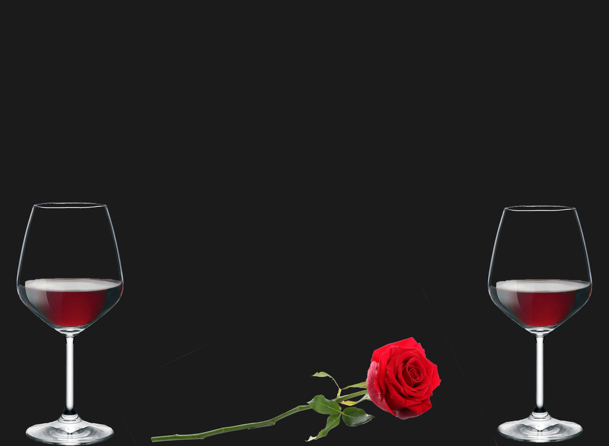
Two Wine Glasses
Feb 16, 2022 14:11:54 #
Feb 17, 2022 07:14:47 #
Feb 17, 2022 07:58:26 #

Keep 60% of the left, title, "Alcoholic Rose Thirsts." The message, Rose is looking for one more drink and is dragging herself to the wine goblet.
Feb 17, 2022 08:01:14 #
Great lighting and perfectly black background. Consider a bit more black space at the bottom of the shot.
Feb 17, 2022 08:03:03 #

On the download you can see white lines from round the card the rose picture was taken on...
Feb 17, 2022 08:33:18 #
nanaval wrote:
On the download you can see white lines from round the card the rose picture was taken on...
Great. Odd in that I downloaded with my phone. Won’t make that mistake again. I’m without a computer whilst traveling. It really is a nicely lite shot. Great colors. I like it a lot.
Feb 17, 2022 08:36:00 #

OK, I pixel-peeked - which I don't normally do. I wanted to see if there was any interest in the black at all. You did very well at getting reflections in the glasses, and the DOF on the rose face is very good. The first thing that hit me was the lack of space below the focal point. There's a lot of space above, and almost none below. I think that needs to be balanced out a bit. I know everyone else likes those flat-black-textureless backgrounds, but I don't. If it had been a velvet cloth, for example, with some folds and texture, it would have been better, IMHO. There are 3 light streaks in the background that are curious. Sort of like shooting stars on a dark night! I'm curious what those are.
As to your placement of the objects, to me it looks very flat. I think putting the glass on the right nearer and to the rear of the left one and angling the rose in front of both glasses might add a bit of tension and vibrance to the image. But I may be too nit-picky! Which is why I usually don't try to do still life images!
As to your placement of the objects, to me it looks very flat. I think putting the glass on the right nearer and to the rear of the left one and angling the rose in front of both glasses might add a bit of tension and vibrance to the image. But I may be too nit-picky! Which is why I usually don't try to do still life images!
Feb 17, 2022 10:49:09 #


Feb 17, 2022 12:56:52 #
very nice shot...i believe i would like the glasses offset, closer together and the rose touching both glasses
Chuck
Chuck
Feb 17, 2022 13:09:55 #
Julian wrote:
Keeping their distance…
Thanks for looking and commenting Julian
Feb 17, 2022 13:10:42 #
dpullum wrote:
Keep 60% of the left, title, "Alcoholic Rose Thirsts." The message, Rose is looking for one more drink and is dragging herself to the wine goblet.
I like it

Feb 17, 2022 13:12:00 #
Hip Coyote wrote:
Great lighting and perfectly black background. Consider a bit more black space at the bottom of the shot.
Thanks. I thought about the bottom. Guess I'll have to do a little PS magic on it
Feb 17, 2022 13:13:10 #
nanaval wrote:
On the download you can see white lines from round the card the rose picture was taken on...
Thanks Val. In DDL there does appear to be some white on the right side of the blossom. I'll have to be more careful on my isolation technique in the future.
Feb 17, 2022 13:28:36 #
AzPicLady wrote:
OK, I pixel-peeked - which I don't normally do. I... (show quote)
The black background is simply a solid black PS layer. I am going to have to get a yard of black velvet and shoot some background shots. Any light streaks, I can't find them on my monitor, are artifacts. I agree about the flat look, my artistic sense is somewhere between little and none which is why I post here. I'll work on that when I fix the crop
Feb 17, 2022 13:29:00 #
If you want to reply, then register here. Registration is free and your account is created instantly, so you can post right away.