Advice on monochrome tones
Feb 6, 2022 14:47:26 #
avery48
Loc: Jefferson City
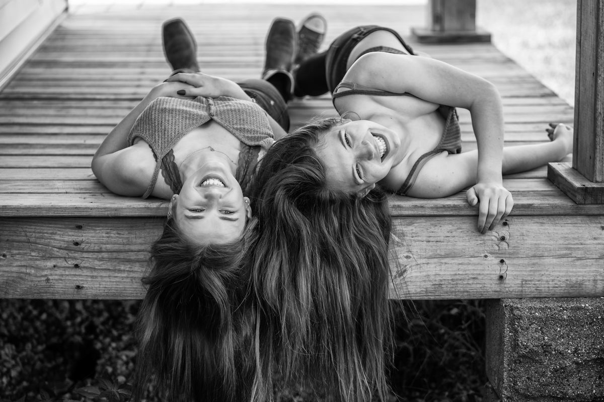
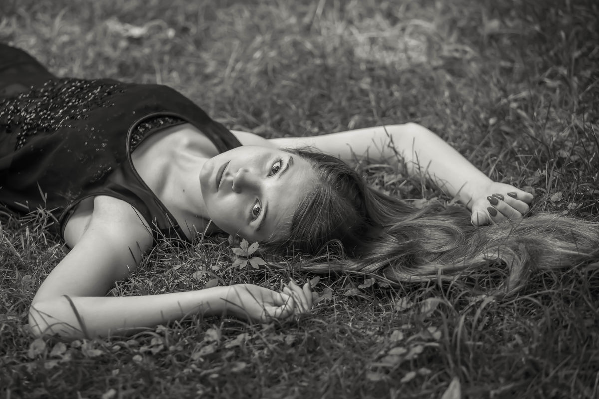
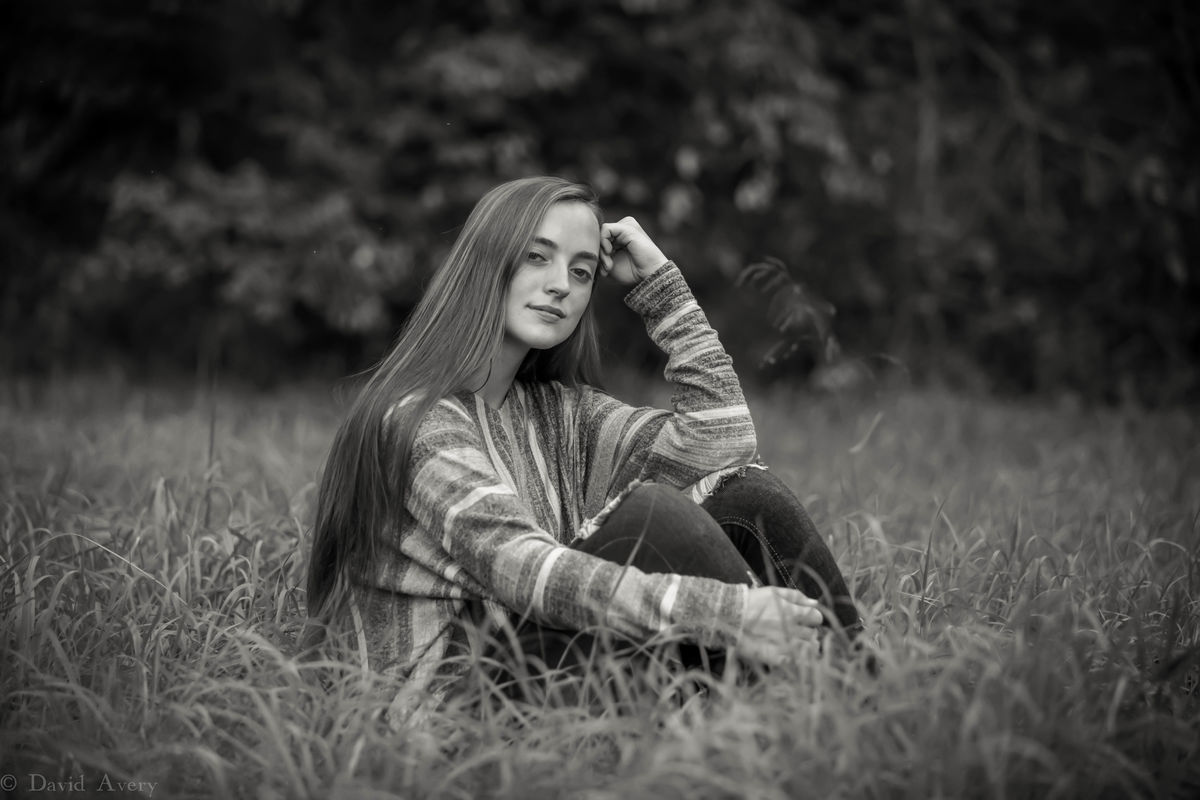
These were some portraits from the last few years, largely from high school senior photo sessions. I often give my clients at M3D Photography choices of an image in color or monochrome and let them choose what they like. I would be grateful for any advice on tonal quality in monochrome images. I always struggle to get the right combination of whites and blacks and "in-betweens." How many of you use tone curves in your Photoshop/Lightroom? Any rule of thumb here? Also, any suggestions on composition? You all have been most helpful in requests I have made in the past. There is a generous amount of experience in Ugly Hedgehog.


Feb 6, 2022 14:50:12 #

These are very well done. I'm particularly fond of the 3rd one. I love the lighting, exposure, and composition.
--Bob
--Bob
avery48 wrote:
These were some portraits from the last few years,... (show quote)
Feb 6, 2022 14:50:28 #

These images are wanting of nothing in my opinion. Great tonality and composition!
Feb 6, 2022 15:32:21 #

avery48 wrote:
These were some portraits from the last few years,... (show quote)
I like 2-5, well done tones.
Feb 6, 2022 18:17:58 #

Very, very nice!!! I do think the first one needs a little push to the black side but I like the rest the way they are.
Dodie
Dodie
Feb 7, 2022 01:52:20 #
#3 IS VERY WELL DONE. The biggest criticism Is ( constructive ) is the verty light tones of the hand. Viewers eyes always go to the brightest part of an image. It's a Distraction that WILL ruin the impact of an otherwise excellent image.Turn your image upside down to see what I mean. It Works!
Feb 7, 2022 06:50:48 #

Feb 7, 2022 08:58:46 #

I think they are all well done. There's not much to critique or suggest. In my opinion, Black and White is something people either appreciate or don't. I do however agree with the critique earlier about the hand. You do want the eyes to pop, and that hand is a bit distracting. There are tons of videos about black and white portraits on Youtube if you do want more ideas about processing and composition. Again, even there you will get a wide variety of thoughts and you should take what you want and toss out what you don't see as solid advice.
My only other thing would be to suggest checking out Joel Grimes. He does a series on portraits, lighting, black and white and other topics that I found helpful. If you like black and white landscape as well as portraits, he has a new course on landscapes that I paid for (I don't know the man or work for him at all) and found some worthy tips on 32-bit processing for black and white. He has some free ones on Youtube as well. I found him to be one of the better teachers of black and white portraits on Youtube, but there are many on that site.
Mike
Feb 7, 2022 10:12:55 #

ROCHESTERTECH wrote:
#3 IS VERY WELL DONE. The biggest criticism Is ( constructive ) is the verty light tones of the hand. Viewers eyes always go to the brightest part of an image. It's a Distraction that WILL ruin the impact of an otherwise excellent image.Turn your image upside down to see what I mean. It Works!
It looks like the same tonal distraction appears to some degree in #4 (arm) & #5 (hand). Can these be selectively muted in photo shop?
Feb 7, 2022 10:50:25 #

Feb 7, 2022 11:52:54 #
avery48
Loc: Jefferson City
Your comments about these images are helpful. I've learned much from them. Little details (like looking at an image upside down) are practical and will help me self-critique better. Thank you all.
Feb 7, 2022 12:23:58 #
avery48 wrote:
Your comments about these images are helpful. I've learned much from them. Little details (like looking at an image upside down) are practical and will help me self-critique better. Thank you all.
Yes, looking at the image upside down is great advice. Someone told me that one years ago and I forgot to mention it, yet I do it all the time without even thinking twice about it now. That tip was a very good one.
Mike
Feb 7, 2022 12:40:48 #
The one other thing that I can think of is to really try to find a position if you're not in a studio, like your 3rd image that is more intimate is to get the light right, to get a catchlight in the eye, or get the light so there is texture or reflection in the eye. I think it draws the viewers eye right to the eye of your subject. I cant always do that, but I try.
Since you had the one with the hand, I tried to find one with a hand as well. I intentionally lightened the eye and around the eye and darkened the hand a touch. I tried to find a balance where it didn't look too overdone. It's always a delicate balance. Otherwise the skin tones don't look right in my opinion.
Since you had the one with the hand, I tried to find one with a hand as well. I intentionally lightened the eye and around the eye and darkened the hand a touch. I tried to find a balance where it didn't look too overdone. It's always a delicate balance. Otherwise the skin tones don't look right in my opinion.

Feb 7, 2022 13:09:50 #
Feb 7, 2022 13:10:57 #
avery48
Loc: Jefferson City
Ksmmike, great advice about the catch light. I was in a dark barn for Image No. 3 and trying to use shadows to create some drama and mood. Almost Rembrandt lighting. Not quite. Light was coming from a door to the left. I see a little catch light there that could be enhanced. But it's something I will look for next time I'm shooting a portrait and processing it. Love the child's image here. Eyes really pop and draw you in. Great mood shot.
If you want to reply, then register here. Registration is free and your account is created instantly, so you can post right away.