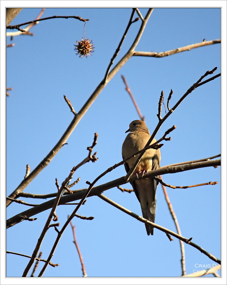
Mourning Dove
Jan 25, 2022 21:49:23 #

I’m happy with this photo but maybe there’s something I can learn from the group.
Jan 26, 2022 03:44:30 #

If you're happy with it, that's what matters. However, since you want criticism, it's considered better if the face isn't shadowed in a way that hides large parts of it and it's considered better if there isn't anything obstructing the view of the main subject (twigs, branches, leaves or whatever). The face is always a centre of attention and while some shadows are to be expected, too much shadowing detracts from its visual significance. You may see the occluding twigs as part of the context but others will see them as less than ideal or possibly distractions.
Jan 26, 2022 07:23:41 #

My suggestion learned from the pros at the Tampabay Camera Club... crop crop crop. A closer crop trimming all sides to have the bird and the burr be the main subjects is what I would do to tell the story.
First, crop your vision using your hands/fingers. Bring the sides in so the bird claws and the burr are 1/3 from the sides. Then bring the top and bottom closer in.
First, crop your vision using your hands/fingers. Bring the sides in so the bird claws and the burr are 1/3 from the sides. Then bring the top and bottom closer in.
Jan 26, 2022 08:25:34 #

RG an dpullum have given you good advice. If you lighten the face and clone out the twig “growing” of the birds head would be a plus.
Jan 26, 2022 09:27:00 #

I like seeing birds in their environment, so seeing all those twigs is a plus for me. Yes, the face is a bit dark and could easily be lightened up a tad - just enough to see a bit of detail would be sufficient, I think. The sky is beautiful and the DOF is quite nice. The only real niggle I have is that tiny bit of out of focus whatever at the top of his head. If that could be tamed without affecting the twig behind him, that would be great.
Jan 26, 2022 10:30:51 #
R.G. wrote:
If you're happy with it, that's what matters. How... (show quote)
R.G., Well said, and Ill watch for those next time to make it even better.
Jan 26, 2022 10:40:53 #
dpullum wrote:
My suggestion learned from the pros at the Tampabay Camera Club... crop crop crop. A closer crop trimming all sides to have the bird and the burr be the main subjects is what I would do to tell the story.
First, crop your vision using your hands/fingers. Bring the sides in so the bird claws and the burr are 1/3 from the sides. Then bring the top and bottom closer in.
First, crop your vision using your hands/fingers. Bring the sides in so the bird claws and the burr are 1/3 from the sides. Then bring the top and bottom closer in.
Thanks for sharing the pro tip. I put the eye at 1/3 from the edge and went from there. R.G. is right about the branches which are more of a distraction here and it lost the branches holding the pod. I was able to bring up the shadows a little in Lightroom mobile.
Jan 26, 2022 10:47:29 #
NJFrank wrote:
RG an dpullum have given you good advice. If you lighten the face and clone out the twig “growing” of the birds head would be a plus.
I can try that! That’s a good reminder to watch the background more closely.
Jan 26, 2022 10:50:51 #
AzPicLady wrote:
I like seeing birds in their environment, so seeing all those twigs is a plus for me. Yes, the face is a bit dark and could easily be lightened up a tad - just enough to see a bit of detail would be sufficient, I think. The sky is beautiful and the DOF is quite nice. The only real niggle I have is that tiny bit of out of focus whatever at the top of his head. If that could be tamed without affecting the twig behind him, that would be great.
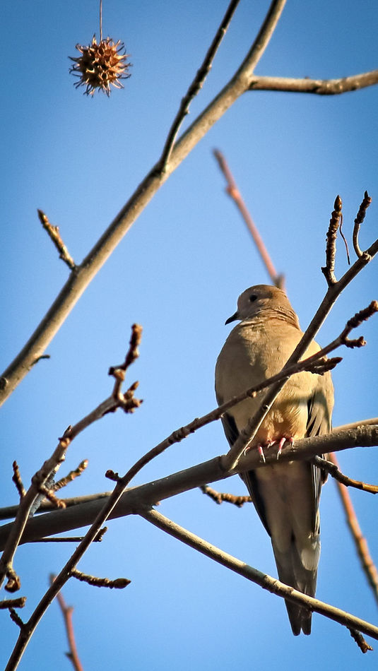
I’m torn about cropping out the surroundings as you can see in the cropped version I added a few minutes ago. I still like the original crop and can adjust the face and branch. I might darken the branch you described a little too.
Jan 26, 2022 12:43:50 #
Craigdca wrote:
I’m torn about cropping out the surroundings as you can see in the cropped version I added a few minutes ago. I still like the original crop and can adjust the face and branch. I might darken the branch you described a little too.
I find the new crop more distracting than the original. The thing dangling from nowhere doesn't cut it with me.
Jan 26, 2022 13:15:58 #
AzPicLady wrote:
I find the new crop more distracting than the original. The thing dangling from nowhere doesn't cut it with me.
That was exactly the reason for the original crop. I wanted to include enough of the upper left branches to support the image of the pod, then cropped the rest to balance the bird with an eye for the branches on that side.
Just a little fine tuning for the face and background branch is all that’s left to do.
Jan 26, 2022 13:20:32 #
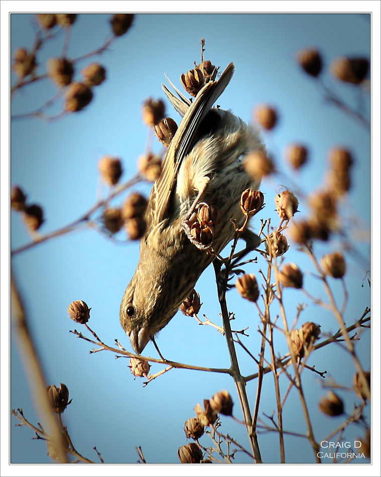
For comparison, I made this photo about a week ago. While I like the serenity of the mourning dove, I like the dynamics and composition of this house finch better.
Jan 26, 2022 17:51:17 #

Craigdca wrote:
I’m happy with this photo but maybe there’s something I can learn from the group.
Before I chime in with my 2 cents worth, why do you like it, what would you do to improve it?
Jan 26, 2022 18:55:57 #
Hip Coyote wrote:
Before I chime in with my 2 cents worth, why do you like it, what would you do to improve it?
I especially like the peaceful mood of the image and the pod’s placement is a bonus. I was also happy with the focus and colors. It would have been better if the bird was looking more to its left for better lighting on its face, and fewer distracting branches would have helped.
Jan 26, 2022 19:33:05 #
AzPicLady wrote:
I find the new crop more distracting than the original. The thing dangling from nowhere doesn't cut it with me.
Yes, the top margin is fine as originally shown at the beginning. No dangling participles or floating burrs.
If you want to reply, then register here. Registration is free and your account is created instantly, so you can post right away.