Macro of Orange - Is it a photo you would display?
Dec 30, 2021 12:14:32 #

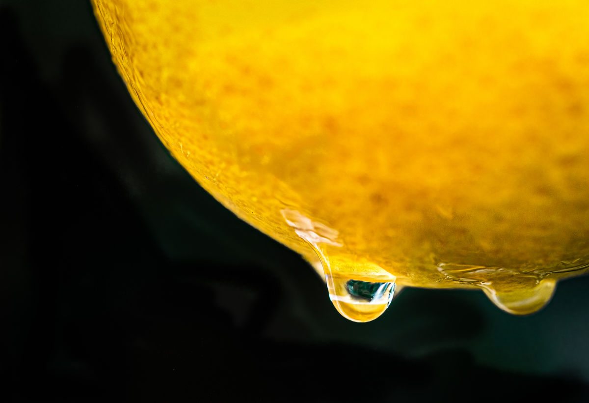
This shot was taken while the orange was on the tree during a slight rain. The orange was swaying in the wind. Normally I would have packed in shooting for the day but I was with my nephew who is interested in learning photography...we had gone to a neighbor's house which overlooks the city but the view was socked in so we improvised and did some macro...in the rain. He leaned to adapt to bad photo environments to at least rescue the day. Lesson learned.
I uploaded two versions...the more cropped one has a little more work on the droplet.
In any event, I took and edited this shot. For the two people on UHH who might even recognized my screen name, I can be quite critical of photos...so why am I showing this photo and asking for constructive criticism? To encourage the serious photogs in the Critique Section to do CC of each others' work!
The pros: The shot is dynamic in color and was taken in difficult circumstances. The water drop is in focus. The shot might look ok printed out. Orange is nice color, I like the black background. I like the composition. Cropping can improve the shot....maybe.
The cons: The wind was blowing so the rest of the orange is out of focus...This image would be much better had I focus stacked the image to get the texture of the orange throughout the shot.
There is really nothing in the water drop that is in focus, such as another orange or the tree (due to movement I suppose.) The m43 sensor does not allow for much wiggle room in cropping. I used Topaz denoise, but there is still quite a lot of noise present.
Bottom line (IMO). This is a photo that I will keep as a way of instructing to adapt to difficult shooting circumstances...make orange-aide out of a bad weather day. But this is not a photo that deserves to be put into a competition or displayed as one of my better photos. It is a memory of a fun day..not much else.
Cheers, Happy New Years
Hip Coyote
Dec 30, 2021 13:46:31 #

Hip Coyote wrote:
....To encourage the serious photogs in the Critique Section to do CC of each others' work!.....
A good suggestion. There's much to be gained from discussing what works well in a shot as well as mentioning what works not so well. Sometimes we just think "That works well" without analyzing why, but it can be good practice to bring these things out in discussion.
About your photo - call it "Tears of the Sun" and sell it for a generous sum to graphic artists who do work for CD covers
 .
.Dec 30, 2021 20:00:19 #
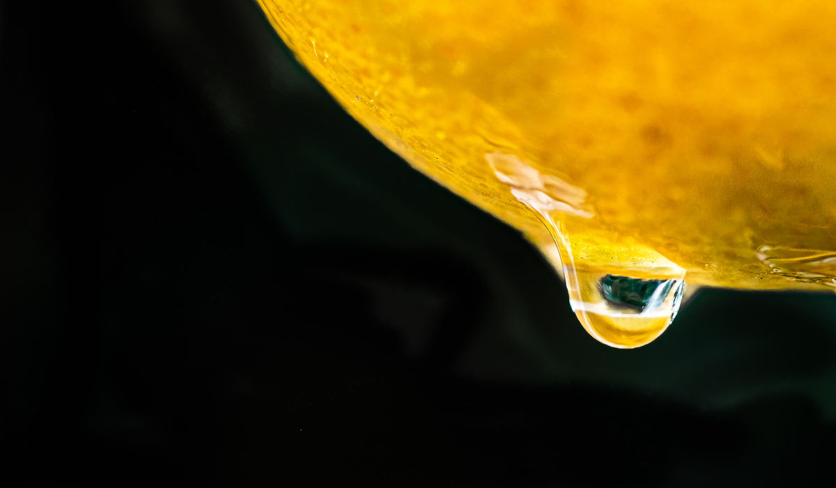
I found a shot from the same day that is a little better...still would benefit from focus stacking...but the image in the drip is better. Shows an orange upside down. CC always welcome.
Cheers to all.
HipCoyote
Cheers to all.
HipCoyote
Dec 31, 2021 08:04:24 #
I think you've already provided your own best critique. It would have been better if the orange skin was more of a feature and the stuff inside the drops could be more identifiable (but that's not an essential feature). As it is it's exclusively about the drops, but their content is nondescript (clear but not engaging or sufficiently recognisable). The second post is an improvement.
Dec 31, 2021 09:20:41 #

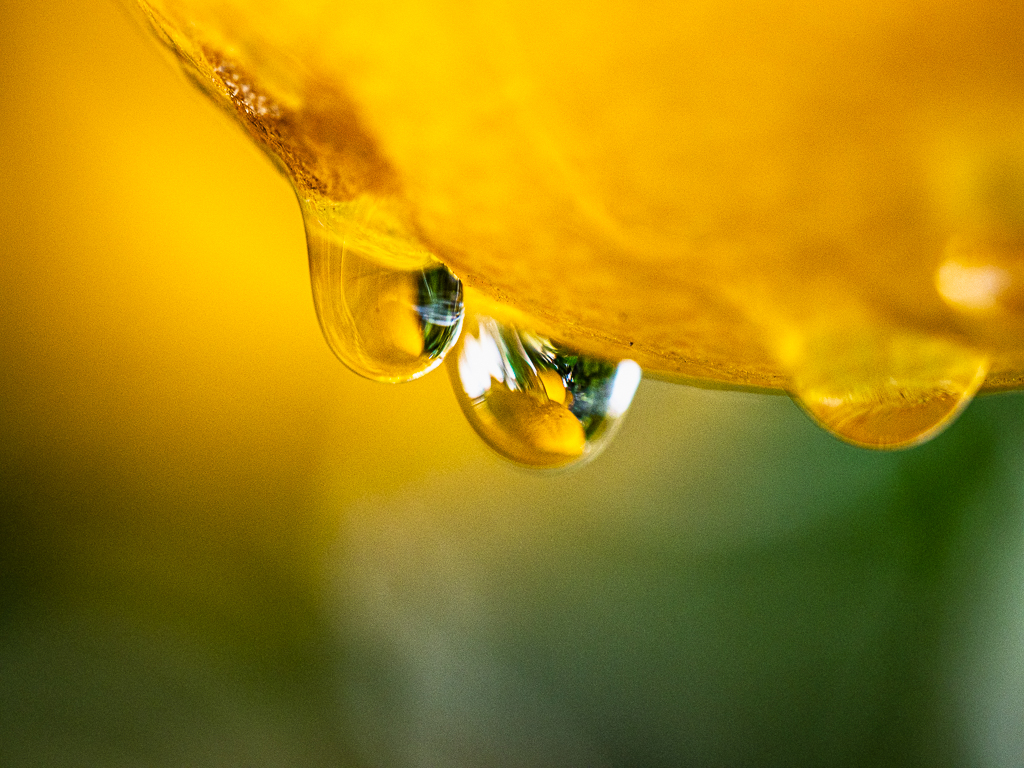
Nice! Would I show it--most certainly. It has high interest for me, both the image itself and the making of it.
Jan 22, 2022 10:51:00 #
jaymatt wrote:
Nice! Would I show it--most certainly. It has high interest for me, both the image itself and the making of it.
Thanks so much. This was captured on a wild in the bush safari…my neighbors yard. I may try this as a more controlled
inside , artificial lit, project to do some focus stacking.
If you want to reply, then register here. Registration is free and your account is created instantly, so you can post right away.