Eilean Donan revisit.
Nov 10, 2021 06:15:37 #

Nov 10, 2021 06:34:43 #

R.G. wrote:
Looking for something different this time.
.
.
Fantastic images!!!!
Nov 10, 2021 07:00:19 #
Nov 10, 2021 07:21:18 #

Looks good in both color and b&w, but I really like the moody feel of the color image. Well captured.
Nov 10, 2021 07:23:57 #
yssirk123 wrote:
Looks good in both color and b&w, but I really like the moody feel of the color image. Well captured.
Thank you Bill.
Nov 10, 2021 14:08:26 #

I enjoyed it as an FYC project and I enjoy this version even more, R.G.
Nov 10, 2021 15:14:34 #
UTMike wrote:
I enjoyed it as an FYC project and I enjoy this version even more, R.G.
Thank you Mike. Glad you enjoyed (twice
 ).
).Nov 11, 2021 06:07:39 #

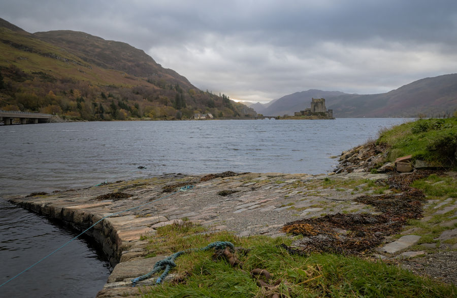
No.1 reminds of many a day spent in Scotland with no real light, just a flat brightness that I would find very hard to work with.
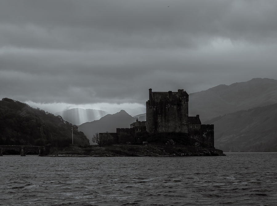
No.2 is an image I can 'read'. I'm seeing poor conditions with the promise of better weather to come, a dark and foreboding castle, and the clans rattling thier claymores. There's a book in there.
No.2 is an image I can 'read'. I'm seeing poor conditions with the promise of better weather to come, a dark and foreboding castle, and the clans rattling thier claymores. There's a book in there.
Nov 11, 2021 06:35:50 #
John N wrote:
No.1 reminds of many a day spent in Scotland with no real light, just a flat brightness that I would find very hard to work with.
No.2 is an image I can 'read'. I'm seeing poor conditions with the promise of better weather to come, a dark and foreboding castle, and the clans rattling thier claymores. There's a book in there.
No.2 is an image I can 'read'. I'm seeing poor conditions with the promise of better weather to come, a dark and foreboding castle, and the clans rattling thier claymores. There's a book in there.
I would agree that flat, grey light isn't ideal, but thanks to PP it can provide a useful starting point. Some would say it's a better starting point than harsh light. I've learned to employ useful PP tactics like split toning, colour added locally via Adjustments brushes, pushing the saturation then mitigating any unwanted effects, working the contrast together with the tone levels etc - not as easy as having good light on a good day but not failures either, especially since most people expect shots of Scotland to be misty, cloudy, stormy or whatever. I've learned to like shots of mountains that have clouds caressing their peaks.
About that book.... If it ever gets to print, I hope you don't forget who inspired it
Nov 11, 2021 14:47:00 #
Nov 11, 2021 14:51:31 #
Nov 11, 2021 16:11:08 #
bertloomis
Loc: Fort Worth, Texas
I don't find these photos appealing. The first, no real color, too much haze and a not so good sky. The second lacks contrast [unlike Ansel Adams work] and a lot of the sky and water should be cropped out.
Nov 11, 2021 16:55:49 #
bertloomis wrote:
I don't find these photos appealing. The first, no real color, too much haze and a not so good sky. The second lacks contrast [unlike Ansel Adams work] and a lot of the sky and water should be cropped out.
In response to this and your other comments elsewhere, it's all a matter of intent. I keep my photos looking like photos. When they stop looking like photos, that's when I decide that the PP has gone too far. Part of the "keep my photos looking like photos" remit is that they retain an element of realism. Flat, grey light and pastel colours was the reality that I shot.
As for the B&W, I could have made it more contrasty by brightening the brights, but that's not what the scene was like. For example I could have made the cloud beams brighter, but they would have looked unrealistic. The simple fact is that the scene had a predominance of darks and only moderately bright highlights.
Nov 11, 2021 16:56:56 #
bertloomis
Loc: Fort Worth, Texas
R.G. wrote:
In response to this and your other comments elsewh... (show quote)
OK, thanks for letting me know.
Nov 13, 2021 22:22:54 #
R.G. wrote:
Looking for something different this time.
.
.
both photos have their own appeal. Of course the close up gives us details in the castle that we don't see from far away. The rays of sun in the backgroud in the close up are almost surreal. I also like the wider perspective. It gives us more of a context and the light in the background is really nice. The other thing that is of interest to me is the scenes in Scotland that we are getting to see via your lens and travels. I've never been to any of these places and they are all fascinating to me.
Erich
If you want to reply, then register here. Registration is free and your account is created instantly, so you can post right away.