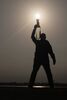
Low light Portrait
Oct 17, 2021 23:34:05 #
Oct 17, 2021 23:35:45 #
Oct 17, 2021 23:36:58 #
Oct 17, 2021 23:37:14 #
Oct 17, 2021 23:37:33 #
 Thanks a bunch
Oct 17, 2021 23:40:33 #
jaymatt wrote:
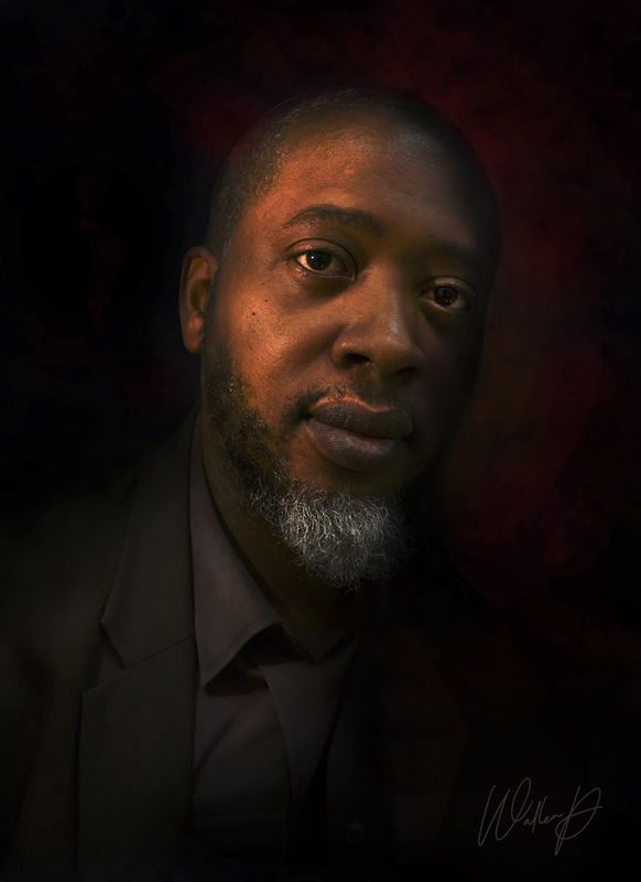
The first is great! The second, ‘way too dark for me.
Thanks

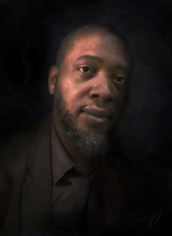
The first one was an edited version of photo 2 which was a copy of the SOOC.
Oct 17, 2021 23:42:37 #
Oct 17, 2021 23:43:09 #
Oct 17, 2021 23:43:39 #
SouthernExposures wrote:
Well done. Just enough light imho-distractions gone!

Oct 17, 2021 23:48:34 #
topcat wrote:
I like it, but I would have liked the lower portion opened up a little. I think that a more balanced light on the subject would look better.
Just my opinion
Just my opinion
It was a quicky edit as we were just goofing about during our break time.
I did visit it again, made the image a tad brighter and also less red.
The brightness of the beard was also reduced because it was taking attention away from the eyes.
In keeping with the ambiance and lightplay, it is still on subdued lighting.
Oct 19, 2021 01:15:49 #

Oct 25, 2021 07:29:12 #
weberwest wrote:
Powerful portrait Wallen, looks very strong in download.
Thanks.
Have a nice day!
Mar 21, 2022 04:22:34 #
If you want to reply, then register here. Registration is free and your account is created instantly, so you can post right away.