Two Views Same Subject
Jun 5, 2021 12:18:50 #

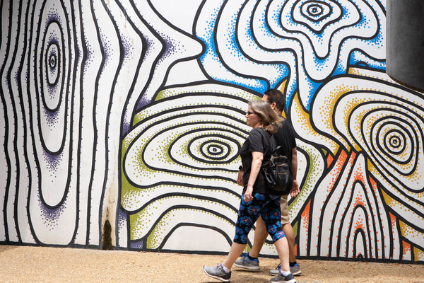
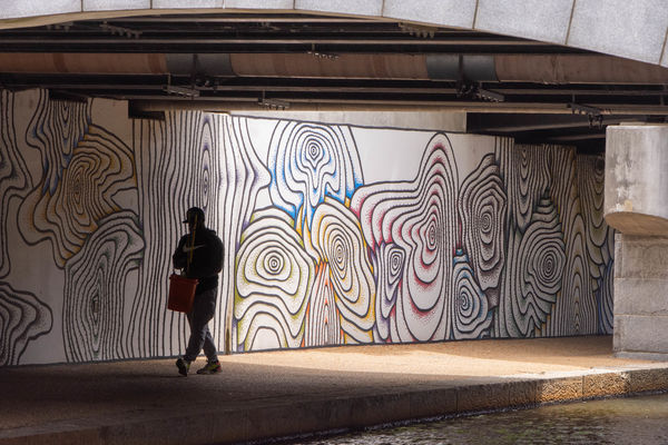
My wife and I traveled to Virginia to see my son and Daughter in law over the Memorial Day weekend. My wife wanted to walk the Slave Trail in Richmond. So of course we journeyed from Alexandria to Richmond to walk the trail. While in the downtown area I saw the mural and thought i might be interesting on how it would look under different scenarios. I liked the first one, as it seemed both were in sync with their strides. The second one with the light and shadow. I liked the idea of the man walking into the shadow.
Jun 5, 2021 15:03:51 #

Jun 5, 2021 15:38:57 #
Cwilson341 wrote:
I like both of these, too, Frank. That's a very interesting mural.
Thanks Carol, it did catch my eye. I took a couple without anyone in the frame. But I felt it was missing something. I also have one with the guy in the lighted area. But I found the one posted more intriguing.
Jun 5, 2021 15:48:44 #

NJFrank wrote:
My wife and I traveled to Virginia to see my son a... (show quote)
Hi Frank. At first glance, I think I prefer the first one. I would crop it slightly and get rid of the distraction on the right side of the frame.
Having said that. I like them both. To me they tell different stories. So it doesn't have to be either or if you are trying to decide which to keep or show.
To me the first one is "two people walking and interesting art in the background. I like the composition* with room to the left of frame for them to walk toward. *I don't like the distraction on the right of frame, it can be cropped or "smart removed" using photoshop. This might be a fun image to share or print. It's colorful and interesting.
The 2nd one tells a different story. It has more context. I too like the man walking into the shadow. This might be something to add to a travel side show to give context. I opened it and put put some "paper" over it to try a crop. (Not real paper, I used the computer for this). IMHO it is a stronger compassion if you crop it on the right, just enough to eliminate the white wall and crop off on the top to just enough to eliminate the white arch, leaving the iron support structures. That's nice. It creates a reverse leading line, for the eye to follow, from the shadow in the tunnel, across the colorful art to the man in the shadows and my eye "rests" there, pondering the man, which is a bit of mystery. The viewer can fill in the story. Note: if it was me I would NOT lighten up that shadow. The mystery is good. Now I think it's an interesting image to share, or print, or put in a slide show of the event.
So maybe after all that I like the 2nd one better. As I said they tell different stories so it's not either or.
But that is me, and those are simply ideas for you to consider. You should do what pleases you because it is your art.
Jun 5, 2021 16:19:17 #
JD thanks very much for your much detailed analysis of my two images. I can see you spent some time digesting the two shots. Now that you pointed out the support on the right side photo #1 I can’t get it out of my brain. But that is a fairly easy fix. On the second shot I waited for him to pass into the shadow. I felt it allowed the viewer to come to their own conclusion. As I mentioned to Carol I have the walker in the lighted area. I found I acceptable but I felt it need more.
I posted both because to me the represented two different views of the same scene. Perhaps traveling a total of six hours I wanted to get more than one shot.😀
I posted both because to me the represented two different views of the same scene. Perhaps traveling a total of six hours I wanted to get more than one shot.😀
Jun 5, 2021 17:04:52 #
NJFrank wrote:
JD thanks very much for your much detailed analysi... (show quote)
You are welcome.
I have that happen too, I don’t see something then someone points it out and then it’s a forehead slap.

Jun 5, 2021 19:13:46 #

Jun 5, 2021 19:25:07 #
Jun 6, 2021 07:28:31 #

I think the second one is far more powerful Frank - and agree with JD on the crop. Whilst cropping I’d probably choose to level it to the overhead girder. A very nice image.
Jun 6, 2021 10:15:15 #
magnetoman wrote:
I think the second one is far more powerful Frank - and agree with JD on the crop. Whilst cropping I’d probably choose to level it to the overhead girder. A very nice image.
Thanks, I too agree with you on the second shot. Much more powerful. I did some cropping before posting it. But I wanted to retain a bit of the tunnel to show the overhead as being a tunnel. Some coming off the right side I don’t have an issue with
Jun 6, 2021 10:35:24 #

Good work in these shots and the excellent discussion that flows from them, Frank!
Jun 6, 2021 10:41:53 #
UTMike wrote:
Good work in these shots and the excellent discussion that flows from them, Frank!
Thanks Mike, that is why I post inFYC. People are more open to discussing the post. Usually get some good suggestions.
Jun 6, 2021 13:41:13 #

Jun 6, 2021 13:59:56 #
Jun 6, 2021 14:00:40 #
Rathyatra wrote:
Very clever and two good images from one.
Thanks, I think hanging around for a bit helped me get these shots.
If you want to reply, then register here. Registration is free and your account is created instantly, so you can post right away.