Dawn on the beach
Jun 5, 2021 07:05:32 #
The beach lends itself to minimalist compositions, which is something I'm trying to explore lately. I like the second shot because it is really all about the lines and the shapes. The first shot has the sun in the composition which is nice; but it grabs your attention. That makes it all about the sunrise rather than about the beach. The third shot, to me, works even better than the second because you don't even have color to distract you. What do you think?
Erich
Erich
no. 1 Three Minutes at Sunup
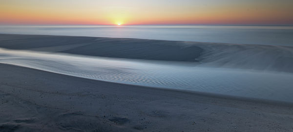
(Download)
no. 2 Diagonals
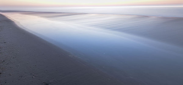
(Download)
no. 3 One step farther and removing the color really makes it about shapes and lines
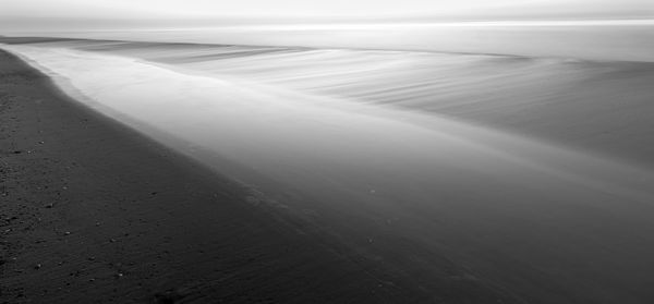
(Download)
Jun 5, 2021 08:02:56 #

Granted I’m looking at these on my phone, but often times a thumbnail size gives you useful feedback regarding composition and contrast. I actually prefer the first shot and something wishes for a little less cropping at the top in all three. Really like these shots though. !!!
Jun 5, 2021 08:12:45 #
I really fretted about the cropping at the top. The problem was that the sky was lighter than the water or the beach. Result was very little detail in the top of the image. That is why I decided on the crop that I used. I can see your point as well. Like I said, it was something that you look at and look at and have a hard time making up your mind. Thanks for the input. Glad you liked the photos.
Erich
Erich
Jun 5, 2021 14:34:31 #

I love the smooth simplicity and flowing lines. Definitely a case of less is more! I like 1 & 2 equally-would be hard to pick a favorite!
Jun 5, 2021 14:55:58 #
Cwilson341 wrote:
I love the smooth simplicity and flowing lines. Definitely a case of less is more! I like 1 & 2 equally-would be hard to pick a favorite!
Thanks. Simplicity is exactly what I'm looking for here. I'm leaning toward the black and white as my favorite. Thanks for your input. Always good to hear from you.
Erich
Jun 5, 2021 17:44:02 #
You delivered simplicity and calm. Very pleasing photos #1 & #2. I see you favor the B&W but I don't see it. Not enough to like, non emotional. I would walk right by it if it was in a show, but 1&2 I would stop and ponder.
Jun 6, 2021 08:01:44 #
Jim-Pops wrote:
You delivered simplicity and calm. Very pleasing photos #1 & #2. I see you favor the B&W but I don't see it. Not enough to like, non emotional. I would walk right by it if it was in a show, but 1&2 I would stop and ponder.
That is very interesting. I'm leaning toward the black and white because of the simplicity. From your considered comment, then, the color gives the photo an emotional impact that strikes you. That makes sense since we see things in color. Thanks for your input.
Erich
Jun 6, 2021 08:40:12 #

Jun 6, 2021 10:36:17 #

I always appreciate your shots and the thought that goes into them, Erich!
Jun 6, 2021 11:03:58 #

I viewed all three images. The first one, al least for me is you”typical “ sunrise shot. The second one has nice muted colors. The third one is all about the lines and tones. Well worth getting up early and hitting the beach.
Jun 6, 2021 12:49:56 #
yssirk123 wrote:
Beautiful images Erich!!!
Thank you. I got lucky and there was a channel of water up on the beach that was being kept alive by occasional waves washing over the crest of the sand. That created more interest than just sand and water. Thanks for taking a look.
Erich
Jun 6, 2021 12:51:27 #
UTMike wrote:
I always appreciate your shots and the thought that goes into them, Erich!
Thank you. That is a really nice compliment. I appreciate that.
Erich
Jun 6, 2021 12:53:53 #
NJFrank wrote:
I viewed all three images. The first one, al least for me is you”typical “ sunrise shot. The second one has nice muted colors. The third one is all about the lines and tones. Well worth getting up early and hitting the beach.
I agree with you about the sunrise shot. It's nice; but it is also like a million others. I was trying to get the sun to be elongated as it rose; but it did not really show up in the final result. So, the other two are the ones that interest me. Not sure which I like best. Maybe I'll just have to print both of them!!
Erich
Jun 6, 2021 16:50:01 #
A toss-up with the second and third images - I really do like both.
re: the cropping on top - maybe (maybe) just a little tight, but not distracting.
To me, the only distraction is, in contrast to the abstract and pleasing rendering of the sky/sea in both color and b/w versions, the rocks and pebbles on the beach are too sharp - the contrast breaks the mood for me. Can they be smoothed out? I think it would add much to the photo and still keep the moodiness.
Jun 6, 2021 23:04:13 #
CassidyMariya
Loc: New Jersey
I love the first picture the best! Although all of them are really good! In my opinion the third one could of used color instead of black and white. Great work Mr.Brunner :)
If you want to reply, then register here. Registration is free and your account is created instantly, so you can post right away.