Request to land
Apr 9, 2021 11:56:41 #
DonVA
Loc: British Columbia and New Mexico
Nalu wrote:
That is a pretty shot and I like the presentation of a white background. It's, well, just different and unusual. I like it. Thinking that you probably shot this in landscape mode, you probably cropped out a lot of the frame to the right of the bird. I would use that area to give the bird a bit more room to move into and not have him (her) bumping into the right side. Regardless, like the image a lot and thanks for sharing.
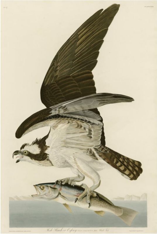
I agree that from a compositional point of view there should be space on the right side but as is, centered on the frame and with the white background, this looks very like it was painted by John James Audubon. That puts it into a category where the usual rules of composition are ignored.
Audubon was an illustrator and had no room on his canvas for anything but his subject.
This, for example, is his 'Fish Hawk or Osprey'.
Apr 9, 2021 11:58:56 #

Apr 9, 2021 12:52:36 #
Apr 9, 2021 13:31:24 #

Apr 9, 2021 13:43:00 #
Apr 9, 2021 17:38:43 #

Apr 9, 2021 19:31:39 #

Apr 9, 2021 19:35:42 #

Apr 11, 2021 13:25:41 #
darolwintle wrote:
Request to land
Beautiful shot and beautifully presented! Thanx for sharing.
If you want to reply, then register here. Registration is free and your account is created instantly, so you can post right away.