Monthly Masters' Critique - April 2021 - Van Gogh's "Almond Blossom"
Apr 2, 2021 10:05:32 #

Introduction
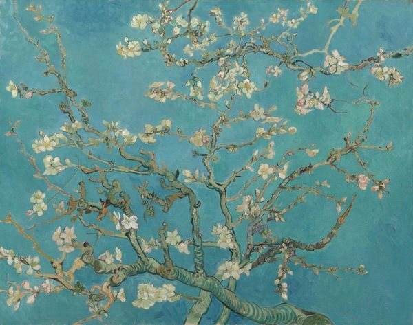
Vincent Van Gogh loved nature. Blossoming trees, like in the painting Almond Blossom, were one of his favorite subjects to paint. He painted a number of variations on the theme, ranging from a small flowering sprig in a glass to lavishly blossoming trees. Almond trees flower early in the spring making them a symbol of new life. Van Gogh borrowed the subject, the bold outlines and the positioning of the tree in the picture plane from Japanese printmaking.
The painting was a gift for his brother Theo and sister-in-law Jo, who had just had a baby son, Vincent Willem. In the letter announcing the new arrival, Theo wrote: ‘As we told you, we’ll name him after you, and I’m making the wish that he may be as determined and as courageous as you.’ Unsurprisingly, it was this work that remained closest to the hearts of the Van Gogh family. Vincent Willem went on to found the Van Gogh Museum where the work is displayed permanently.
Study this image and share with us your opinion of it. You may wish to use the questions below to guide your thinking.
Questions to Consider
1. What do you think of the composition of this image? The colors? Does it have impact? Does it suggest a story? Would you want it on your wall? Why or why not?
2. Think for a moment about the perspective. Do you think it was viewed from above, below, from the side? Was it perhaps a reflection? Does it matter? Does it matter if we are not sure? Would it matter if this were a photograph?
3. The color palette is mentioned in several of the linked articles, and in others I reviewed. It’s clear that as a painter Van Gogh had full control of his colors, and throughout his work, he never shied away from making alterations in what he saw with his eyes to create in his paintings a color combination that pleased him. Do you ever alter the color palette of your photographs to achieve a result that pleases you more? There are many arguments in photography about how far photographers should go in such endeavors. Do you have an opinion?
4. Most of the articles I encountered mentioned the influence of Japanese art on Van Gogh’s representation of these almond blossoms. Have you photographed a flower scene that you think reflects some of that influence? If so, please share.
5. Flowers are a common subject for traditional media artists and for photographers. Some photographers I know consider the subject boring and overdone. What do you think? Would you share one of your own flower photos that you are especially fond of? It can be traditionally photographed or creatively edited.
Links for Further Study
https://www.vincentvangogh.org/almond-blossom.jsp
https://en.wikipedia.org/wiki/Almond_Blossoms
https://www.youtube.com/watch?v=7RX2fhqHiP0 (how to paint your own almond blossom)
https://www.vangoghstudio.com/story-behind-blossoming-almond-tree/
https://byronsmuse.wordpress.com/2016/03/12/vincent-van-gogh-almond-blossoms-or-fragile-beauty/
https://www.vangoghmuseum.nl/en/collection/s0176V1962
Apr 14, 2021 10:29:04 #

I am finally getting around to writing. I will just touch on a few of the questions you threw out.
I love the composition. Many times I have tried for something similar.
His colors are kind of uniquely his, and therefor one of the most attractive aspects of many of his works.
I can only imagine this composition achieved by looking up. Not for a moment did I think it was a reflection, however many of my similar compositions are of limbs overhanging water. And yes I would certainly hang it on a wall!
I have toyed with several of my photographs over the last week or so, nudging the colors towards a more similar palette as he has used any number of times. Its his greens that have always struck me so.
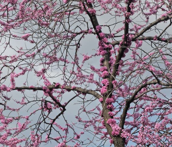
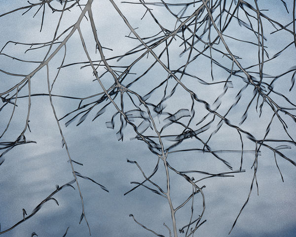
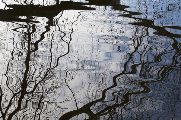
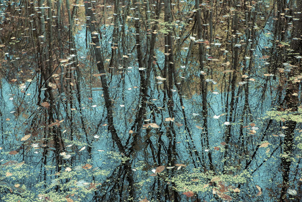
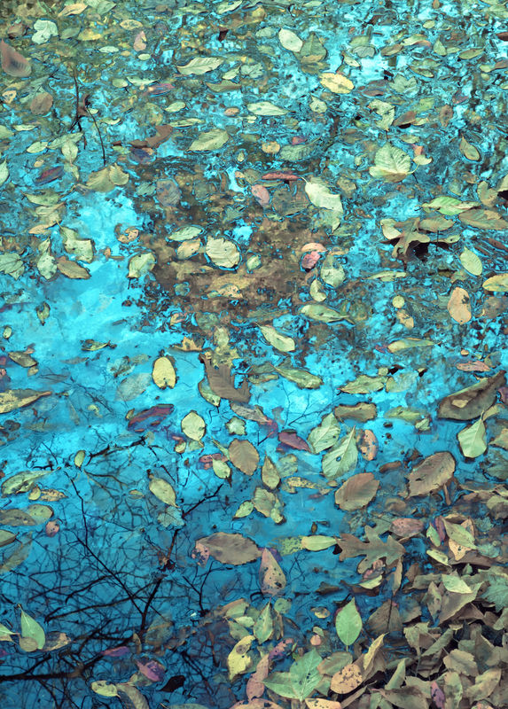
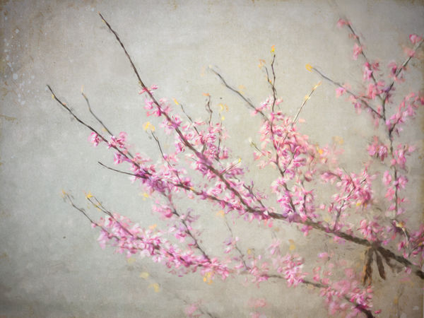
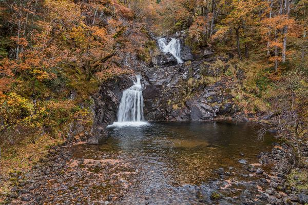
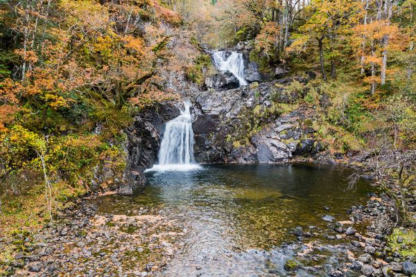
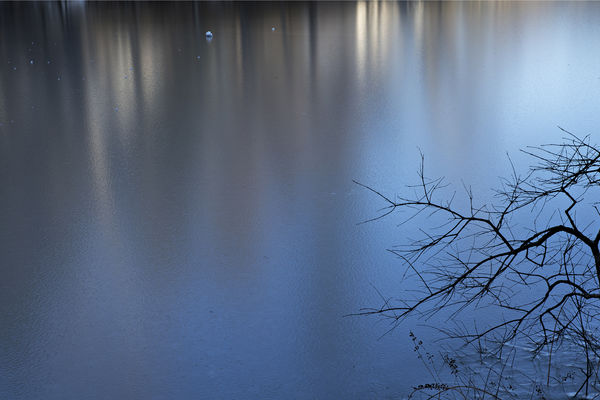
I don't often shoot flowers. While in DC some years ago I made the effort to get some shots of the cherry blossoms, but the area was amongst buildings. The first shot here is a cropped composition from one of those shots. I spent a fair amount of time shifting the blue sky to green but I disliked all those attempts. So this is simply a cherry blossom picture. The next two are looking down into the water at the reflections of limbs.
Lastly a couple where I tried to manipulate the colors. I don't think I am very experienced with doing that. Something I seldom do in processing images. Never the less, here they are.
I love the composition. Many times I have tried for something similar.
His colors are kind of uniquely his, and therefor one of the most attractive aspects of many of his works.
I can only imagine this composition achieved by looking up. Not for a moment did I think it was a reflection, however many of my similar compositions are of limbs overhanging water. And yes I would certainly hang it on a wall!
I have toyed with several of my photographs over the last week or so, nudging the colors towards a more similar palette as he has used any number of times. Its his greens that have always struck me so.
I don't often shoot flowers. While in DC some years ago I made the effort to get some shots of the cherry blossoms, but the area was amongst buildings. The first shot here is a cropped composition from one of those shots. I spent a fair amount of time shifting the blue sky to green but I disliked all those attempts. So this is simply a cherry blossom picture. The next two are looking down into the water at the reflections of limbs.
Lastly a couple where I tried to manipulate the colors. I don't think I am very experienced with doing that. Something I seldom do in processing images. Never the less, here they are.
Apr 14, 2021 10:59:02 #

I had sort of forgotten about this thread. Thanks for reminding me! I wanted to address the second question - about perspective. Many years ago I was involved in a sort of study of perspective and what it does to an image - be it a photograph or a painting. There were two trains of thought. One was that there should always be something that "grounded" the image - let the viewer know where he was in connection to the image. The other thought was that having no grounding item allowed the viewer to float to the image without limits. I found that doing the second was a lot of fun but sometimes difficult to do. What was really fun was watching viewers move around a bit to find their stability in reference to the image. It is interesting to put people a bit off-balance every now and then.
As to the images that Fergmark posted, I think he has done a wonderful job of capturing the same feeling, especially in images #3 and 4. And, he spoke about the special colours in the painting. I think he has also captured those as well. There is a difference in the tones, obviously, because of the difference between paint and reality.
As to the images that Fergmark posted, I think he has done a wonderful job of capturing the same feeling, especially in images #3 and 4. And, he spoke about the special colours in the painting. I think he has also captured those as well. There is a difference in the tones, obviously, because of the difference between paint and reality.
Apr 14, 2021 11:36:35 #
fergmark wrote:
I am finally getting around to writing. I will j... (show quote)
Thank you Mark, for your comments! I agree with you on the impact of Van Gogh's colors: they are compelling and enviable.
I had the impression of looking up with this one too, or looking "through" to water beneath, something I'm more likely to photograph.
Your images are lovely. Those last two are in a unique color palette of your own, and they are excellent.
Apr 14, 2021 11:40:10 #
AzPicLady wrote:
I had sort of forgotten about this thread. Thanks... (show quote)
Thanks for jumping in! I'm glad you brought up the issue of perspective. It's one of those things that defines how we capture photographs, and we're far more constricted than traditional artists, as we are restricted by availability and reality, while painters can manipulate and imagine their perspectives, or even defy nature by flattening and distorting it. To a point, we can too, in software, but we are confined to starting off with an existing reality. We can also, by compositional choices and angles, cause viewers to "wonder" and question reality.
Apr 14, 2021 11:44:50 #
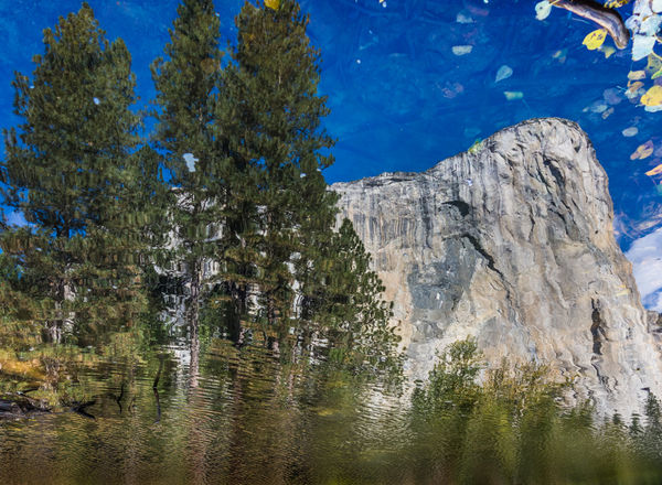
Here's a couple of images of mine that came to mind when I started reading the responses to the thread.
The first is a redbud shot over the edge of the river on a rather drab day, then edited in Photoshop to add some "paint dabs" with a brush and a texture.
The second is straight out of camera, shot in Yosemite - and flipped upside down. It's all a reflection.
The first is a redbud shot over the edge of the river on a rather drab day, then edited in Photoshop to add some "paint dabs" with a brush and a texture.
The second is straight out of camera, shot in Yosemite - and flipped upside down. It's all a reflection.
Apr 15, 2021 06:21:59 #

Having tried to photograph blossoms in trees against a clear bit of sky I've found that it's not as easy as it might at first seem. I suspect that Vincent's approach involved placing his easel underneath a tree at a suitable point and then finalising the composition as he saw fit, which would involve including and/or excluding the branches with blossoms on them to give just the right density and depth. As with the Japanese artists he probably didn't feel any urgency to portray depth or perspective accurately.
As far as the colours go, I'll assume that the colour of the sky is as he intended and not the result of pigment deterioration. Perhaps Sky Blue was overdone as a colour for skies even in his day. Any colour shifting that I've done is limited to things like neon yellow-green grass needing more primary green and less yellow, or yellow-green autumn colours benefitting from a shift toward orange and red (see below).
.
Apr 15, 2021 08:10:49 #
minniev wrote:
Here's a couple of images of mine that came to mind when I started reading the responses to the thread.
The first is a redbud shot over the edge of the river on a rather drab day, then edited in Photoshop to add some "paint dabs" with a brush and a texture.
The second is straight out of camera, shot in Yosemite - and flipped upside down. It's all a reflection.
The first is a redbud shot over the edge of the river on a rather drab day, then edited in Photoshop to add some "paint dabs" with a brush and a texture.
The second is straight out of camera, shot in Yosemite - and flipped upside down. It's all a reflection.
The redbud shot is beautifully done. Your artistic touch is really inspiring.
There were several other photos that also came to mind, but which included more environment. I have also turned upside down a number of photos. It was part of my process when painting abstracts, to rotate the canvas when assessing the compositions. Often times proceeding with the painting in various rotations. I know I have a number which are wired to hang in different orientations. so, a couple of the others I thought of.
If you want to reply, then register here. Registration is free and your account is created instantly, so you can post right away.