A first for me...
Feb 28, 2021 12:18:10 #
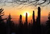
I would appreciate feedback on this.
Background image was found on the web, credit in file name.
Roses were shot inside a semi-transparent deskside waste container with remote flash on the top, Sony A7c with 28-60mm kit lens.
Used Photoshop to change the colour of the background and rotate original background image.
ACR to adjust white balance, saturation, contrast of roses.
Photoshop "Select" - "subject". Create mask of selection.
Slight adjustment of masks (background and foreground) to finesse shadows and blending of the two images.
Since I usually do not use Photoshop for anything other than panoramas, I would like some honest opinions, please, as to how I can improve my technique for this type of composite work.
Thanks for looking.

Feb 28, 2021 12:42:09 #

Very nice. There are a few small places that need attention. This is on the rose on the right side of the photo.
--Bob
--Bob
Ourspolair wrote:
I would appreciate feedback on this. br Background... (show quote)
Feb 28, 2021 13:39:47 #
rmalarz wrote:
Very nice. There are a few small places that need attention. This is on the rose on the right side of the photo.
--Bob
--Bob
Thanks for pointing that out.. I had the image enlarged and totally forgot that area...
Feb 28, 2021 14:36:17 #
Ourspolair wrote:
I would appreciate feedback on this. br Background... (show quote)
In addition to the cutout errors that Bob pointed out, I would add the following:
1. It appears that the main lighting on the flowers comes from the right. The main light on the background appears to come from the left.
2. There are areas in the flower where it's slightly out of focus but the cutout (masking) edges are overly sharp, such as the green leaves at the top of the image.
3. The focus on the flower doesn't match the background focus. The focus on the flower is closer to the camera. The back of the flower is slightly blurred. But the background cloth is in sharper focus. This is especially obvious just above and to the right of the middle flower. As you travel from the lens to the background, you first have a sharp focus on the flower blending into a softer focus and finally into a sharp background focus. You will see this to some degree as you move around the edges of your flower. You should consider blurring the background to match the focus of the flower where they meet. Next time, you might consider shooting the flower with a greater depth of field to make the focus blending into the background a little more seemless.
4. Also more cutout errors in the area between the middle flower and the leaves.
Hope this helps
Mike
Feb 28, 2021 14:39:45 #
Interesting process Ours, comes out really well in DL or even DDL - I am not into this kind of work so I cannot offer any suggestions but to me the effect is very pleasing. Joe
Feb 28, 2021 14:54:10 #

I like your pairing, aside from some focus issues already mentioned, and other tweaks.
When you get a chance, rotate it 90 degrees to either side and see what you think. For me, a 90-degree rotation counter-clockwise makes a more pleasing flow.
We have a texture library from which you can use any posted photos. Within that thread is information for free backgrounds/overlays/texture websites: https://www.uglyhedgehog.com/t-630884-1.html
Thanks for posting!
Feb 28, 2021 18:07:53 #
SalvageDiver wrote:
In addition to the cutout errors that Bob pointed ... (show quote)
Thank you kindly for the detailed critique. I shall use all comments to redo the image soon.
Feb 28, 2021 18:08:26 #
weberwest wrote:
Interesting process Ours, comes out really well in DL or even DDL - I am not into this kind of work so I cannot offer any suggestions but to me the effect is very pleasing. Joe
Thanks for looking in and for the comment.
Feb 28, 2021 18:10:08 #
Linda From Maine wrote:
I like your pairing, aside from some focus issues already mentioned, and other tweaks.
When you get a chance, rotate it 90 degrees to either side and see what you think. For me, a 90-degree rotation counter-clockwise makes a more pleasing flow.
We have a texture library from which you can use any posted photos. Within that thread is information for free backgrounds/overlays/texture websites: https://www.uglyhedgehog.com/t-630884-1.html
Thanks for posting!
When you get a chance, rotate it 90 degrees to either side and see what you think. For me, a 90-degree rotation counter-clockwise makes a more pleasing flow.
We have a texture library from which you can use any posted photos. Within that thread is information for free backgrounds/overlays/texture websites: https://www.uglyhedgehog.com/t-630884-1.html
Thanks for posting!
Thanks for the input. I shall be applying all of the input soon.
Mar 1, 2021 07:31:37 #

Very good, but if you look on the dd there are a lot of places all round the flowers that have not been cut out.
As other people have given you very good advice I will add that I do like the way the background reddish colours compliment the colours in the roses.. Great for a first try...
As other people have given you very good advice I will add that I do like the way the background reddish colours compliment the colours in the roses.. Great for a first try...
Mar 1, 2021 08:12:07 #

Using PS is a journey not a sprint, as I can attest to. Suggestions given are helpful. If nothing else you can keep them in the back of your mind while working on your next project. Embrace the learning curve and above all else enjoy the journey.
Mar 1, 2021 08:38:23 #
nanaval wrote:
Very good, but if you look on the dd there are a lot of places all round the flowers that have not been cut out.
As other people have given you very good advice I will add that I do like the way the background reddish colours compliment the colours in the roses.. Great for a first try...
As other people have given you very good advice I will add that I do like the way the background reddish colours compliment the colours in the roses.. Great for a first try...
Thanks for looking in, taking the time to comment and add some encouragement.
Mar 1, 2021 08:41:51 #
NJFrank wrote:
Using PS is a journey not a sprint, as I can attest to. Suggestions given are helpful. If nothing else you can keep them in the back of your mind while working on your next project. Embrace the learning curve and above all else enjoy the journey.
Yup - I have been using PS since CS4 but always found their masking processes tedious. The improvements in the selection tool and experimenting with lighting set-ups drove me to get into the composite game. I think that I shall have to keep the suggestions "front-of-mind" as I move forward. I was happy to embark on the journey, but clearly have to pay much more attention to the details!
Thanks for your encouragement.
Mar 1, 2021 09:26:23 #
tcthome
Loc: NJ
Linda From Maine wrote:
I like your pairing, aside from some focus issues already mentioned, and other tweaks.
When you get a chance, rotate it 90 degrees to either side and see what you think. For me, a 90-degree rotation counter-clockwise makes a more pleasing flow.
We have a texture library from which you can use any posted photos. Within that thread is information for free backgrounds/overlays/texture websites: https://www.uglyhedgehog.com/t-630884-1.html
Thanks for posting!
When you get a chance, rotate it 90 degrees to either side and see what you think. For me, a 90-degree rotation counter-clockwise makes a more pleasing flow.
We have a texture library from which you can use any posted photos. Within that thread is information for free backgrounds/overlays/texture websites: https://www.uglyhedgehog.com/t-630884-1.html
Thanks for posting!
 Thank you.
Mar 1, 2021 10:16:02 #
Ourspolair wrote:
Thank you kindly for the detailed critique. I shall use all comments to redo the image soon.
Hi Ourspolair,
I do think that this is a very good first try. Much much better that my first composite ever was, by far.
As I came back to revisit your image and read some of the other comments, I realized another important element for you to consider. You need a shadow cast onto your background to add depth to the image. One doesn't know if the flower is laying on or elevated above the background. You did pick a hard background with its rippling contours to create a shadow on. You might trying experimenting with a textured background as Linda from Maine suggested. Creating a shadow onto a background with a flat contour should be easier than a background with a complicated geometry.
I hope you don't think that I'm piling on. My intent is to give you some constructive feedback based on errors I've made many times in the past. And as I've been told many times, the details don't need to be perfect, just good enough to complete the illusion (at the intended viewing distance). But you've made a good start and the more you practice, the better you get.
Have fun,
Mike
If you want to reply, then register here. Registration is free and your account is created instantly, so you can post right away.