Playing Around With Split Toning
Feb 26, 2021 01:30:16 #

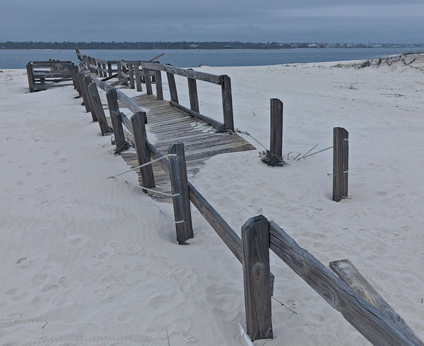
I have read about split-toning and what type of effect you can expect from using it. But until now, I have not found any composition that seemed to fit the "why would I try it it" box on the checklist. I was trying to figure out the best processing for the attached file and just could not get a color balance that I was happy with. Even my default 'change it to monochrome' didn't seem to work. So with all of that I gave split-toning a try and I have to say I'm pleased with the results.
Is it a true representation of what the environment looked like when I was there? Of course not, but it does seem to impart more of the mood I was feeling as I surveyed the storm damage in the park.
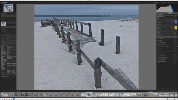
I would be interested to get thoughts and opinions from everyone in this group. Being that I use darktable, I thought a screenshot of the split-toning settings would be more beneficial than trying to explain my settings.
Is it a true representation of what the environment looked like when I was there? Of course not, but it does seem to impart more of the mood I was feeling as I surveyed the storm damage in the park.
I would be interested to get thoughts and opinions from everyone in this group. Being that I use darktable, I thought a screenshot of the split-toning settings would be more beneficial than trying to explain my settings.
Feb 26, 2021 05:33:45 #

I find that split toning is a good way to add colour to a shot that's flat colour-wise and that doesn't respond well to just turning up the saturation. Or alternatively if I've reached the limit of what I can add using saturation, small amounts of split toning can be a way to tweak the shot to get some extra colour into it (emphasis on the "small amounts"). Overdoing split toning can be a quick way to get an unnatural, overcooked look.
If you've taken a shot on a misty or overcast day it can be lacking in colour and contrast. You may not want misty shots to be ultra colourful, but on the other hand you may not want them to be flat grey either.
The added tints can be used to warm up or cool down the colour scheme, or alternatively a mixture of warm and cool colours can be used to give an overall balance (plus some added contrast via complementary colours). My usual combination for landscape shots is almost the opposite to what you did - blue (~215 - 220) for the highlights and orange (~30 - 33) for the shadows. And unless Darktable is calibrated differently from Lightroom you've used more saturation than I would normally (typically for me, 12 would be a lot. 4 - 8 would be more common). Having said that, it's all about intention and my usual intention is to hold on to a natural look. Surreal or atmospheric effects would typically require more extreme adjustments.
Feb 26, 2021 07:15:13 #
In my view, you have rendered this overcast beach scene very well. The tones you have emphasized have resulted in an image which is highly credible and brings more to the viewer than the original. Well done, and thanks for sharing the screen shot.
Feb 26, 2021 09:31:44 #
R.G. wrote:
I find that split toning is a good way to add colo... (show quote)
Thank you very much for the very descriptive feedback. I will play around with the colors after work today and see what results come of it for sure. The color I used for the shadows was pulled from the water color and I picked yellow to bring out some of the warmth in the wood and try to keep the sand as white as possible.
Darktable is calibrated differently than other programs and that is why I included the screenshot to show the values for the given composition. If you suggest I pull back on the saturation a bit I can try that also.
I'm not sure I was purely holding on to a natural look, but I definitely try to avoid over saturation and applying too much contrast. Key word is "try"...LOL.
Thank you again for the feedback!
Tony
Feb 26, 2021 09:34:39 #
Ourspolair wrote:
In my view, you have rendered this overcast beach scene very well. The tones you have emphasized have resulted in an image which is highly credible and brings more to the viewer than the original. Well done, and thanks for sharing the screen shot.
I appreciate the comments, thank you! Since I have never really fiddled with split toning before, I'm glad to know that I am at least on the right track.
Feb 26, 2021 21:36:41 #

Feb 27, 2021 10:17:12 #

Feb 27, 2021 12:05:03 #
Feb 27, 2021 12:05:14 #
Feb 27, 2021 12:38:11 #

Feb 27, 2021 14:23:22 #
Fotoartist wrote:
The before and after escapes me.
I apologize, I don't follow. Did you want to see it processed without split toning for comparison?
Feb 28, 2021 18:57:49 #
Most often I use split toning to create or emphasize a particular mood in a captured scene.
Feb 28, 2021 20:06:37 #
johngault007 wrote:
I have read about split-toning and what type of ef... (show quote)
I like the photo; but I don't really have anything constructive to add since I really don't use split toning....maybe I should?
Erich
Feb 28, 2021 21:03:33 #
rook2c4 wrote:
Most often I use split toning to create or emphasize a particular mood in a captured scene.

I was trying to do just that.
Feb 28, 2021 21:04:08 #
ebrunner wrote:
I like the photo; but I don't really have anything constructive to add since I really don't use split toning....maybe I should?
Erich
Erich
Not sure...I am still trying to figure that out as well.

If you want to reply, then register here. Registration is free and your account is created instantly, so you can post right away.