Winter Sunset Options?
Feb 14, 2021 11:55:39 #
jbk224
Loc: Long Island, NY
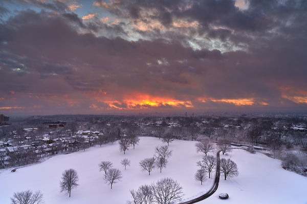
Sitting in my kitchen, after a recent snow, I saw the fire in the sky at sunset. I missed the big show, but made it outside to capture what I could.
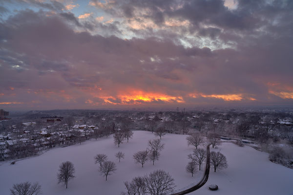
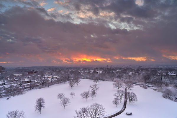
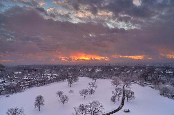
Attached are three processed images. #1 has a masked layer for the sky to bring it to the correct exposure and colors. The foreground basically only has slight shadow brought out. #2 has a 2nd layer for the snow to bring out the contrast between the bright white snow and sky. When I did this, I thought that the sky, where it meets the foreground slightly lightened up-- so I again darkened this area.
My wife says she doesn't see the difference between #2 and #3; and likes these better than #1.
I like #2 + #3; but I keep going back to #1 and really don't know why.
What do you think and would you do anything more?
Thanks for your feedback.
Jon
Z6/24-70 f/4;/1/20sec/24mm @ f/8/ISO 110--Handheld

Feb 14, 2021 11:58:09 #

Feb 14, 2021 11:58:37 #

jbk224 wrote:
Sitting in my kitchen, after a recent snow, I saw ... (show quote)
Jon, image 2 works for me because the snow is white. Great capture and processing.
Feb 14, 2021 13:53:52 #
I think you're going back to No 1 because as you remember it at the time, 2 & 3 are to bright in the ground snow area. I think if you split the difference you would be happier.
Feb 14, 2021 14:48:06 #
Great capture to start with. My vote goes to #3, the brightness of the snow does not overpower the density of the sky. Thanks for sharing. Please stay safe.
Feb 14, 2021 17:04:33 #
jbk224
Loc: Long Island, NY
Jim-Pops wrote:
I think you'r going back to No 1 because as you remember it at the time, 2 & 3 are to bright in the ground snow area. I think if you split the difference you would be happier.
So, I cut back the exposure at the snow....???
You may be right.
Jon
Feb 14, 2021 17:17:30 #
jbk224
Loc: Long Island, NY
Jim, when I made the adjustment you suggested and then put them side by side; I had two completely different feelings:
#3 is a picture..contrasting the 'bright' white/clean snow with the dark and fiery sky. It is what it is.
#4 creates a foreboding feeling..Yes, the snow is white, but by keeping it 'darker in the light'; my eye travels to the fiery sky expecting something dark.
Maybe I'm overthinking this..
#3 is a picture..contrasting the 'bright' white/clean snow with the dark and fiery sky. It is what it is.
#4 creates a foreboding feeling..Yes, the snow is white, but by keeping it 'darker in the light'; my eye travels to the fiery sky expecting something dark.
Maybe I'm overthinking this..
Feb 14, 2021 17:46:57 #
jbk224 wrote:
Jim, when I made the adjustment you suggested and then put them side by side; I had two completely different feelings:
#3 is a picture..contrasting the 'bright' white/clean snow with the dark and fiery sky. It is what it is.
#4 creates a foreboding feeling..Yes, the snow is white, but by keeping it 'darker in the light'; my eye travels to the fiery sky expecting something dark.
Maybe I'm overthinking this..
#3 is a picture..contrasting the 'bright' white/clean snow with the dark and fiery sky. It is what it is.
#4 creates a foreboding feeling..Yes, the snow is white, but by keeping it 'darker in the light'; my eye travels to the fiery sky expecting something dark.
Maybe I'm overthinking this..
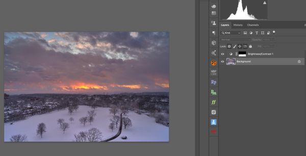
I tried this
Opened your No2. Then made a selection of the ground. While selection is active I added a Brightness/Contrast layer. I lowered my brightness slider -65. I softened the horizon edge with a soft 20% brush on the mask. Blow up my screen capture and you will see the area I softened. This setting also made your blacks a bit blacker/sharper. On your last example I thought yours went flat.
I tried to use a curves layer to do the same thing but the white is so white it wouldn't work for me.
If you try these moves and think it is a little too blue select the mask ,Command+Click, then select a curves layer. In the curves layer pick the Blue curve and lower it till you're happy.
Feb 14, 2021 21:06:38 #
jbk224
Loc: Long Island, NY
Thanks for your help. Decided to bring out the true white snow and add black back to the edges.
Feb 15, 2021 11:52:23 #
Feb 15, 2021 12:46:12 #
StanMac
Loc: Tennessee
jbk224 wrote:
So, I cut back the exposure at the snow....???
You may be right.
Jon
You may be right.
Jon
Snow looks white even at night to me. I think the second pic, with the brighter snow, works best to my eye. FWIW.
Stan
Feb 15, 2021 21:11:21 #
Flying Three
Loc: Berthoud, CO
I think you have 2 different photos within the one. I would crop for the top half and adjust for the beautiful sunset. I would use the bottom half in stark black and white for a stunning visual of the trees.
If you want to reply, then register here. Registration is free and your account is created instantly, so you can post right away.