Do You Use Negative Space as an Element in your Image Compositions?
Feb 2, 2021 21:21:09 #
Shooter41
Loc: Wichita, KS
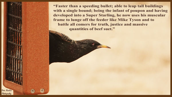
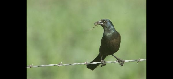
All of us old-timers remember listening to Superman on the radio back in the day. Some of us even saw the movie which showed where Superman came from and the family that raised him on Earth. The Starling in the attached image is scrunched up in a muscular ball ready to spring off of the hanging bird feeder with enough forward momentum to take off mid-air. While composing and editing the image, I asked myself if negative space ahead of the Starling was appropriate in that would be where he would take off. Would the photographers interested in composition on UHH care to share their thoughts regarding whether the negative space in my creation is appropriate or could be better?
Feb 2, 2021 21:50:47 #
The rule of composition I learned is leave space for the subject to move into unless your compositional message is "Oh God! I'm gonna go SPLAT!!!" I have seen some compositions where the idea was to show the subject was leaving - but in the back of my mind I still hear "splat".
Feb 2, 2021 21:53:35 #

Shooter41 wrote:
All of us old-timers remember listening to Superma... (show quote)
I think your shot is well composed and I agree that having negative space in front so the subject has room to “move” is a good idea.
Feb 2, 2021 22:07:52 #

I'm mostly a wild life shooter, sometimes that includes the grand kids. I use negative space in most of my photos. I don't hear 'splat' but if I don't use enough, something doesn't look right and it's usually something to do with the rule of the thirds.
Good post and I'm still a Superman fan. Saturday afternoons when I was eight I would take my future wife to the movies. We would both get in and have a bag of popcorn for a quarter. HA see how far you get with a quarter in a theature these days.
I think it's a good shot
Good post and I'm still a Superman fan. Saturday afternoons when I was eight I would take my future wife to the movies. We would both get in and have a bag of popcorn for a quarter. HA see how far you get with a quarter in a theature these days.
I think it's a good shot
Feb 2, 2021 22:11:25 #

The generally accepted "rule" is that whenever there's movement in a specific direction, the object in motion should be given some space to move in to. Similarly, whenever there's a directed gaze, the gazer should be given some space to look in to.
Taking that a step further, it's sometimes seen as desirable if the movement (or the gaze) leads in towards the centre of the frame, as opposed to leading out of the frame. However, that requirement could be very restrictive where the composition as a whole is concerned and it would be inappropriate in many situations, so a certain amount of flexibility is required.
Your posted image just about meets that requirement but as a consequence approximately half of the image is empty space. In this instance it works, but like most things, negative space can be overdone. Your added text helps to keep a sense of balance but without it I would say you would be close to the upper limit of how much negative space you would want.
Having said that, balance is usually something that you want but a deliberate imbalance can sometimes be used to good effect, and negative space can be used to create that sense of imbalance.
Breaking the "rules" can sometimes be done to good effect, but on the other hand it can also come across as inappropriate. It's all about creative choices, but choices aren't all equal when it comes to the effectiveness of the final result.
Feb 2, 2021 22:47:07 #
Shooter41 wrote:
All of us old-timers remember listening to Superma... (show quote)
Interesting topic. I think the text takes this out of the realm of a stand-alone photograph and creates more of a page in a magazine. In that context, it's not as much of an issue with negative space as it is one of a compositionally unbalanced page.
I would consider rearranging the text.
Feb 2, 2021 22:57:03 #
Shooter41 wrote:
All of us old-timers remember listening to Superma... (show quote)
IMNSHO, that area to the right is not negative space. It’s just empty space and some background.
I do agree about the amount you’ve included in the frame and about the reason why it works. But as a design element, it’s not negative space. It’s really not a design element at all.
Feb 3, 2021 02:29:21 #

User ID wrote:
IMNSHO, that area to the right is not negative space. It’s just empty space and some background.
I do agree about the amount you’ve included in the frame and about the reason why it works. But as a design element, it’s not negative space. It’s really not a design element at all.
I do agree about the amount you’ve included in the frame and about the reason why it works. But as a design element, it’s not negative space. It’s really not a design element at all.

I was just about to comment the same thing.
Negative space happens by design.
In photographs, unless it was created to be one, it is just space or uncluttered area.
To be more precise, Negative space is the area around the Positive space (main element) that contains nothing but creates another element in the design.
In a photograph, usually such spaces unless contrived to be a negative space do not make an additional design element but rather a platform for holding other elements.
In the OP's photo, the space is not empty nor "creating" a design element. Rather, it is "already" an element of clouds/bokeh. In this case acting as a diffused supporting platform for the text element.
To the OP's credit, it is a good decision to put that "breathing/action space" into his composition.
Feb 3, 2021 03:42:27 #
Some clever use of negative space in Logos:
.
.
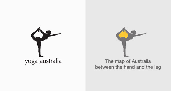
The negative space of the ink pen nib creates a spoon

negative space of fingers with the box creates a house

E & X create an arrow representing the idea of moving packages

The negative space of the person playing golf outlines a face and create an eye. The whole composition creates a Spartans head

Feb 3, 2021 06:13:36 #
In this case, the negative space implies movement and energy, provides opportunity for a story. Without it, all you have is a picture of a bird.
Feb 3, 2021 06:23:55 #

Shooter41 wrote:
... Would the photographers interested in composition on UHH care to share their thoughts regarding whether the negative space in my creation is appropriate or could be better?
Very appropriate, IMHO. I often use negative space as you have done here with the "rule of thumb" placing it ahead of the subject giving it room to "move into" the composition. While reviewing my Death Valley images recently I changed that rule to show a small boy moving toward the edge of the frame instead as if he wanted to "get the hell out."

Feb 3, 2021 06:35:09 #

Shooter41 wrote:
All of us old-timers remember listening to Superma... (show quote)
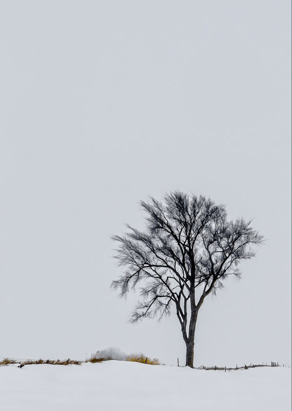
Yes. In this case of the solitary tree I use NS to emphasize the solitary isolation of the subject and perceive the NS and tree in a balance of sorts.
Your suggested example of “ space into which the bird can move” is another I find useful. As well, I use NS as “ space into which to gaze”.
Even flowers benefit from “space to gaze into”.
Just one guy’s thoughts...
The example by cameraf4 reminds me that NS can imply a space, or a time or a danger/circumstance that is being left behind or escaped by contriving movement “out of the picture” rather than “into the picture”.
Dave


Feb 3, 2021 06:43:41 #

Yes, when the scene warrants using negative space.
--Bob
--Bob
Shooter41 wrote:
All of us old-timers remember listening to Superma... (show quote)
Feb 3, 2021 07:34:48 #

Wallen wrote:
Some clever use of negative space in Logos:
.
.
Wallen: Thanks for your examples. These are some design elements that I had not noticed before. I will not look at FedEx logos the same way anymore. Nice to learn something so early in the day.
Feb 3, 2021 09:06:51 #

Shooter41 wrote:
All of us old-timers remember listening to Superma... (show quote)
Simple answer, YES!
If you want to reply, then register here. Registration is free and your account is created instantly, so you can post right away.