Help, please, before printing
Jan 21, 2021 14:01:20 #
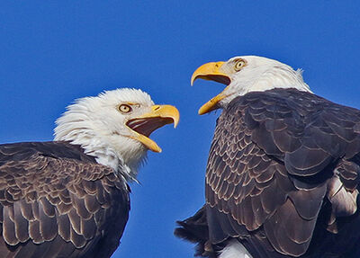
This is my first posting to this group. Honestly its the first time I really wanted some serious critique of an image.
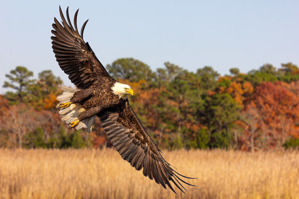
I'm on the verge of making a large print of this for my doctors office. Might be 16 or 20" width, what ever works out with the least cropping. But print size and aspect is also a reason I'm posting this. Will also be making a couple other prints of it as well.
I think I need all of the images height to protect the eagles wingtips in the printing. Going large because of where it is going to be displayed. So please do offer thoughts on print size and aspect.
Also, Please give me your thoughts on colors and how "correct" they seem to you on your monitors. I have already had a small test print made and the colors looked true to me but I'm always glad for second and 3rd opinions.
Thirdly, please share your thoughts on its composition and any editing tweaks you think might improve the image.
And, because this is going to be hung in a semi public place, actually 2 semi public places, I plan to reopen the original files and have another go at the image with a more critical eye then I may have used during its last edit. I cant reshoot the eagle or the fall background but all possible tune-ups are fair game.
Thanks very much,
Bill
Jan 21, 2021 14:05:42 #
WDCash wrote:
This is my first posting to this group. Honestly ... (show quote)
A really great shot! Colors are good, the eye detail is wonderful. The background however. Is it too much for a professional office? Otherwise I luv this shot!
Jan 21, 2021 14:21:22 #
Ysarex
Loc: St. Louis
WDCash wrote:
This is my first posting to this group. Honestly ... (show quote)
Great shot! Congrats.
White balance seems good to a tad warm.
I'd make a few tweaks.
I'd punch up the blue sky a bit.
I'd add a vignette to close in the corners a bit.
And you need to take some time to think about this because it's bit jarring at first. I'd flip it. You know how you shot it but no one else has to know that. It's not like there's a sign in the photo that say's eat at Joe's so nothing is going to look wrong. Composition is going to feel very different if people read in from the left (they do) see the eagle and then have a lot of empty space to get lost in as opposed to read in from the left and set the scene and then get the big reward of the eagle and stop looking any further.

Jan 21, 2021 14:37:10 #

WDCash wrote:
This is my first posting to this group. Honestly ... (show quote)
You can print the aspect ratio as-is, go square, or crop equally on the left and right as required to fit the aspect ratio of a print.
If you have a raw file of this, I would edit it and see if you can recover some detail in the white feathers of the bird's head, which is currently burned out to white. That is the only real suggestion I have about the processing. If all you have is a JPEG, you may find that you cannot recover the white feathers at all. That's why raw is used by action photographers and wedding photographers... Fur, feathers, and fabrics all have details that are often recoverable from a raw file, but are burned out or plugged up in a JPEG processed in camera.
As for color, it looks acceptable. You know what time of day you recorded, from the EXIF data in the file, so its slight overall warmth may or may not be accurate. (I did evaluate in Download on my calibrated and profiled monitor.) At any rate, the warmth is neither excessive nor objectionable to my taste.
Jan 21, 2021 14:40:34 #

It's a striking image as is. You could blur the background in post if you think it's too busy.
Jan 21, 2021 14:50:34 #

The most objectionable thing for me is the blown highlights in the eagles head. Assuming you have a RAW file to work with, I would start by correcting that first. It would be a much nicer picture with some detail in the head.
Jan 21, 2021 14:57:54 #
Ysarex wrote:
Great shot! Congrats. br br White balance seems g... (show quote)
I fully agree with that analysis and suggestions. I flip images often for compositional reasons. We in the Americas and Europe and much of the world read left to right. Asia and Middle East often Right to Left. It makes a difference when viewing a photograph.
Jan 21, 2021 15:14:12 #
WDCash wrote:
This is my first posting to this group. Honestly ... (show quote)
Sorry if anyone has already suggested this, I have started the reedit and decided a bit of water, which was there, might add something And I was going to ask about improving the sky a bit.
I have yet to blur this possible background. Still needs its own edits and some focus blur.
Jan 21, 2021 15:16:20 #
ALL is pretty GREAT on my monitor ! - If anything, as mentioned, darken the head feathers and the sky and - I would take some red out of the midtones and add blue to the midtones to make the greens in the trees pop and the blues in the sky pop - at least that's how I do it in Elements 9. This will also cool the warm WB - some .....thanks for sharing
Jan 21, 2021 15:22:14 #
timcc
Loc: Virginia
Very nice image! Just a couple suggestions:
- It seems a little too warm, leaving the sky slightly too red and making the background stand out a little too much for my taste. A white balance adjustment could fix both. (Assuming my monitor's settings are similar to yours or the printer's.)
- Agree with burkphoto that the blown-out white on the eagle's head needs to be corrected, especially if the photo is to be enlarged as you indicated.
Jan 21, 2021 15:35:59 #
Sinewsworn wrote:
A really great shot! Colors are good, the eye detail is wonderful. The background however. Is it too much for a professional office? Otherwise I luv this shot!
Thanks Timothy,
Apparently the Doctor does not agree.
Jan 21, 2021 15:41:20 #
burkphoto wrote:
You can print the aspect ratio as-is, go square, o... (show quote)
Thankyou Bill.
Great insights.
It was shot Raw and I'm already deep into a reedit from that file. I think your correct that I lost some detail in its head feathers the last time around. Will work to correct that.
As to the overall color. Your correct again. It was shot on auto white balance and I neglected to correct that in post.
Thanks.
Jan 21, 2021 15:44:12 #
Ysarex wrote:
Great shot! Congrats. br br White balance seems g... (show quote)
Thanks for the suggestions Ysarex,
Your version looks good. I never thought about flipping it. Or that we read left to right and might wander off the image.
Jan 21, 2021 15:46:34 #
kpmac wrote:
It's a striking image as is. You could blur the background in post if you think it's too busy.
Thanks Ken,
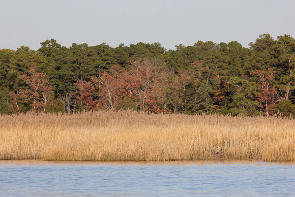
Actually the blur that is there I added. The background was added and as shot was infocus. I was timid about how much to blur.
Jan 21, 2021 15:49:19 #
fergmark wrote:
The most objectionable thing for me is the blown highlights in the eagles head. Assuming you have a RAW file to work with, I would start by correcting that first. It would be a much nicer picture with some detail in the head.
Thanks Mark.
Odd they are not blown at all on my monitor or according to LR. But as discussed above I did allow wash out a good bit of detail last time around. Ahh the blessing of shooting RAW and being able to get a re-do, as many as I like.
Thanks
If you want to reply, then register here. Registration is free and your account is created instantly, so you can post right away.