Upper Norwalk River WINNER
Jan 10, 2021 21:27:42 #
The votes are in. Here are the results
no. 4 Jim-Pops one vote
no. 8 SpyderJan one vote
no. 9 SoHillGuy one vote
no. 10 GeorgeK six votes
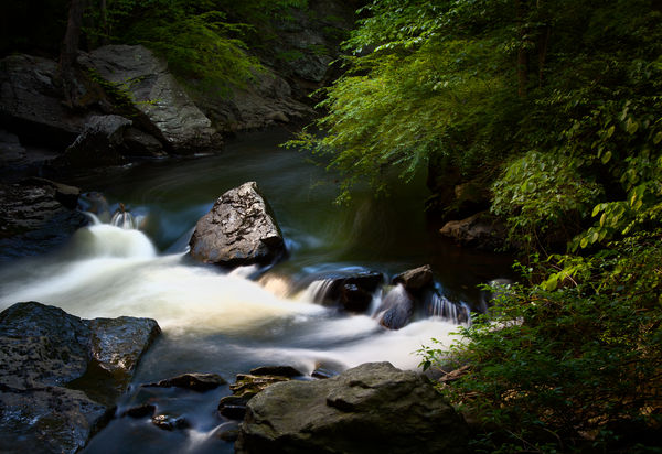
no. 11 NikonGal seven votes
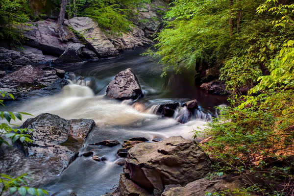
no. 12 SalvageDiver seven votes
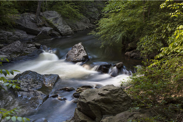
So, we have another tie. You guys really like to make life tough for your moderator! So here I go. I hope I make sense.
I spent a good amount of time going back and forth between the two edits. I was looking for something technical that I could hang my hat on to favor one edit over the other. I did not see anything. Then it struck me that, while they are both stunning, the character of these two edits is quite different. So I went back to the original and I compared both edits to the original to see if that would help me make a decision. Here is my take:
edit no. 11 :
In this edit the shadows remain dark. Attention was paid, in particular, to the rock in the middle of the stream. This became a feature element of the edit. It is bright and prominent. I think the attention paid to the foliage in the trees is also very good. While it has been brightened to enhance the detail of the foliage, it is not so bright as to take away attention from the rock in the middle. The shadows darkness adds depth to the image. It also puts our attention squarely on the foliage border and the rock in the middle of the stream. I think it is an outstanding edit.
edit no 12:
Here everything is brightened and enhanced. We see detail everywhere. When I look at this edit, it makes me think of an HDR image. This type of heightened reality works really well for images of buildings or "rusty gold" of abandoned autos or industrial disrepair. In a natural scene like this one, I think the heightened detail makes it hard for the viewer's eye to fall on one area or even two areas. Everything is enhanced and I'm going from the rocks along the shore to the very bright leaves, to the rock in the middle.
Verdict: I'm really impressed with the subtlety of edit no. 11. There is just enough light on the foliage so that it makes a good natural border. There is also detail in the darker areas; but it is restrained and it never detracts from that rock in the middle that becomes the central element in the composition. My vote is for edit no. 11
This was a tough one; but congratulations goes, this week, to NikonGal. Excellent work and a well deserved win.
I'm going to post both photos for easy comparison and also leave the link to the dropbox folder so you can look at all of them again, if you wish. They will remain until Thursday when I have to use that folder for the next batch of edits.
dropbox link :
https://www.dropbox.com/sh/vi041n21nvihmj1/AABJ9u-kmq8uXyMzje9afPota?dl=0
no. 4 Jim-Pops one vote
no. 8 SpyderJan one vote
no. 9 SoHillGuy one vote
no. 10 GeorgeK six votes
no. 11 NikonGal seven votes
no. 12 SalvageDiver seven votes
So, we have another tie. You guys really like to make life tough for your moderator! So here I go. I hope I make sense.
I spent a good amount of time going back and forth between the two edits. I was looking for something technical that I could hang my hat on to favor one edit over the other. I did not see anything. Then it struck me that, while they are both stunning, the character of these two edits is quite different. So I went back to the original and I compared both edits to the original to see if that would help me make a decision. Here is my take:
edit no. 11 :
In this edit the shadows remain dark. Attention was paid, in particular, to the rock in the middle of the stream. This became a feature element of the edit. It is bright and prominent. I think the attention paid to the foliage in the trees is also very good. While it has been brightened to enhance the detail of the foliage, it is not so bright as to take away attention from the rock in the middle. The shadows darkness adds depth to the image. It also puts our attention squarely on the foliage border and the rock in the middle of the stream. I think it is an outstanding edit.
edit no 12:
Here everything is brightened and enhanced. We see detail everywhere. When I look at this edit, it makes me think of an HDR image. This type of heightened reality works really well for images of buildings or "rusty gold" of abandoned autos or industrial disrepair. In a natural scene like this one, I think the heightened detail makes it hard for the viewer's eye to fall on one area or even two areas. Everything is enhanced and I'm going from the rocks along the shore to the very bright leaves, to the rock in the middle.
Verdict: I'm really impressed with the subtlety of edit no. 11. There is just enough light on the foliage so that it makes a good natural border. There is also detail in the darker areas; but it is restrained and it never detracts from that rock in the middle that becomes the central element in the composition. My vote is for edit no. 11
This was a tough one; but congratulations goes, this week, to NikonGal. Excellent work and a well deserved win.
I'm going to post both photos for easy comparison and also leave the link to the dropbox folder so you can look at all of them again, if you wish. They will remain until Thursday when I have to use that folder for the next batch of edits.
dropbox link :
https://www.dropbox.com/sh/vi041n21nvihmj1/AABJ9u-kmq8uXyMzje9afPota?dl=0
Jan 11, 2021 05:25:43 #
Paul Diamond
Loc: Atlanta, GA, USA
Besides the rock that is dead center in the frame, it is a focal point even if it was not 'centered'. 12 might be a HDR to you. My taste - it is a more complete, more believeable photo, showing more of the environment with all parts drawing the eyes to the overall picture as well as looking around to enjoy each aspect of the place, the moment and the time/light/water motion, etc. For my eyes and monitor, I might darken it a bit, overall or selectively. But, 12 is the winner over 11. A lasting image that you can enjoy seeing again and again.
Jan 11, 2021 08:51:49 #

Jan 11, 2021 10:44:44 #

I would like to make a few comments here. And include a couple of examples. First, just to sort of set the scene, of the circumstances. I had my tripod set up shooting to the left, experimenting with this new filter. As I was preparing to leave and just looking around, I said to myself looking to the right, that looks rather nice, and took two exposures. Over the years since it was taken, I pulled this shot into a folder on my desktop, but had never even thought to make an edit. Around the time I submitted it, I did my first edit, which is the first example, basically an HDR approach. This edit which I more or less approved of it initially, obliterated what I had been initially attracted to about it. This has been one of the more difficult images I have worked on, in an attempt to get it just how I wanted. The second image is my latest go at it. I feel pretty sure there will be more editing on this. If I decide to print it, that is a given.
Jan 11, 2021 11:42:20 #

I had a lot of trouble choosing between these two. I like them both. That's why I asked if I could vote twice.
Jan 11, 2021 11:48:41 #
fergmark wrote:
I would like to make a few comments here. And inc... (show quote)
I know the feeling Mark. I have a few that I keep playing with. Of these two I like the second one better.
Jan 11, 2021 12:22:23 #
SpyderJan wrote:
I know the feeling Mark. I have a few that I keep playing with. Of these two I like the second one better.
Thanks for joining in Jan. I think that the first edit, which showed the water passing below the low hanging branches was something I liked. That extra depth and interest. The second edit was towards that aim. I used a little vignetting and some dodging and burning along with a little of this and that. The only way to really figure it out is to do a test print, knowing it will be darker. Similar to having the monitor brightness turned down, and go from there. :)
Jan 11, 2021 12:50:55 #
I just love this discussion about these edits. I wish this was done much more often. After reviewing the various edits, I actually liked #11 better than the one I posted. I got in a hurry and realized later that I had my monitor brighness turned down, resulting in an overly bright image. The one modification that I would like to have seen in both 11 and Marks 2nd version is brightening and detail in the stream below the falls and above the rock. This provides a viewer to enter the photo, find the subject, which I found to be the falls with the rock being complementary, and then a path to exit the image. For images that are static, I don't feel an entrance and exit is very important. But there is definitely motion in this image and the entrance and exit is important to let the viewer follow that motion. Just a side note, I think the composition would have been a little stronger if the image was flipped so that the water came in from the upper right and flowed to the lower left. With that said, I think 11 is the stronger image, but would have highlighted the stream above and below the falls. That's why I came back and voted for 11.
Jan 11, 2021 13:32:04 #
SalvageDiver wrote:
I just love this discussion about these edits. I ... (show quote)
I get what you are saying. I just took the second of my images and modified it some. A quickie on the low res image. Undid the vignette at the bottom with a little dodging. Subtle, but enough to get a sense of it. Really appreciate hearing your input!
Jan 11, 2021 14:22:53 #

I really enjoyed this discussion and also hearing more from the image provider. When I initially saw the image, I knew that I wanted to emphasize the rock and water and downplay the foliage, but not eliminate it completely. SalvageDiver, thank you for your comment about having an entrance and exit when there's motion in an image. I found it extremely helpful and I'll be watching for that in future processing. For where I am in my photo journey, I find this weekly exercise of all of us working on a single edit, extremely helpful with creativity. Bev
Jan 11, 2021 14:44:39 #
captivecookie
Loc: Washington state
ebrunner wrote:
The votes are in. Here are the results br br no.... (show quote)
Erich, thanks for posting the winner. It is a very satisfying image.
If you want to reply, then register here. Registration is free and your account is created instantly, so you can post right away.