Color or B&W -- which do you like and why?
Dec 10, 2020 17:12:23 #
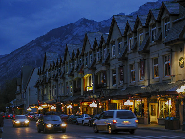
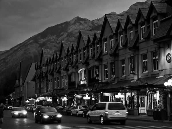
In a recent post of B&W images, several commenters liked the B&W version of this photo as opposed to other B&W images I posted. It started as a color image taken with a low resolution Olympus digital camera on a trip to Alberta, Canada in 2004 and was shot during the blue hour. I always liked the color image too, so I thought it would be fun to post both the color and the B&W images and ask your unbiased analyses. Which of these two images do you like and why? This is for fun and maybe I'll learn something useful in the process. Thanks if you decide to participate. jak
Dec 10, 2020 17:45:13 #
The color image has life and vibrance but the b/w is flat and very dull.
The color image wins hands down.
In my opinion.
The color image wins hands down.
In my opinion.
Dec 10, 2020 17:55:37 #
Bertk
Loc: NY
May be try to increase the contrast in BW and see, I loke oth but right now definitely Color looks better IMHO
Dec 10, 2020 18:11:05 #

There is a warmth to the color image, while the B&W seems stark. Night scenes in B&W are difficult. Congrats to you for both.
Dec 10, 2020 19:14:03 #

Dec 10, 2020 20:40:49 #

jak86094 wrote:
In a recent post of B&W images, several commen... (show quote)
Jak, I like the color for its blue hour and variation in colors giving the images an emotional impact. The black and white image is too stark for me compared to your superb blue hour image.
Dec 11, 2020 08:17:44 #

I like them equally well. The bottom of the photo is certainly more vibrant in the color version, but the building detail and the mountain are more alive in monochrome. It’s a wash for me. If I were selecting a photo for presentation, I’d go with the black and white. If I were saying, ”Here’s where I‘ve been,” I’d go with the color.
Dec 11, 2020 08:28:55 #

jaymatt wrote:
I like them equally well. The bottom of the photo is certainly more vibrant in the color version, but the building detail and the mountain are more alive in monochrome. It’s a wash for me. If I were selecting a photo for presentation, I’d go with the black and white. If I were saying, ”Here’s where I‘ve been,” I’d go with the color.
I agree with John here. I'm definitely not a Monochrome guy but there is much better separation from the buildings and the background in #2. I would like to see the contrast increased in the color image.
Dec 11, 2020 09:20:12 #
Dec 11, 2020 09:48:18 #

jak86094 wrote:
In a recent post of B&W images, several commen... (show quote)
Jak, I still like the B&W version, this time over the color version. Reason is also the same, I believe the B&W version is what I would see if I were there. Just my two cents worth.

Greg
Dec 11, 2020 10:19:20 #
Color. Stark images often have more impact in B&W. But this is not one (Just my opinion)
Dec 11, 2020 10:21:41 #
StevenG
Loc: Long Island, NY
jak86094 wrote:
In a recent post of B&W images, several commen... (show quote)
Color. In my opinion the b and w does not have enough elements that typically make that type of photo stand out: shapes, textures, contrast, etc. The color is much more alive.
Dec 11, 2020 12:59:00 #

As processed and presented here, I think the color image is the superior shot. However, with some additional processing (black levels, contrast, etc.) I think the b&w could be stunning. So the answer is... a definite maybe!
Dec 11, 2020 13:54:59 #

I think we need the color because of the overall darkness of the shot. Very little contrast in B&W.
Dec 11, 2020 15:31:57 #
captivecookie
Loc: Washington state
The color mixed two light temperature, so you get the contrasting cool light of nature, and the warm light of artificial bulbs. To my understanding this light mix is why the blue hour is such a superior time to do city or small town"night" photography during this time.
The monochrome version is able to separate buildings from nature by controlling contrast.
So in this election you have a winner with each candidate for reasons specific to each.
The monochrome version is able to separate buildings from nature by controlling contrast.
So in this election you have a winner with each candidate for reasons specific to each.
If you want to reply, then register here. Registration is free and your account is created instantly, so you can post right away.