Opinions Please
Oct 29, 2020 15:13:17 #

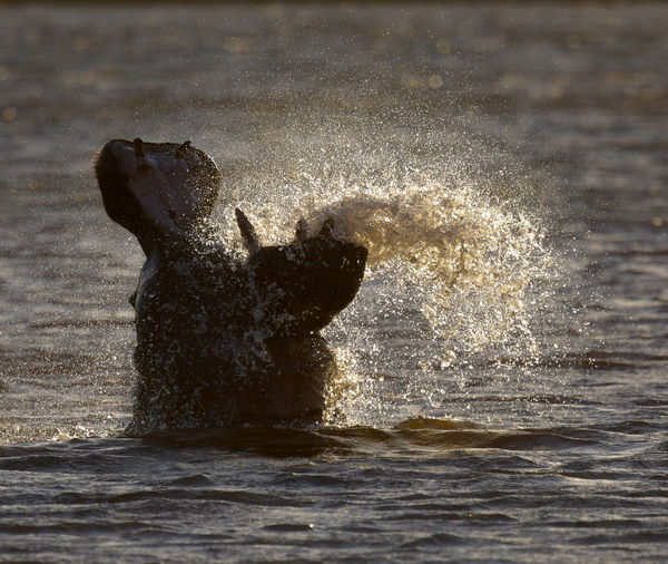
This months Outdoor Photographer is focused on Black & White photography. Personally, I've never seen the logic of throwing away thousands of colors in favor of a couple hundred shades of gray. So I ask my fellow enthusiasts, what do you think? The last photo is one that looked good to me in B & W, and I never saved a color version. It was near dark, and not a lot of color anyway.
No right or wrong answer, just honest opinions.
Thanks,
Mike
No right or wrong answer, just honest opinions.
Thanks,
Mike

Oct 29, 2020 15:22:26 #

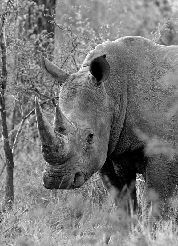
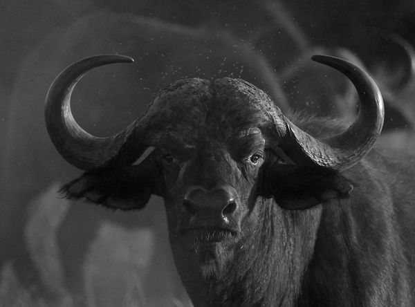
The decision to use b&w instead of color rests with the photographer's intended image, impact and subject matter. Not all subjects do exceptionally well with b&w, though others like old barns or cars do really well. What emotion are you trying to convey? How do you want the viewer to be moved emotionally? What is the reason to choose one over the other? The reasons are as varied and numerous as there are photographers and photographs. Of your set, I thnk the rhino is the best conversion. Not really sure what the subject is in #1, and the Cape buffalo would be a really fine image if, IMHO, it was lightened a bit and the blacks were dialed back a touch. Thanks for posting! 
Oct 29, 2020 15:24:19 #

B&W was first, for many years, all by itself.
Then color became available.
Many who have been photographing in B&W were used to using and working in that medium.
So they go back to it??
There are many shots that do look better in B&W.
Sometimes the impact of the shot is greater in B&W.
An image with little contrast is blah in B&W.
But, reality, for the majority of people, is color.
Boils down to an individual volition.
Oct 29, 2020 15:24:28 #

The Water Buffalo is my pick but the Rhino is a very close second.
Oct 29, 2020 15:29:58 #
capmike wrote:
This months Outdoor Photographer is focused on Black & White photography. Personally, I've never seen the logic of throwing away thousands of colors in favor of a couple hundred shades of gray. So I ask my fellow enthusiasts, what do you think? The last photo is one that looked good to me in B & W, and I never saved a color version. It was near dark, and not a lot of color anyway.
No right or wrong answer, just honest opinions.
Thanks,
Mike
No right or wrong answer, just honest opinions.
Thanks,
Mike
IMHO some shots cry out for color, others for B&W it's personal taste I guess. The Buffalo should be a B&W shot, it adds an ominous aspect to him. For me the other two just don't matter either way.
Oct 29, 2020 15:33:04 #

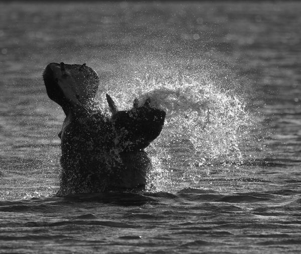
In my opinion, the color photo of #1 is better than the B&W photo of #2. Too much detail is lost in #2 and the color of the water in #1 adds more. I do enjoy the B&W of #4 over the color of #3. The subject is highly pronounced and the lighting helps to emphasize it. The color takes away from the subject. In the last photo the lighting is absolutely perfect and emphasizes your subject extremely well. Some photos are better in color while others are greatly enhanced by just being B&W. Mahalo for sharing.
Oct 29, 2020 15:36:43 #

Logic is not what's called for here, Mr. Mike 😊 Emotional impact can be heightened when color is removed.
Also, there are many ways to edit for black & white. Often on UHH, lack of experience or lack of a robust b&w editor will produce somewhat boring results.
Understanding light and shadow, tonal range, textures and forms - and whether the story is told best in b&w or color, that is how you achieve memorable results. I'm quite satisfied with this one:
https://www.uglyhedgehog.com/t-630773-1.html
.
Oct 29, 2020 15:38:26 #

Can't speak for anyone else, but I do love B&W, and what I look for in a strong image is the full range of values from black to white present. That is the way I evaluate my efforts. In respect to what to submit, a version of the Rhino or the Buff.
Oct 29, 2020 15:43:46 #
RiJoRi
Loc: Sandy Ridge, NC
To my eye, the rhino shots show where B+W works. The green of the leaves are somewhat distracting - the bright colors draw my eyes to them. That distraction disappears in the B+W, and you see RHINO!
(BTW, that bright green is the color that human eyes are most sensitive to.)
(BTW, that bright green is the color that human eyes are most sensitive to.)
Oct 29, 2020 15:58:50 #

capmike wrote:
....Personally, I've never seen the logic of throwing away thousands of colors in favor of a couple hundred shades of gray....
Is light more important than colour? Are shape or texture or pattern more important than colour? Is the storytelling/message/action more important than colour. If so, the photographer's intent will be more readily perceived if the distraction of colour is out of the way. Because of that directness, B&W can appear more dramatic than colour. And it can also appear more nostalgic (once upon a time, B&W is all there was). When the photographer deliberately takes away colour it tells the viewer that beauty wasn't the most important thing.
Oct 29, 2020 16:10:04 #
R.G. wrote:
Is light more important than colour? Are shape or... (show quote)
It depends on the image.
Some comparable examples.
Oct 29, 2020 16:36:56 #

For me it's all most always color. The only exceptions are lines, shapes and texture
Oct 29, 2020 16:47:05 #
Here is my 2 cents worth... I think that the hippo shot is the most spontaneous of the group, but if you want to submit it, you should look more carefully at the lack of tonality in the backlit water. The clolour shot has lots of tones in that, which are blown out in the B&W rendition. It is a much more original capture than the others.
With the Rhino, I think that you should increase the contrast. It is a great capture, but is almost monotone.
Similar thing with the water buffalo. You need to make the image punch if you want it to get some attention. Gee - that was a lot for 2 cents! Great captures all. Please stay well and keep on sharing.
Oct 29, 2020 16:59:41 #

If I were an "artist"- the kind that works in paints, pencils, pastels, charcoal, inks, etching materials and watercolours, I would not want to confine my work to only one medium. Different subjects call for different treatments as per moods, impact, rendition and the artist's vision, concept and interpretation of a given subject.
Alas, I can not paint or draw beyond refreshing the walls in my home or studio and drawing stick figures, respectively. So I take the same "versatility "approach with my photography.
Many folks profess that black and white photography requires more skill, is more artistic or impactful and that colour photography is "pretty but it covers up a lack of skill or artistry that would be required to render the same image in monochrome. Others insist that black and white renditions are drab and the exclusion of colour is unrealistic. I disagree with both of these notions as general concepts.
Both mediums require equal degrees of skill beyond general correctness of technique like exposure, composition and other basic technical elements. Black and white photography requires pre-visualization of colour subjects in panchromatic rendition, control of the grayscale to provide density, contrast, and detail were required. Mood and contrast are established mainly by the interaction of light and shadow and rendition of textures. Colour work requires knowledge of colour harmony and disharmony, saturation, tint and hew. The two disciplines overlap in many respects but each has its specific controls and variations. Each can be technically and aesthetically excellent or poorly crafted.
There is nothing wrong with sticking to one method or medium and specializing or have a particular preference for one or the other. For me, however, I like to diversify. But that's me, so I don't want to foist this opinion on anyone else. Remember, I'm a frustrated and failed painter/drawer/etcher so when I look at a subject and say, ", MAN!! would I ever like to do charcoal of this guy or scene? or "this scene would make a nice watercolour", or "I want this to have the feel of an old-masters painting or a victorian sampler" and all I have is a camera...
As for me, I am a commercial photograher, so in many cases, I have to do what the client dictates. If they ask my advice, I will tell them the encapsulation of waht I have written above and advise on an approach. Sometimes there is a collaboration. When I do my OWN work, when I am off duty, I have the luxury of being a hobbyist and doing whatever I want. That is waht I advise for the OP or anyone else that has a similar question. Try both, and then some. You can go in with a concept and stick to it or change your mind. With digital photography, you can have your cake and eat it too and you don't need to buy different films and worry about different processes. You can create multiple renditions of the same subject and see which is more suitable in your vision or likening.
If you decide to do everything in black and white, you can shoot, with many cameras, in monochrome mode. You can shoot film and go back to the darkroom, or you can simulate many traditional darkroom effects, image tones, textures, and special effects in post-processing.
Oct 29, 2020 17:13:04 #

When we were all shooting black & white film, we would sometimes screw a colored filter on the lens to alter tones in the image. You can do this digitally in post processing. I did the shot below with black & white film and a yellow filter on the lens. A colored filter will lighten the same color in the image. The leaves on the tree in the background were yellow. The yellow filter made them lighter. You might want to apply filters in your post processing software to achieve a wider range of tones in the image.
If you want to reply, then register here. Registration is free and your account is created instantly, so you can post right away.